A Lesson in Inventing Your Own Statistics

Nothing makes me happier than pointing out when someone is wrong.

I admit, that’s a pretty sad life. And for some unfathomable reason that doesn’t endear me to the person who uttered the incorrect statement – which it really should as I’m correcting some mistaken belief of theirs, assisting them on the path to truth.

Perhaps, as Jonathan Haidt teaches us, my endeavour is a hopeless one as approaching truth is forever clouded by confirmation bias. Polarization runs rampant and scientific disciplines are scarred by replication crises and publication bias.

I don’t take issue with any of those points: reduce my ambitions to “a little less wrong” and what follows still holds.

A few days after the Riksbank had upped its interest rate to 0% last month, Daniel Lacalle, a Spanish economist, author and fund manager – and whose musings are usually quite insightful – decided to vent his (questionable) objections to central banks and negative interest rates (NIRP) in a very strange way:

  1. Deliver a bunch of vague one-liners about monetary policy and unsustainable capital markets.
  2. Make shit up about Sweden and Swedish capital markets.

Obviously, I don’t mind too much the rhetoric of those who vehemently oppose central banks, but I do mind people pulling numbers out of their behinds and just inventing things about the world that clearly are not true.

So let’s do some fact-checking.

It’s apparently really bad for governments to have public debt – and negative interest rates allegedly work like crack-cocaine for politicians in their endless desire for more and more and more underfunded expenditures. Spend away, minister!

Except that many (non-crisis) countries such as Sweden aren’t borrowing. In fact, Sweden’s debt-to-GDP ratio is at its lowest point since 2012 and has been dropping like a stone since about the time that the Riksbank first lowered its policy rate to below 0%. In fact, as the Riksbank sits on over 35% of the outstanding government debt, there’s been quite a scramble among commercial banks to meet their capital requirements; there aren’t enough bonds to go around. The big macro debate in Sweden right now is over how much more the government ought to spend given that the debt is so small.

My favorite part is when Lacalle starts inventing numbers to support his case. Strangely enough, he’s arguing that NIRP fuels an unsustainable boom such that increasing share prices and property prices (things that most of us individually tend to think are good or at least harmless) are, in Lacalle’s mind, actually evidence of how bad life is.

Ye, I too hate it when my retirement fund or house go up in value.

  1. Sweden’s “Real estate price index has increased 50 percent (from 160 points to 240).”

The official statistics agency, Statistics Sweden, reports a +17 increase in broad real estate indices since early 2015, but they only include data until late-2018. The index is also on a completely different level, suggesting that Lacalle used some other source. 

Using numbers from Ekonomifakta we find house price increases of 9% and 19% across various regions from Q1 2015 (when the Riksbank NIRP policy began) to Q3 2019. Again, wrong index numbers so couldn’t have been Lacalle’s source.

But maybe house prices have increased some in the last few months such that Lacalle’s 50% number is correct? No, they’ve been flat, reports the realtor industry organization Svensk Mäklarstatistik.

Searching high and low for a Swedish house price index that conforms to Lacalle’s peculiar range (160 to 240), I finally found a promising one at Trading Economics:

Trading econ Sweden House Price Index.png

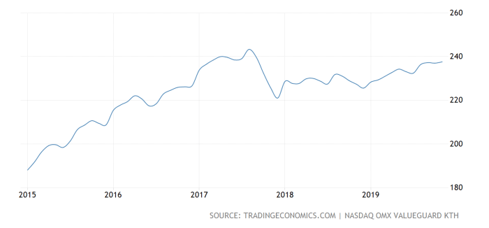
Interestingly enough, Lacalle seems to have misread the chart; the index value for Feb 2015 is around 190 – not 160 – producing a much more reasonable +26% increase over the last five years. Even that, as we’ve seen with the more reputable sources above, might be tad exaggerated.

2. Sweden’s stock market is up “more than 20%”

Next up: the stock market – always a grateful subject for unsubstantiated rants.

“more than 20%” is cheating as technically anything above “20%” would work. Curiously enough, no index for the Swedish stock market shows those numbers between Feb 18, 2015, and today:

  • OMXS30, a commonly quoted index that does not include dividends, is up 8% since then.
  • Using indices that do account for (reinvested) dividends, OMXSPI shows 27.5% gain since NIRP was introduced;
  • OMXS30GI shows a 30.5% gain;
  • and OMXSCAPGI reports a 52% return.

Then again, if gradually increasing stock markets are a bad thing, then why didn’t Lacalle go with the highest, most inflated number he could find?

3. “Average residential index” is apparently up 27%

Not a statistics I’m familiar with, but I refer the reader to (1) above for sources on property prices.

4. “nonreplicable assets have risen between 30 and 70 percent”

First: that’s quite a range, Sir.
Second: ye, I’ve never heard that term before (let alone something to measure it) – and neither, it seems, has Google. I suspect Lacalle invented some more numbers to complement his already fake-y statistics. 

Tl;dr – don’t just make shit up, kids. Do look into your claims before you mindless utter them. You may be entitled to your own opinion (actually not really), but you can’t just believe whatever you want, making shit up along the way.

Global Warming: Take Off My Sweater?

There is a new UN Intergovernmental Panel on Climate Change report. It contains nothing but bad news, of course. But I am busy with my real life; I have obligations to others; I have to feed myself and shower; I even go to the gym regularly. What to do? Just trust a hysterical sixteen-year-old? (Yes, I mean Greta.)

When someone or something claims that there is, has been, change in something I perceive might be important, I apply the following four quick tests. I do this to decide how much I must attention I should pay to the change news.

1 Source credibility

Not all sources are created equal. Some stink, some have a long record of being reliable. The Wall Street Journal is one of the latter. Almost all anonymous internet sources are not even sources. The National Enquirer will publish anything (although it has had a few remarkable scoops). Normal sixteen-year old girls are only credible when they pronounce on show biz stars or on something related to a skill they have personally acquired, such as piano or gymnastics.

2 Main text: description of process

I scrutinize the description at the heart of the announcement of change though only for a short time. Does the process described make sense? Is it derived in an intelligible way from a study, or studies, that conform to conventional scientific, or other scholarly standards? If no claim is made that they do, they don’t, ever. If there is such a claim, there can still be abuse but there will shortly be a denunciation, in most cases, at least.

3 Narrative around description

Most change descriptions not directly in a scholarly journal come wrapped up inside a narrative. The narrative is often more interesting than the findings to which they are supposed to be linked. That’s intentional but dangerous. Suppose your doctor carefully measures your heartbeat and records his observations. Suppose that then, he gives you a very good lecture on the faults of Social Security. However valid the latter is, it should gain no authority whatsoever from the impeccable measurement of you heartbeat. This is a crude example but people do this sort of things all the time. Do you think climate activist do?

I ask myself how tightly connected the narrative is to the straightforward description of the relevant change? Often the answer is: barely, sometimes: not at all.

4 Gauging critically the order of magnitude of change

Suppose I tell you that I have lost weight. (I could use that.) Courtesy requires that you congratulate me but rationality demands that you ask: How much? If my response is one ounce, you will tend to dismiss my announcement and you will be right. One ounce out of 220 lbs is like nothing. (That’s aside from the fact that it might actually be nothing, a measurement error.)

The mysterious issue of “statistical significance” (that I will resist going into here though I am tempted) is only indirectly related to this matter. A difference between before and after, for example, may be statistically significant but yet, completely unimportant.

The short Wall Street Journal piece (1) covering the publication of the report is rich in narrative and short on figures. (That’s usually the case with climate change announcements, I think.) On rare figure drew my attention:

In the past 140 years -covering most but not quite all of the Industrial Age – global surface temperatures have risen by one (unit) degree Celsius.

To give you a practical idea, that’s not enough of a rise to cause me to take off my cotton sweater, or even to unbutton the top of my shirt. If the temperature rose by only one C between 8 am and noon, I would think something was wrong with the weather! I can easily believe that at this rate, in another 1400 years, it will be ten degree centigrade (Celsius) warmer and, we will still be here. That’s unless something else, something much more likely, like an epidemic. wipes us out. (2) and (3).

As this example illustrates, it may often be wise too reverse the critical sequence described above. Why bother to assess the source credibility associated with an announced change, or the conformity of the description change process to good scientific practice, or check out the attachment of the surrounding narratives to the process in the description, why do all this if the measured change is too small to merit attention?

My more complete ruminations on climate change skepticism are in Liberty Unbound: “Climate Change Denier.”

Endnotes

1   “U.N. Panel Sees Threat to Ocean” – by Robert Lee Hotz, Wall Street Journal 9/26/19, P. A8.

2     I am well aware that this is a sort of arithmetic average. Surface temperature may have gone up more in some areas and less in others. They may have declined in some places. If the subject is dealt with, it will be in: Watts Up with That.

3      The WSJ accounts implies that the UN report is oddly concerned with fisheries. This is odd because fishermen have known forever that there are warm and cool patches at the same latitude in the oceans. They also know that those shift positions and that the positions of such warm and cool patches affect the movements of fish.

On Translating Earnings From The Past

A few days ago, John Avery Jones published a great piece on the Bank of England blog (“Bank Underground”), investigating how much Jane Austen earned from her novels in the early 1800s. By using the Bank’s own archives and tracking down Austen’s purchases of “Navy Fives” (Bank of England annuities, earning 5%), Avery Jones backed out that Austen’s lifetime earnings as a writer was probably something like £631 – assuming, of course, that the funds for this investment came straight from the profits of her novels.

Being a great fan of using literature to illustrate and investigate financial markets of the past, I obviously jumped on this. I also recently looked at the American novelist Edith Wharton’s financial affairs and got very frustrated with the way commentators, museums, and scholars try to express incomes of the past in “today’s terms”, ostensibly vivifying their meaning.

For the Austen case, both Avery Jones and the Financial Times article that followed it, felt the need to “translate” those earnings via a price index, describing them as “equivalent to just over £45,000 at today’s prices”.

Hang on a minute. Only “£45,000”? For the lifetime earnings of one of the most cherished writers in the English language? That sounds bizarrely small. That figure wouldn’t even pay for the bathroom in most London apartments – and barely get you a town-house in Newcastle. The FT specifically makes a comparison with contemporary fiction writers:

“[Austen’s] finances compare badly even with those of impoverished novelists today: research last year by the Authors’ Licensing and Collecting Society found that writers whose main earnings came from adult fiction earned around £37,000 a year on average”

Running £631 through MeasuringWorth’s calculator yields real-price estimates of £45,910 (using 1815 as a starting year) – pretty close. But what I think Avery Jones did was adjusting £631 with the Bank’s CPI index in Millenium of Macroeconomic Data dataset (A.47:D), which returns a modern-day price of £45,047 – but that series ends in 2016 and so should ideally be another 7% or so from 2016 until May 2019.

 “This may not be the best answer”

Where did Avery Jones go wrong in his translation? After all, updating prices through standard price indices (CPI/RPI/PCE etc) is standard practice in economics. Here’s where:

untitled-1

The third line on MeasuringWorth’s result page literally tells researchers that the pure price number may not reflect the question one is asking. The preface to the main site includes a nuanced discussion about prices in the past:

“There is no single ‘correct’ measure, and economic historians use one or more different indices depending on the context of the question.”

When I first estimated Mr. Darcy’s income, this was precisely the problem I grappled with; simply translating wealth or incomes from the past to the present using a price index severely understates the meaning we’re trying to convey – i.e., how unfathomably rich this guy was. There is no doubt that Mr. Darcy was among the richest people in England at the time (his annual income some 400 times a normal worker’s salary), a well-respected and wealthy man of elevated rank. However, translating his wealth using a price index doesn’t even put him on the Times’ Rich List over the thousand wealthiest Britons today. Clearly, that won’t do.

Because we are much richer today in real terms, price indices alone do not capture the meaning we’re trying to communicate here. Higher real income – by definition – is a growth in incomes above the rise in prices. We therefore ought to use a more tangible comparison, for instance with contemporary prices of food or mansions or trips abroad; or else, using real income adjustments, such as GDP/capita or average earnings.

MeasuringWorth provides us with three other metrics over and above the misleading price-index adjustment:

Labour Earnings = £487,000
using growth in wages for the average worker, it reports how large your wage would have to be today to afford what Austen could afford on £631 in 1815. Obviously, quality adjustments and technological improvements make these comparisons somewhat silly (how many smartphones, air fares and microwaves could Austen buy?), but the figure at least takes real earnings into account.

Relative Income = £591,300
Like ‘Labour Earnings’, this adjustment builds on the insight above, but uses growth in real GDP/capita rather than wages. It more closely captures the “relative ‘prestige value’” that we’re getting at.

Both these attempt are what I tried to do for Mr. Darcy (Attempt #2 and #3) a few years ago.

Relative Output = £2,767,000
This one is more exciting because it captures the relationship to the overall economy. If I understand MeasuringWorth’s explanation correctly, this is the number that equates the share of British GDP today with what Austen’s wealth – £631 – would have represented in 1815.

Another metric I have been experimenting with is reporting the wealth number that would put somebody in the same position in the wealth distribution of our time. For example, it takes about £2,5m to qualify for the top-1% of British wealth (~$10m in the United States) distribution today. What amount of wealth did somebody need to join the top 1% in, say, 1815? If we could find out where Austen’s wealth of £631 (provided her annuities were her only assets) rank in the distribution of 1815, we can back out a modern-day equivalent. This measure avoids many of the technical problems above for how to properly adjust for a growing economy, and how to capture inventions in a price index – and it gets to what we’re really trying to convey: how wealthy was Austen in her time?

Alas, we really don’t have those numbers. We have to dive deep into the wealth inequality rabbit hole to even get estimates (through imputed earnings, capital stocks or probate records) – and even then the assumptions we need to make are as tricky and inexact as the ones we employ for wage series or prices above.

The bottom line is pretty boring: we don’t have a panacea. There is no “single correct measure”, and the right figure depends on the question you’re asking. A reasonable approach is to provide ranges, such as MeasuringWorth does.

But it’s hard to imagine the Financial Times writing “equivalent of between £45,000 and £2,767,000 at today’s prices”…

Nightcap

  1. Working in President Trump’s Council of Economic Advisers Casey Mulligan, Supply and Demand (in that order)
  2. How not to use percentages in a news story Joakim Book, Power & Market
  3. Climate change denialism Jacques Delacroix, Liberty Unbound
  4. The Mahabharata in South Asia, Europe, and East Asia Michael Kinadeter, JHIBlog

Let’s Find Out – or: the Power of Reference

The core message of a number of books I’ve recently had the great pleasure to read has been fairly simple. Have a look. Check it out. Put your numbers in perspective. In a world awash with statistics and cognitive biases imploring us to cheer mindlessly for our own team, having the skill and wherewithal to step back and carefully ask: “can this really be so?” is golden.

One of recently passed celebrity professor and YouTube phenomenon Hans Rosling’s most profound advice for countering misinformation about the state of the world is precisely this: put all numbers in perspective. Never accept unaccompanied numbers – never believe the numerator without checking the denominator. What matters, as Bryan Caplan never ceases to emphasize as the GMU Economics creed, “are statistics, not emotions – and arguments, not stories.”

But, a statistic may never be left alone, Rosling maintains, but always compared to other relevant numbers. What share of its total category does this statistic represent? What was it last year, 5 or 10 or 20 years ago? Is there some self-evident change in associated behavior that is relevant or ought to explain it? A century ago street cars used to kill and injure hundreds of people every year, but since very few American cities make use of street cars today, the casualty is fortunately much lower. If we keep in mind that miles travelled by cars far outnumber miles travelled by street cars, reporting the number of street car deaths – while probably correct – entirely miss the point when discussing traffic safety. In How Not To Be Wrong, Mathematics professor Jordan Ellenberg quipped

Dividing one number by another is mere computation ; knowing what to divide by what is mathematics.

Here’s another example. If I told you about 23 000 individual deaths and spent a brief 10 second on each of them, going through the list would take me almost three days. On a personal level like that, 23 000 deaths is an absurd, insane, catastrophe-style event that few people are emotionally equipped to handle – essentially the size of my hometown, wiped out in a single year. If I told you those 23 000 deaths were due to antibiotic resistant diseases in the U.S. last year, the pandemic scenarios working through your mind quickly escalate. That many! Let’s find the nearest bunker!

If I then told you that cancer and heart diseases (each!) claim the lives of about 20x that, the fear of lethal apocalyptic germs consuming the world ought to quickly recede. Oh.

Here’s another example. It is entirely correct to point out that the number of people killed in worldwide airplane accidents in 2018 (556 people) was much higher than the year before (44 people) and the year before that (325 people). Would one be excused for believing that air travel is getting more risky and dangerous? Forbes, for instance, ran a roughly accurate story claiming that airline fatalities increased by 900%.

Not in the slightest. The number of fatalities from air travel has been falling for decades, all while the number of flights and miles travelled have increased exponentially, meaning that the per-flight, per-mile or per-passenger risk of death has kept dropping. Not to mention that alternative modes of travelling like driving is magnitudes more dangerous.

While Rosling teaches us to figure out what the base rate is, i.e. putting our statistic into appropriate perspective, one of Philip Tetlock’s tricks for becoming a ‘Superforecaster’ is to use Bayesian updating of one’s beliefs. This picks up precisely where Rosling’s idea left off. Once we know where to start, we have to amass more information, numbers and observations from other points of view – Bayesian updating is a popular method to incorporate and synthesize new information with the old.

In short “Calculation, like logic, is your friend” (Landsburg 2018: 44). Statistics matter and numbers can deceive. In order to better understand our realities and see through mistakes that others make – either intentionally to deceive or persuade, or unintentionally through ignorance – we must embrace the core message of people like Ellenberg, Tetlock, Duffy, Rosling or Pinker.

Always Be Comparing Thy Numbers. Never accept an unaccompanied statistic. Never trust numerators without denominators.

Nightcap

  1. Bringing natural law to international relations Samuel Gregg, Law & Liberty
  2. How to face down the Secret Service Irfan Khawaja, Policy of Truth
  3. Affirmative Action at Harvard and statistics Gelman, Goel, & Ho, Boston Review
  4. The right’s triumph; the Left’s complicity Chris Dillow, Stumbling & Mumbling

Twelve Things Worth Knowing According to Jacques Delacroix, PhD, Plus a Very Few Brain Food Items.

Note: I wish you all a prosperous, healthy, and writerly year 2019. (No wishes for happiness, it will come from all the above.)

I have a French nephew who is super-smart. Not long after graduating from the best school in France, he moved to Morocco where he married a super-smart Moroccan woman. He is so smart that he asked me for my intellectual will before I depart for another planet. It’s below.

Here are my qualifications: I taught in universities for thirty years, including twenty-five years in a business school in Silicon Valley. My doctorate is in sociology. (Please, don’t judge me.) My fields of specialization are Organizational Theory and the Sociology of Economic Development. My degree is from a very good university although I am a French high school dropout. My vita is linked here (pdf). Its academic part is respectable from a scholarly standpoint, no more. There is much additional info in my book: I Used to Be French: an Immature Autobiography, available from me, and on Amazon Kindle, and in my electronic book of memoirs in French: “Les Pumas de grande-banlieue: histoires d’émigration”, also on Amazon Kindle.

1. When the facts don’t fit your perspective you should change …. ? (Complete sentence.)

2. One basic complex idea worth knowing that resists learning: natural selection.

Note: the effective mechanism involved is multi-generational differential reproduction. You don’t understand natural selection until you can put a meaning on all three words.

3. Another basic idea worth knowing, a counter-intuitive one, that also resists learning: the principle of Comparative Advantage: If you are not working at what you do the very best, you are impoverishing me. There is a ten-lesson quick course on my blog to explain this. Look for short essays with the word “protectionism” in the title. A longform version can also be found, here.

4. Taking from the poor is a stupid way to try to become rich when you can invent a new world – like Steve Jobs – and be immensely rewarded for it. Or open a decent restaurant and be well rewarded, or learn welding. There isn’t much you can take from the poor anyway because they are poor. Plus, the bastards often resist!

5. Culture is in the heads (plural). Everything else isn’t “culture.”

6. How a body of people act is not simply the addition of the thinking of its individual human members. (There is a sociology!)

7. Beware those pesky fractions. Quick test: Five years ago, my income was 40% of yours. Now, my income is only 20% of yours. Am I earning less than I did five years ago?

8. Correlation is not causation but there is no causation without some sort of correlation.

9. Statistical significance is significant even if you don’t quite know what it signifies. Find out. It’s not hard.

10. Use statistical estimation methods even if you don’t understand them well. It will improve your reasoning rigor by confronting you brutally with the wrongness of your guesses. And you can only become better at it with practice.

11. There is not text that’s not improved by extirpating from it half of all adjectives and adverbs.

12. Reading is still the most efficient way to improve your comprehension of the world.

It seems to me that if you understand these twelve points inside out, you are well above average in general culture; that’s even true on a global scale.

Below are some intellectual anchoring points of my life. They are subjectively chosen, of course. Don’t lend them too much credence.

My favorite singer-composers: Jacques Brel; the Argentinean Communist Atahualpa Yupanqui. (I can’t help it.)

My favorite instrumental musics: baroque music, the blues.

My favorite painters: Caravaggio (link); Delacroix (Eugene); Delacroix (Krishna).

I don’t have a favorite book because I read all the time without trying to rank books. These three books have made a lasting impression, changed my brain pathways forever, I suspect: Daniel Defoe, Robinson Crusoe; George R. Stewart, Earth Abides; Eric Hoffer, The True Believer: Thoughts on the Nature of Mass Movements.

The only two intelligent things I have said in my life:

“Once you know a woman well vertically, you know nothing about her horizontally.”

“There is not bad book.”

On the point of quantifying in general and quantifying for policy purposes

Recently, I stumbled on this piece in Chronicle by Jerry Muller. It made my blood boil. In the piece, the author basically argues that, in the world of education, we are fixated with quantitative indicators of performance. This fixation has led to miss (or forget) some important truths about education and the transmission of knowledge. I wholeheartedly disagree because the author of the piece is confounding two things.

We need to measure things! Measurements are crucial to our understandings of causal relations and outcomes.  Like Diane Coyle, I am a big fan of the “dashboard” of indicators to get an idea of what is broadly happening.  However, I agree with the authors that very often the statistics lose their entire meaning. And that’s when we start targeting them!

Once we know that this variable becomes the object of target, we act in ways that increase this variable. As soon as it is selected, we modify our behavior to achieve fixed targets and the variable loses some of its meaning. This is also known as Goodhart’s law whereby “when a measure becomes a target, it ceases to be a good measure” (note: it also looks a lot like the Lucas critique).

Although Goodhart made this point in the context of monetary policy, it applies to any sphere of policy – including education. When an education department decides that this is the metric they care about (e.g. completion rates, minority admission, average grade point, completion times, balanced curriculum, ratio of professors to pupils, etc.), they are inducing a change in behavior which alters the significance carried by this variable.  This is not an original point. Just go to google scholar and type “Goodhart’s law and education” and you end up with papers such as these two (here and here) that make exactly the point I am making here.

In his Chronicle piece, Muller actually makes note of this without realizing how important it is. He notes that “what the advocates of greater accountability metrics overlook is how the increasing cost of college is due in part to the expanding cadres of administrators, many of whom are required to comply with government mandates(emphasis mine).

The problem he is complaining about is not metrics per se, but rather the effects of having policy-makers decide a metric of relevance. This is a problem about selection bias, not measurement. If statistics are collected without an intent to be a benchmark for the attribution of funds or special privileges (i.e. that there are no incentives to change behavior that affects the reporting of a particular statistics), then there is no problem.

I understand that complaining about a “tyranny of metrics” is fashionable, but in that case the fashion looks like crocs (and I really hate crocs) with white socks.

The Cost of ‘Free’ – or why I don’t like freeware

This is a partial response to Fabio Rojas recent post on the fate of Stata, a statistics package, given the rise of a free alternative, R. Rojas and others have many reasons for why R is a good package, but for now I wish to deal with the argument that it being ‘free’ is a virtue.

R is free, but I see it as a fault because it reveals that it doesn’t have a devoted support system and because it isn’t free at all. It’s actually very costly!

If you’ve spent any time with an economist you should know that there is no such thing as a free lunch. If R is free we should not simply assume it is better. To the contrary we should ask why it is free. As I have tried to argue elsewhere, it is because when you purchase software you aren’t just purchasing a few lines of code. You’re purchasing the support system that comes with it. When a company purchases Stata, or any commercial software, they do so with the expectation that they can call a dedicated hotline for troubleshooting. As software has evolved you’ve seen companies experiment with pricing to acknowledge the fact that we don’t purchase a one time software but a continuous support system.

Consider Xbox or Playstation’s online services. Their use is charged on a per time basis because it costs money to run servers and provide customer support. Even ‘freemium’ games, which nominally don’t require any money to play, survive off micro transactions which enable companies to earn steady revenues in exchange for continuing support and new content. I would not be surprised if freemium statistical software is tried in the future – access to basic regressions is free but more advanced models cost money to run. I half joke.

But let’s assume you’re good at coding and don’t need much support outside of a few days reading an R book. Should you praise R for being ‘free’? No, because you still paid the time value of your time. Every hour spent learning how to code in R is an hour you could have spent doing any number of things.

Now to be clear, you may still want to learn R if it frees up your time in the future by automating X process. This post isn’t to argue against adopting R. My point is only to say that it isn’t free in a meaningful sense. Adopting R costs in the sense that you’re giving up a devoted support system and value of time equal to how long it takes you to become proficient in it.

It’s possible that once you account for those things R is still ‘cheaper’ than commercial software like Stata or SPSS. That is an empirical question beyond the scope of this post.

How dairy farmers unions in Canada are distorting the facts about supply management

Under heat recently as President Trump has criticized supply management in Canada and retaliated against it, the different provincial associations representing dairy farmers have moved on the offensive. To promote the virtues of this system meant to reduce production in order to prop up prices through the use of trade tariffs, production quotas and price controls (how can we call those virtues), these unions have produced numerous infographics to make their case. It is even part of what they dub their These-infographics-show-that-diary-prices-are-lower-in-Canada-than-elsewhere, that milk is still a cheap drink relative to other type of drinks and those prices, supposedly, increase more slowly than elsewhere. All of these graphics are dishonest and must be dismantled.

The most egregious of these infographics – present in the “lobby day kit” – shows the price of milk in Australia (1.55 CAD), Canada (1.45 CAD) and New Zealand (1.65 CAD). They are seemingly using 2014 prices. First of all, they use data that conflicts massively with the reports of Statistics Canada that suggest that milk prices hover between 2.33$ to 2.48$ per liter.  Their data is provided by AC Nielsen but no justification is presented as to why they are better than Statistics Canada. The truth is that it is not better. Participants in Nielsen surveys come from a self-selected pool of storeowners who wish to participate and are then selected by Nielsen to be part of the data collection. Then, they can record prices. It should be mentioned that not all regions of Canada are covered in the data. Although the Nielsen data does have some uses (especially with regards to market studies), it hardly measures up Statistics Canada when comes the time to evaluate price levels. This is because the government agency collects information from all regions and tries a broader sweep of retailers in order to create the consumer price index.

But an even larger problem is that, in their comparison of prices, they don’t mention that New Zealand taxes milk. In New Zealand, all food items are subjected to sales tax, which is not the case in Canada and Australia. Hence, when they compare retail prices, they are comparing prices that exclude taxes and prices that include taxes. One would like to find if they acknowledge this fact in the methodological mentions, but there are none!

Using prices available at Numbeo.com and Expatisan.com and the exchange rates made available by the Bank of Canada, we can correct for this problem of theirs. Simply changing prices source leads to a massively different result with regards to Australia whose milk prices are lower than in Canada. Secondly, once we adjust for the sales tax in New Zealand, we find that prices in New Zealand are lower than in Canada. In fact they are lower than in one of Canada’s cheapest market, Montreal (let alone Toronto or Vancouver).  So the infographic they show in order to lobby governments is a fabrication.

Table 1: The real price of milk

Using Numbeo.com (regular milk)
Unadjusted Adjusted for taxes
 Australia  $           1.59  $                 1.59
 New Zealand  $           2.26  $                 1.97
 Canada  $           1.99  $                 1.99
 Using Expatisan.com (whole milk)
 Unadjusted  Adjusted for taxes
 Sydney  $           1.82  $                 1.47
 Wellington  $           2.42  $                 2.10
 Montreal  $           2.87  $                 2.87

Source: Numbeo.com and Expatisan.com, consulted May 16th 2014 and the Bank of Canada’s currency converter. Note: using the Statistics Canada price would make Canada’s situation even worse by comparison.

This is part of a pattern of deceit since they also massage data for numerous other graphs that are presented to Canadians in efforts to convince them of the virtues of supply management. One other example is an infographic that presents a figure of nominal milk prices in Australia before and after the abolition of supply management. Given that prices seem more volatile after 2000 and that they increase more steeply, they try to make us believe that liberalization was a failure. This is not the case. Any sensible policy analyst would deflate nominal prices by the general price index to control for inflation. When one does just that using the data from the Australian Bureau of Statistics, one sees that real prices stabilized in the first ten years of deregulation after increasing roughly 15% in the decade prior. And since 2010, real prices have been falling constantly.

Other examples abound. In one instance, the Quebec union of dairy farmers circulated an infographic meant to show that nominal prices for dairy products increased faster in the United States than in Canada. Again, they omit inflation. Since 1990 (their own starting date), prices of dairy products have risen more slowly than inflation – indicating a decline in real prices. In Canada, the opposite occurred – inflation increased more slowly than dairy prices indicating an increase of the real price.

The debate around supply management is complicated. The policy course to adopt in order to improve agricultural productivity and lower prices for Canadians is hard to pinpoint. But whatever position one may hold, no one is well-served by statistical manipulations offered by the unions representing dairy farmers.

On 7 million deaths from air pollution

ATTN published a video of An-huld (the really cool guy who made my childhood by being in all my favorite action movies like Predator* and who ended up being the governor of California). In that short clip, Schwarznegger starts by saying that 7 million individuals die from pollution-related illnesses.

That number is correct. But it is misleading.

People see pollution as “all and the same”. But some forms of pollution increase with development (sulfur emissions and some would argue that too much CO2 emissions is pollution as it causes climate change). However, others drop dramatically – especially heavy particules (Pm10) which are a great cause of smog. Julian Simon (the late cornucopian economist who is one my greatest intellectual influence) pointed out this issue and noted that the deadliest forms of pollution are those that relate to underdevelopment.

Back in 2003, Jack Hollander published the Real Environmental Crisis: Why Poverty, Not Affluence is the Environment’s Number One Enemy. Hollander pointed out that simply from the combustion of organic matter (read: firewood and animal manure – literally burning fecal matter) indoors for the purposes of heating, cooking and lighting was responsible for close to 2 millions deaths.

Since then, the WHO came out with a study pointing out that around 3 billion people cook and heat their homes with open fires and stoves that rely on biomass or anthracite-coal. They put the number of premature deaths directly resulting from this at over 4 million people. This is close to 60% of the figure cited by the former President of California (yes, I know he was governor – see here). In other words, 60% of the people who die prematurely as a result of strokes, ischaemic heart diseases, chronic obstructive pulmonary diseases and lung cancers can be attributed to indoor air pollution. That means pollution resulting from the fact that you are so poor that you have to burn anything at hand at the cost of your health.

True, richer countries pollute and there are policy solutions (I have often argued that governments are better at polluting than at reducing pollution, but that is another debate) that should be adopted. But, these forms of pollution do not harm human life as much as those that come with poverty.

* By the way, when you watch Predator, do you realize that there are two future American governors in that movie? I mean, imagine that when Predator came out, some dude from the future told you that two of the main actors would end governing American states. Pretty freaky!

Spanish GDP since 1850

Among the great economic historians is Leandro Prados de la Escosura. Why? Because, before venturing in massively complex explanations to explain academic puzzles, he tries to make sure the data is actually geared towards actually testing the theory. That attracts my respect (probably because it’s what I do as well which implies a confirmation bias on my part). Its also why I feel that I must share his most recent work which is basically a recalculation of the GDP of Spain.

The most important I see from his work is that the recomputation portrays Spain as a less poor place than we have been led to believe – throughout the era. To show how much, I recomputed the Maddison data for Spain and compared it with incomes for the United Kingdom and compared it Leandro’s estimates for Spain relative to those for Britain (the two methods are very similar thus they seem like mirrors at different levels). The figure below emerges (on a log scale for the ratio in percentage points). As one can see, Spain is much closer to Britain than we are led to believe throughout the 19th century and the early 20th century. Moreover, with Leandro’s corrections, Spain convergence towards Britain from the end of the Civil War to today is very impressive.

spanishgdp

The only depressing thing I see from Leandro’s work is that Spain’s productivity (GDP / hours worked) seems to have stagnated since the mid-1980s.

spanishproductivity

Canadian Megatrends: Top 1% income share and median age

Statistics Canada just came up with a study on the top income share of the top 1% in Canada. As I have explained elsewhere, my view of inequality is that: a) it has increased; b) not as much as we think; c) a lot of the increase is from desirable factors (personal utility maximization differing from income maximization or international immigration) or neutral factors (demography, marriage); d) that the inequality that is worrisome stems either from birth or government manipulations of the market and; e) that those stemming from government manipulations, direct (like subsidizing firms) or indirect (like the war on drugs which means that a large number of individuals are jailed and then released with a “prison earnings penalty” which stymies their income levels and growth), are the easiest to fight.

The recent Statistics Canada study allows me to make my point again with regards to element C of my answer. As I looked at their series, all I could think was “median age”. A lot of the variations seem to be related to the median age of the population. I went back to the census data I had collected for my book and plotted it against the data. This is what it looks like.

medianage

Why would there be a relation? Well, each year you measure the income distribution, the demographic structure of that population changes. As it grows older, you have more people at the top of their earnings curve relative to those at the bottom. Not only that, but earnings curve seem elongated in recent times – we live longer and so some people work older as witnessed by increased labor force participation rates above a certain age closer to retirement. And the heights of the earnings curve are now higher than ever before while we also enter later into the labor market.

Now, I am not sure how much aging would “explain away” rising inequality in Canada, but there is no point denying that it does explain some of it away. But, I would not be surprised that a large part is explained away. Why am I saying that? Because of this paper on Norway’s age structure. 

In Norway, the median age in 1950 was much higher than it was in Canada back then and today, it is roughly the same as Canada (although Canada has had a steeper increase in inequality). And according to the paper on Norway, adjusting for composition bias in inequality measures caused by aging, eliminates entirely the upward trend in that country. In fact, it may even reverse the trend whereby inequality adjusted for age has actually declined over time. This is a powerful observation. Given that Canada has had a steeper increase in median age, this suggests that the increase in inequality might be simply the cause of a statistical artifice.

Castro: Coercing Cubans into Health

On Black Friday, one of the few remaining tyrants in the world passed away (see the great spread of democracy in the world since 1988). Fidel Castro is a man that I will not mourn nor will I celebrate his passing. What I mourn are the lives he destroyed, the men and women he impoverished, the dreams he crushed and the suffering he inflicted on the innocents. When I state this feeling to others, I am told that he improved life expectancy in Cuba and reduced infant mortality.

To which I reply: why are you proving my point?

The reality that few people understand is that even poor countries can easily reduce mortality with the use of coercive measures available to a centralized dictatorship. There are many diseases (like smallpox) that spread because individuals have a hard time coordinating their actions and cannot prevent free riders (if 90% of people get vaccinated, the 10% remaining gets the protection without having to endure the cost). This type of disease is very easy to fight for a state: force people to get vaccinated.

However, there is a tradeoff to this. The type of institutions that can use violence so cheaply and so efficiently is also the type of institutions that has a hard time creating economic growth and development. Countries with “unfree” institutions are generally poor and grow slowly. Thus, these countries can fight some diseases efficiently (like smallpox and yellow fever), but not other diseases that are related to individual well-being (i.e. poverty diseases). This implies that you get unfree institutions and low rates of epidemics but high levels of poverty and high rates of mortality from tuberculosis, diarrhea, typhoid fever, heart diseases, nephritis.

This argument is basically the argument of Werner Troesken in his great book, The Pox of LibertyHow does it apply to Cuba?

First of all, by 1959, Cuba was already in the top of development indexes for the Americas – a very rich and healthy place by Latin American standards. A large part of the high levels of health indicators were actually the result of coercion. Cuba actually got its very low levels of mortality as a result of the Spanish-American war when the island was occupied by American invaders. They fought yellow fever and other diseases with impressive levels of violence. As Troesken mentions, the rate of mortality fell dramatically in Cuba as a result of this coercion.

Upon taking power in 1959, Castro did exactly the same thing as the Americans. From a public choice perspective, he needed something to shore up support.  His policies were not geared towards wealth creation, but they were geared towards the efficient use of violence. As Linda Whiteford and Laurence Branch point out, personal choices are heavily controlled in Cuba in order to achieve these outcomes. Heavy restrictions exist on what Cubans can eat, drink and do. When pregnancies are deemed risky, doctors have to coerce women to undergo abortion in spite of their wishes. Some women are incarcerated in the Casas de Maternidad in spite of their wishes. On top of this, forced sterilization in some cases are an actually documented policy tool.   These restrictions do reduce mortality, but they feel like a heavy price for the people. On the other hand, the Castrist regime did get something to brag about and it got international support.

However, when you look at the other side of the tradeoff, you see that death rates from “poverty diseases” don’t seem to have dropped (while they did elsewhere in Latin America).  In fact, there are signs that the aggregate infant mortality rates of many other Latin Americans countries collapsed toward the low-levels seen in Cuba when Castro took over in 1959  (here too). Moreover, the crude mortality rate is increasing while infant mortality is decreasing (which is a strong indictment about how much shorter adult lives are in Cuba).

So, yes, Cuba has been very good at reducing mortality from communicable diseases and choice-based outcomes (like how to give birth) that can be reduced by the extreme use of violence. The cost of that use of violence is a low level of development that allows preventable diseases and poverty diseases to remain rampant. Hardly something to celebrate!

Finally, it is also worth pointing two other facts. First of all, economic growth in Cuba has taken place since the 1990s (after decades of stagnation in absolute terms and decline in relative terms). This is the result of the very modest forms of liberalization that were adopted by the Cuban dictatorship as a result of the end of Soviet subsidies. Thus, what little improvements we can see can be largely attributed to those. Secondly, the level of living standards prior to 1990 was largely boosted by the Soviet subsidies but we can doubt how much of it actually went into the hands of the population given that Fidel Castro is worth 900$ million according to Forbes. Thus, yes, Cubans did remain dirt poor during Castro’s reign up to 1990. Thirdly, doctors are penalized for “not meeting quotas” and thus they do lie about the statistics. One thing that is done by the regime is to categorize “infant deaths” as “late fetal deaths” – its basically extending the definition in order to conceal a poorer performance.

Overall, there is nothing to celebrate about Castro’s dictatorship. What some do celebrate is something that was a deliberate political action on the part of Castro to gain support and it came at the cost of personal freedom and higher deaths from preventable diseases and poverty diseases.

H/T : The great (and French-speaking – which is a plus in my eyes because there is so much unexploited content in French) Pseudoerasmus gave me many ideas – see his great discussion here.

The News: Fair and Unbiased

Reminder: Favorite Democratic presidential candidate Clinton (H.) must be considered innocent until she is found guilty by a court of law. Be patient!

The Obama Air Force bombed a Doctors Without Borders clinic in Afghanistan, killing about twenty people including doctors and underage patients. White House spokesperson: “We are still the best!” (Learning how to write headlines liberal style.)

I looked at a picture of the Oregon mass killer. He looked African-American to me. I am not an expert on race but I am pretty sure he would not have been seated at a Sears lunch counter in Mississippi in 1956. I wonder if he too was a white supremacist.

The police found thirteen of his firearms, all perfectly gun controlled (legal, in other words).

It seems to me that the statistics that matters the most with respect to homicides is type of homicide for 100,000 people. For the period 2000-2014 the US stands high in the ranking of deaths per hundred thousand within the context of a mass killings. It ranks number four, behind Norway, Finland, and….Switzerland. N. S.! (From the Wall Street Journal of 10.3 4 2015 reporting on an academic study.) I think a fourteen year period is significant. It does not look like cherry picking to me but I am open minded.

This all makes me muse about how raw figures are presented to the public. We all know the US homicide rate is high. (I don’t have the numbers at hand but there is no disagreement about the general statement.) I wonder what the US ranking would be if we deducted from the US homicide total count all homicides committed by African-Americans in areas administered by Democrats for a long time, say, more than ten years. I am thinking Chicago and Baltimore, for example. Just imagining.