“The only time I’m not thinking about Palantir…”

If you’re not following Palantir, it’s on track to be one of the most important new American firms in geopolitics and security, and it just launched its IPO on September 30. (For what it’s worth, my buy stop is around $12 right now.)

Founded by real-life Ozymandias and California Ideology archon Peter Thiel, and governed by Freud Institute-bloodline parvenu Alex Karp, Thiel has said it will be every bit as important as Facebook is today.

Reading this profile of CEO Alex Karp, in which Karp laments his loss of anonymity and all its hedonistic red-light opportunities, while building a billion-dollar big data company to empower clients like the CIA, reminds me of a quote from Getting Straight.

Why haven’t you learned anything?

It’s all there, it’s all there in Toynbee and those books on the shelf!

Suppression breeds violence!

You’re going to raise the curfew an hour?

Will you look outside?

You see that kid?

Last week he just wanted to get laid.

Now he wants to kill somebody!

Broken incentives in medical research

Last week, I sat down with Scott Johnson of the Device Alliance to discuss how medical research is communicated only through archaic and disorganized methods, and how the root of this is the “economy” of Impact Factor, citations, and tenure-seeking as opposed to an exercise in scientific communication.

We also discussed a vision of the future of medical publishing, where the basic method of communicating knowledge was no longer uploading a PDF but contributing structured data to a living, growing database.

You can listen here: https://www.devicealliance.org/medtech_radio_podcast/

As background, I recommend the recent work by Patrick Collison and Tyler Cowen on broken incentives in medical research funding (as opposed to publishing), as I think their research on funding shows that a great slow-down in medical innovation has resulted from systematic errors in organizing knowledge gathering. Mark Zuckerberg actually interviewed them about it here: https://conversationswithtyler.com/episodes/mark-zuckerberg-interviews-patrick-collison-and-tyler-cowen/.

A History of Plagues

As COVID-19 continues to spread, fears and extraordinary predictions have also gone viral. While facing a new infectious threat, the unknowns of how new traits of our societies worldwide or of this novel coronavirus impact its spread. Though no two pandemics are equivalent, I thought it best to face this new threat armed with knowledge from past infectious episodes. The best inoculation against a plague of panic is to use evidence gained through billions of deaths, thousands of years, and a few vital breakthroughs to prepare our knowledge of today’s biological crises, social prognosis, and choices.

Below, I address three key questions: First, what precedents do we have for infections with catastrophic potential across societies? Second, what are the greatest killers and how do pandemics compare? Lastly, what are our greatest accomplishments in fighting infectious diseases?

As foundation for understanding how threats like COVID-19 come about and how their hosts fight back, I recommend reading The Red Queen concerning the evolutionary impact and mechanisms of host-disease competition and listening to Sam Harris’ “The Plague Years” podcast with Matt McCarthy from August 2019, which predated COVID-19 but had a strangely prophetic discussion of in-hospital strategies to mitigate drug resistance and their direct relation to evolutionary competition.

  • The Biggest Killers:

Infectious diseases plagued humanity throughout prehistory and history, with a dramatic decrease in the number of infectious disease deaths coming in the past 200 years. In 1900, the leading killers of people were (1) Influenza, (2) Tuberculosis, and (3) Intestinal diseases, whereas now we die from (1) Heart disease, (2) Cancer, and (3) Stroke, all chronic conditions. This graph shows not that humans have vanquished infectious disease as a threat, but that in the never-ending war of evolutionary one-upmanship, we have won battles consistently since 1920 forward. When paired with Jonathan Haidt’s Most Important Graph in the World, this vindicates humanity’s methods of scientific and economic progress toward human flourishing.Death rates

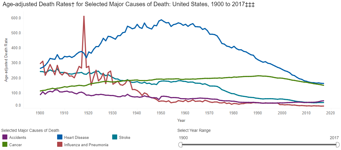
However, if the CDC had earlier data, it would show a huge range of diseases that dwarf wars and famines and dictators as causes of death in the premodern world. If we look to the history of plagues, we are really looking at the history of humanity’s greatest killers.

The sources on the history of pandemics are astonishingly sparse/non-comprehensive. I created the following graphs only by combining evidence and estimates from the WHO, CDC, Wikipedia, Our World in Data, VisualCapitalist, and others (lowest estimates shown where ranges were presented) for both major historic pandemics and for ongoing communicable disease threats. This is not a complete dataset, and I will continue to add to it, but it shows representative death counts from across major infectious disease episodes, as well as the death rate per year based on world population estimates. See the end of this post for the full underlying data. First, the top 12 “plagues” in history:

Capture disease top 12


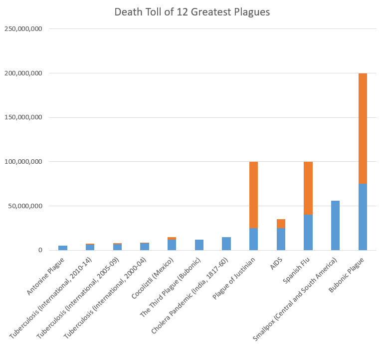
Note: blue=min, orange=max across the sources I examined. For ongoing diseases with year-by-year WHO evidence, like tuberculosis, measles, and cholera, I grouped mortality in 5-year spans (except AIDS, which does not have good estimates from the 1980s-90s, so I reported based on total estimated deaths).

Now, let’s look at the plagues that were lowest on my list (number 55-66). Again, my list was not comprehensive, but this should provide context for COVID-19:

Capture covid

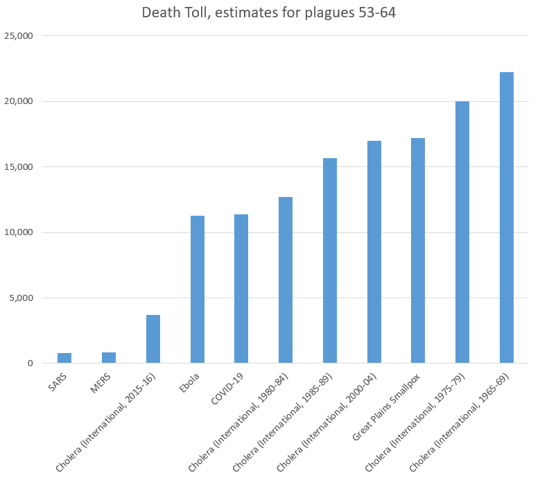
As we can see, the 11,400 people who have died from COVID-19 recently passed Ebola to take the 61st (out of 66) place on our list of plagues. Note again that several ongoing diseases were recorded in 5-year increments, and COVID-19 still comes in under the death rates for cholera. Even more notably, it has 0.015% as many victims as the plague in the 14th Century,

  • In Context of Current Infectious Diseases:

For recent/ongoing diseases, it is easier to compare year-by-year data. Adding UNAIDS to our sources, we found the following rates of death across some of the leading infectious causes of death. Again, this is not comprehensive, but helps put COVID-19 (the small red dot, so far in the first 3 months of 2020) in context:

Capture diseases by year

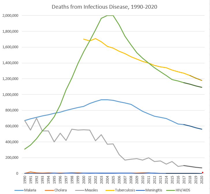
Note: darker segments of lines are my own estimates; full data at bottom of the post. I did not include influenza due to the lack of good sources on a year-by-year basis, but a Lancet article found that 291,000-645,000 deaths from influenza in a year is predictable based on data from 1999-2015.

None of this is to say that COVID-19 is not a major threat to human health globally–it is, and precautions could save lives. However, it should show us that there are major threats to human health globally all the time, that we must continue to fight. These trendlines tend to be going the right direction, but our war for survival has many foes, and will have more emerge in the future, and we should expend our resources in fighting them rationally based on the benefits to human health, not panic or headlines.

  • The Eradication List:

As we think about the way to address COVID-19, we should keep in mind that this fight against infectious disease builds upon work so amazing that most internet junkies approach new infectious diseases with fear of the unknown, rather than tired acceptance that most humans succumb to them. That is a recent innovation in the human experience, and the strategies used to fight other diseases can inform our work now to reduce human suffering.

While influenzas may be impossible to eradicate (in part due to an evolved strategy of constantly changing antigens), I wanted to direct everyone to an ever-growing monument to human achievement, the Eradication List. While humans have eradicated only a few infectious diseases, the amazing thing is that we can discuss which diseases may in fact disappear as threats through the work of scientists.

On that happy note, I leave you here. More History of Plagues to come, in Volume 2: Vectors, Vaccines, and Virulence!

Disease Start Year End Year Death Toll (low) Death Toll (high) Deaths per 100,000 people per year (global)
Antonine Plague 165 180 5,000,000 5,000,000 164.5
Plague of Justinian 541 542 25,000,000 100,000,000 6,250.0
Japanese Smallpox Epidemic 735 737 1,000,000 1,000,000 158.7
Bubonic Plague 1347 1351 75,000,000 200,000,000 4,166.7
Smallpox (Central and South America) 1520 1591 56,000,000 56,000,000 172.8
Cocoliztli (Mexico) 1545 1545 12,000,000 15,000,000 2,666.7
Cocoliztli resurgence (Mexico) 1576 1576 2,000,000 2,000,000 444.4
17th Century Plagues 1600 1699 3,000,000 3,000,000 6.0
18th Century Plagues 1700 1799 600,000 600,000 1.0
New World Measles 1700 1799 2,000,000 2,000,000 3.3
Smallpox (North America) 1763 1782 400,000 500,000 2.6
Cholera Pandemic (India, 1817-60) 1817 1860 15,000,000 15,000,000 34.1
Cholera Pandemic (International, 1824-37) 1824 1837 305,000 305,000 2.2
Great Plains Smallpox 1837 1837 17,200 17,200 1.7
Cholera Pandemic (International, 1846-60) 1846 1860 1,488,000 1,488,000 8.3
Hawaiian Plagues 1848 1849 40,000 40,000 1.7
Yellow Fever 1850 1899 100,000 150,000 0.2
The Third Plague (Bubonic) 1855 1855 12,000,000 12,000,000 1,000.0
Cholera Pandemic (International, 1863-75) 1863 1875 170,000 170,000 1.1
Indian Smallpox 1868 1907 4,700,000 4,700,000 9.8
Franco-Prussian Smallpox 1870 1875 500,000 500,000 6.9
Cholera Pandemic (International, 1881-96) 1881 1896 846,000 846,000 4.4
Russian Flu 1889 1890 1,000,000 1,000,000 41.7
Cholera Pandemic (India and Russia) 1899 1923 1,300,000 1,300,000 3.3
Cholera Pandemic (Philippenes) 1902 1904 200,000 200,000 4.2
Spanish Flu 1918 1919 40,000,000 100,000,000 1,250.0
Cholera (International, 1950-54) 1950 1954 316,201 316,201 2.4
Cholera (International, 1955-59) 1955 1959 186,055 186,055 1.3
Asian Flu 1957 1958 1,100,000 1,100,000 19.1
Cholera (International, 1960-64) 1960 1964 110,449 110,449 0.7
Cholera (International, 1965-69) 1965 1969 22,244 22,244 0.1
Hong Kong Flu 1968 1970 1,000,000 1,000,000 9.4
Cholera (International, 1970-75) 1970 1974 62,053 62,053 0.3
Cholera (International, 1975-79) 1975 1979 20,038 20,038 0.1
Cholera (International, 1980-84) 1980 1984 12,714 12,714 0.1
AIDS 1981 2020 25,000,000 35,000,000 13.8
Measles (International, 1985) 1985 1989 4,800,000 4,800,000 19.7
Cholera (International, 1985-89) 1985 1989 15,655 15,655 0.1
Measles (International, 1990-94) 1990 1994 2,900,000 2,900,000 10.9
Cholera (International, 1990-94) 1990 1994 47,829 47,829 0.2
Malaria (International, 1990-94) 1990 1994 3,549,921 3,549,921 13.3
Measles (International, 1995-99) 1995 1999 2,400,000 2,400,000 8.4
Cholera (International, 1995-99) 1995 1999 37,887 37,887 0.1
Malaria (International, 1995-99) 1995 1999 3,987,145 3,987,145 13.9
Measles (International, 2000-04) 2000 2004 2,300,000 2,300,000 7.5
Malaria (International, 2000-04) 2000 2004 4,516,664 4,516,664 14.7
Tuberculosis (International, 2000-04) 2000 2004 7,890,000 8,890,000 25.7
Cholera (International, 2000-04) 2000 2004 16,969 16,969 0.1
SARS 2002 2003 770 770 0.0
Measles (International, 2005-09) 2005 2009 1,300,000 1,300,000 4.0
Malaria (International, 2005-09) 2005 2009 4,438,106 4,438,106 13.6
Tuberculosis (International, 2005-09) 2005 2009 7,210,000 8,010,000 22.0
Cholera (International, 2005-09) 2005 2009 22,694 22,694 0.1
Swine Flu 2009 2010 200,000 500,000 1.5
Measles (International, 2010-14) 2010 2014 700,000 700,000 2.0
Malaria (International, 2010-14) 2010 2014 3,674,781 3,674,781 10.6
Tuberculosis (International, 2010-14) 2010 2014 6,480,000 7,250,000 18.6
Cholera (International, 2010-14) 2010 2014 22,691 22,691 0.1
MERS 2012 2020 850 850 0.0
Ebola 2014 2016 11,300 11,300 0.1
Malaria (International, 2015-17) 2015 2017 1,907,872 1,907,872 8.6
Tuberculosis (International, 2015-18) 2015 2018 4,800,000 5,440,000 16.3
Cholera (International, 2015-16) 2015 2016 3,724 3,724 0.0
Measles (International, 2019) 2019 2019 140,000 140,000 1.8
COVID-19 2019 2020 11,400 11,400 0.1


Year Malaria Cholera Measles Tuberculosis Meningitis HIV/AIDS COVID-19
1990 672,518 2,487 670,000 1,903 310,000
1991 692,990 19,302 550,000 1,777 360,000
1992 711,535 8,214 700,000 2,482 440,000
1993 729,735 6,761 540,000 1,986 540,000
1994 743,143 10,750 540,000 3,335 620,000
1995 761,617 5,045 400,000 4,787 720,000
1996 777,012 6,418 510,000 3,325 870,000
1997 797,091 6,371 420,000 5,254 1,060,000
1998 816,733 10,832 560,000 4,929 1,210,000
1999 834,692 9,221 550,000 2,705 1,390,000
2000 851,785 5,269 555,000 1,700,000 4,298 1,540,000
2001 885,057 2,897 550,000 1,680,000 6,398 1,680,000
2002 911,230 4,564 415,000 1,710,000 6,122 1,820,000
2003 934,048 1,894 490,000 1,670,000 7,441 1,965,000
2004 934,544 2,345 370,000 1,610,000 6,428 2,003,000
2005 927,109 2,272 375,000 1,590,000 6,671 2,000,000
2006 909,899 6,300 240,000 1,550,000 4,720 1,880,000
2007 895,528 4,033 170,000 1,520,000 7,028 1,740,000
2008 874,087 5,143 180,000 1,480,000 4,363 1,630,000
2009 831,483 4,946 190,000 1,450,000 3,187 1,530,000
2010 788,442 7,543 170,000 1,420,000 2,198 1,460,000
2011 755,544 7,781 200,000 1,400,000 3,726 1,400,000
2012 725,676 3,034 150,000 1,370,000 3,926 1,340,000
2013 710,114 2,102 160,000 1,350,000 3,453 1,290,000
2014 695,005 2,231 120,000 1,340,000 2,992 1,240,000
2015 662,164 1,304 150,000 1,310,000 1,190,000
2016 625,883 2,420 90,000 1,290,000 1,170,000
2017 619,825 100,000 1,270,000 1,150,000
2018 1,240,000
2019
2020 16,514

Nightcap

  1. Bernie, Cuba, literary, and ill-gotten gains Irfan Khawaja, Policy of Truth
  2. The weird global coronavirus data Scott Sumner, EconLog
  3. Why the Fed shouldn’t “Do Nothing” George Selgin, Alt-M
  4. Corporatism (“anarchy”) on the Indian subcontinent Priya Satia, LARB

There is no Bloomberg for medicine

When I began working in medical research, I was shocked to find that no one in the medical industry has actually collected and compared all of the clinical outcomes data that has been published. With Big Data in Healthcare as such a major initiative, it was incomprehensible to me that the highest-value data–the data that is directly used to clear therapies, recommend them to the medical community, and assess their efficacy–were being managed in the following way:

  1. Physician completes study, and then spends up to a year writing it up and submitting it,
  2. Journal sits on the study for months, then publishes (in some cases), but without ensuring that it matches similar studies in the data it reports.
  3. Oh, by the way, the journal does not make the data available in a structured format!
  4. Then, if you want to see how that one study compares to related studies, you have to either find a recent, comprehensive, on-point meta-analysis (which is a very low chance in my experience), or comb the literature and extract the data by hand.
  5. That’s it.

This strikes me as mismanagement of data that are relevant to lifechanging healthcare decisions. Effectively, no one in the medical field has anything like what the financial industry has had for decades–the Bloomberg terminal, which presents comprehensive information on an updatable basis by pulling data from centralized repositories. If we can do it for stocks, we can do it for medical studies, and in fact that is what I am trying to do. I recently wrote an article on the topic for the Minneapolis-St Paul Business Journal, calling for the medical community to support a centralized, constantly-updated, data-centric platform to enable not only physicians but also insurers, policymakers, and even patients examine the actual scientific consensus, and the data that support it, in a single interface.

Read the full article at https://www.bizjournals.com/twincities/news/2019/12/27/there-is-no-bloomberg-for-medicine.html!

Changing the way doctors see data

Over the past four years, my brother and I have grown a business that helps doctors publish data-driven articles from the two of us to over 30 experienced researchers. However, along the way, we noticed that data management in medical publication was decades behind other fields–in fact, the vital clinical outcomes from major trials are generally published as singular PDFs with no structured data, and are analyzed in comparison to existing studies only in nonsystematic, nonupdatable publications. Effectively, medicine has no central method for sharing or comparing patient outcomes across therapies, and I think that it is our responsibility as researchers to present these data to the medical community.

Based on our internal estimates, there are >3 million published clinical outcomes studies (with over 200 million individual datapoints) that need to be abstracted, structured, and compared through a central database. We recognized that this is a monumental task, and we therefore have focused on automating and scaling research processes that have been, through today, entirely manual. Only after a year of intensive work have we found a path toward creating a central database for all published patient outcomes, and we are excited to debut our technology publicly!

Keith recently presented our venture at a Mayo Clinic-hosted event, Walleye Tank (a Shark Tank-style competition of medical ventures), and I think that it is an excellent fast-paced introduction to a complex issue. Thanks also to the Mayo Clinic researchers for their interesting questions! You can see his two-minute presentation and the Q&A here. We would love to get more questions from the economic/data science/medical communities, and will continue putting our ideas out there for feedback!

Some more borderline fraud from the higher education industry.

From the Wall Street Journal: For Sale: SAT-Takers’ Names. Colleges Buy Student Data and Boost Exclusivity

The title pretty much says it all: the College Board is selling data about test-takers (i.e. high school students) to colleges who use that to market to a wider pool of applicants. That wider pool often includes students who don’t stand a chance of getting in to the schools that are now marketing to them, but the marketing gives the false impression that the school wants them.

Joe Six-pack Jr. takes the SAT, fills out a survey, and that survey goes into a database. Some school that normally ranks near the middle of the pack buys a piece of that database, including Joe’s data. They send him a brochure and a letter that looks like it was written specifically for him (and he doesn’t know any better) so Joe, figures he’s being recruited. Instead of just applying to his local state schools, now he shells out an extra $50 to apply to Middling University. They summarily reject his application because his SAT scores were 1100 and they’re only accepting students who scored above 1300. MU now looks a little bit more prestigious in the rankings (which means their current administration can take credit before jumping ship to take a higher paying job at a school looking to also increase in the rankings). The College Board gets paid. The administrators get paid. The U.S. News rankings get a little less useful for incoming students, but they don’t know that. On the other hand the rankings get a little more important for decision makers at schools. And Joe Jr. is funding this whole mess despite being a) the least informed, and b) the least well funded player in this whole mess.

My Startup Experience

Over the past 4 years, I have had a huge transition in my life–from history student to law student to serial medical entrepreneur. Essentially, I have learned a great deal from my academic work that taught me the value that we can create if we find an unmet need in the world, create an idea that fills that need, and then use technology, personal networks, and hard work to create novelties. While startups obviously tackle any new problem under the sun, to me, they are the mechanism to bring about a positive change–and, along the way, get the resources to scale that change across the globe.

I am still very far from reaching that goal, but my family and cofounders have several visions of how to improve not only how patients are treated but also how we build the knowledge base that physicians, patients, and researchers can use to inform care and innovation. My brother/cofounder and I were recently on an entrepreneurship-focused podcast, and we got the chance to discuss our experience, our vision, and our companies. I hope this can be a springboard for more discussions about how companies are a unique agent of advancing human flourishing, and about the history and philosophy of entrepreneurship, technology, and knowledge.

You can listen here: http://rochesterrising.org/podcast/episode-151-talking-medical-startups-with-keith-and-kevin-kallmes. Heartfelt thanks to Amanda Leightner and Rochester Rising for a great conversation!

Thank you!

Kevin Kallmes

Let’s Find Out – or: the Power of Reference

The core message of a number of books I’ve recently had the great pleasure to read has been fairly simple. Have a look. Check it out. Put your numbers in perspective. In a world awash with statistics and cognitive biases imploring us to cheer mindlessly for our own team, having the skill and wherewithal to step back and carefully ask: “can this really be so?” is golden.

One of recently passed celebrity professor and YouTube phenomenon Hans Rosling’s most profound advice for countering misinformation about the state of the world is precisely this: put all numbers in perspective. Never accept unaccompanied numbers – never believe the numerator without checking the denominator. What matters, as Bryan Caplan never ceases to emphasize as the GMU Economics creed, “are statistics, not emotions – and arguments, not stories.”

But, a statistic may never be left alone, Rosling maintains, but always compared to other relevant numbers. What share of its total category does this statistic represent? What was it last year, 5 or 10 or 20 years ago? Is there some self-evident change in associated behavior that is relevant or ought to explain it? A century ago street cars used to kill and injure hundreds of people every year, but since very few American cities make use of street cars today, the casualty is fortunately much lower. If we keep in mind that miles travelled by cars far outnumber miles travelled by street cars, reporting the number of street car deaths – while probably correct – entirely miss the point when discussing traffic safety. In How Not To Be Wrong, Mathematics professor Jordan Ellenberg quipped

Dividing one number by another is mere computation ; knowing what to divide by what is mathematics.

Here’s another example. If I told you about 23 000 individual deaths and spent a brief 10 second on each of them, going through the list would take me almost three days. On a personal level like that, 23 000 deaths is an absurd, insane, catastrophe-style event that few people are emotionally equipped to handle – essentially the size of my hometown, wiped out in a single year. If I told you those 23 000 deaths were due to antibiotic resistant diseases in the U.S. last year, the pandemic scenarios working through your mind quickly escalate. That many! Let’s find the nearest bunker!

If I then told you that cancer and heart diseases (each!) claim the lives of about 20x that, the fear of lethal apocalyptic germs consuming the world ought to quickly recede. Oh.

Here’s another example. It is entirely correct to point out that the number of people killed in worldwide airplane accidents in 2018 (556 people) was much higher than the year before (44 people) and the year before that (325 people). Would one be excused for believing that air travel is getting more risky and dangerous? Forbes, for instance, ran a roughly accurate story claiming that airline fatalities increased by 900%.

Not in the slightest. The number of fatalities from air travel has been falling for decades, all while the number of flights and miles travelled have increased exponentially, meaning that the per-flight, per-mile or per-passenger risk of death has kept dropping. Not to mention that alternative modes of travelling like driving is magnitudes more dangerous.

While Rosling teaches us to figure out what the base rate is, i.e. putting our statistic into appropriate perspective, one of Philip Tetlock’s tricks for becoming a ‘Superforecaster’ is to use Bayesian updating of one’s beliefs. This picks up precisely where Rosling’s idea left off. Once we know where to start, we have to amass more information, numbers and observations from other points of view – Bayesian updating is a popular method to incorporate and synthesize new information with the old.

In short “Calculation, like logic, is your friend” (Landsburg 2018: 44). Statistics matter and numbers can deceive. In order to better understand our realities and see through mistakes that others make – either intentionally to deceive or persuade, or unintentionally through ignorance – we must embrace the core message of people like Ellenberg, Tetlock, Duffy, Rosling or Pinker.

Always Be Comparing Thy Numbers. Never accept an unaccompanied statistic. Never trust numerators without denominators.

Legal Immigration Into the United States (Part 5); The Net Contribution of Immigrants: An Attempt at Critical Quantification

In his October 2006 article in Liberty, (“Immigration: Yes, No, and Maybe” by Richard Fields, Stephen Cox, and Bruce Ramsey), Cox tries to summarize the net cost that (then) current immigrants impose on American society by working out a quantitative example. He stages an imaginary but realistic (Mexican) immigrant family of five living in Los Angeles – two parents and three minor children. He assigns reasonable earnings to the parents and sets those against the probable costs that the whole family imposes in the form of normal local and other services. He arrives at the conclusion that the family annually costs American society 38,900 2006 dollars. (I agree with Cox that this may be a conservative estimate. That would be about 48,000 June 2018 dollars, using the CPI Inflation Calculator of the Bureau of Labor Statistics).

To gauge the real magnitude of the overall normal costs legal immigrants  thus impose on American society, let’s suppose further that all of the 2016 legal immigration is composed of Cox’s families of five. That’s 240,000 such families. The aggregate excess of their social costs over their earnings is 48,000 x 240,000 = 11.52 billion dollars. As a percentage of 2016 GDP, this figure is less than 7/10,000 (seven over ten thousand – 2016 GDP from CountryEconomy.Com).

Now, let’s suppose that Cox was too conservative by one half in his estimate of the cost his family imposes on American society. This would imply that the legal immigrant families that compose all of 2016 immigration cost American society an amount that is like 14/10,000. The numerator in this last estimate includes only legal immigrants. Let’s suppose further that the number of illegal immigrants for the year of reference equals the number of legal ones and that they cost the same and contribute the same as legal immigrants. The cost that all immigrants impose on American society is then approximately 28/10,000 or about 1/3 of one per cent of GDP. If you assume that illegal immigrants earn only half as much as legal immigrants, the net cost of immigration overall goes up correspondingly. It’s still not much. My point is this: In the worst case scenario I can conjure, the net cost that immigrants impose on American society is very low. It’s of the order of 12 million Americans buying a $10 lottery ticket at Nine/Eleven every payday.

This is still certainly an overestimation, for two reasons. One, this scenario is the extreme, limiting case. There is, of course, zero chance that the total legal immigration in any one year is composed entirely of the kind of families of five Cox describes. Among the immigrants, as with nearly all immigration everywhere, there must be a preponderance of healthy young men and young women without children. This happens through self-selection: emigration is very difficult. It requires courage and even a solid dose of unrealism; children are a big impediment in this respect. But, in most cases, younger people without children must easily contribute more than they cost American society because they land all raised up and ready to work (as I said). The exceptions concern those who fall seriously sick– uncommon among the young – and those who end up in jail or prison. The latter is not a rare occurrence among the young in general, among young males in particular. As I said, I deal below with the particular cost of incarcerating immigrants.

The other imaginary limiting case is this: Among the 1,200,000 immigrants in 2016, there is a single family of five as described by Cox and the balance is made up of vigorous young women and young men who never become sick and never transgress the law. In that other limiting case, immigrants are almost certainly a net economic boon to American society. I don’t know where the reality lies and it may change from year to year. It’s doable research which, I think, has not been done.

The second reason why the figure of 28/10,000 is probably an overestimation, or why it leads to fallacious inferences, has to do with life cycles. First, there will probably be a period during the family’s life when the children will be grown and capable of working while the parents themselves are working, undisturbed by family obligations. During that period, three or four, or all five immigrants will in all likelihood contribute more than they take from American society, in spite of their low qualifications. This sweet spot may vanish when the parents reach Medicare and Social Security age. In the meantime, several family members will have contributed to the relevant social funds; one or more of the children will too, probably for 30 years or more. Hence, whether the family of five receives a net benefit or impose a net cost over a longer, trans-generational period depends on actuarial calculations that neither Cox nor I have performed.

I hasten to add that it’s quite possible that such actuarial calculations, performed with real numbers, would still show the five in my chosen family as perpetrating a net cost on American society. To be thorough, one would have to take into account two more things. One is the possibility that one of the three children will turn out to be a great, outsize contributor, like the 40% American Nobel Prize winners born abroad. Or all three. The relevant reasoning has to be trans-generational to some extent, it seems to me. Just look at the extreme imaginary scenario below.

For ten years in a row, the US admits as many immigrants as it did in 2016. That’s 12 million immigrants. Let’s assume none dies during that period and they have no children (We will see that this unrealistic assumption does not matter here.) Not one of the twelve million is able to pay his full fare. On the average, they each cost American society $20,000 there is no chance they will ever pay back, one way or another. However, one of these hapless immigrants is Steve Job’s biological father. You know the rest of this true story. Ask yourself: If it were your decision, knowing this and, and based solely on economic matters which are the stake here, would keep out all twelve million?

This quandary poses an interesting conceptual problem we keep encountering: Had Job’s biological father not accidentally made his girlfriend pregnant; had they not decided to give Steve up for adoption, would someone else have developed the personal computer with Wozniak? Without him? Would you bet on it? The truth is that American society is unusually inventive but it’s probably not the most inventive on a per capita basis. (Last time I looked, the Japanese were registering more patents than Americans – that’s per capita.) It’s also seems true that immigrants account for a disproportionate number of American innovations, including 40% of all Nobel prizes in other than literature. (And also excluding the often farcical Nobel Peace Prize.) It’s not absurd to think of American inventiveness as the happy encounter of American institutions unusually favorable to innovation with immigrant vigor. This is just a speculation, of course but how willing are you to discard it summarily?

Finally, the calculation of immigrants’ net burden imposed on American society necessarily fails to take into account real positive contributions that are difficult to quantify, more or less intangible contributions, some of which I have mentioned elsewhere. They go from Italian cuisine to my own ability to interpret some world events better than almost any native-born professor. Here is another mental experiment: Suppose a national society decided, through some process or other, to bring up the average quality of its every day food from, say English levels, to 1/3 of Italian level. The cost would be astronomical and the result would clearly constitute a significant improvement in the quality of Americans’ every day life – which is what the science of Economics is all about, of course. My point is that the fact that this felicitous result was achieved through the happenstance of immigration does not imply that its societal value is zero.

One of the highest per capita expenditures that immigrants–like every other population group over and below a certain age–impose on American society is the cost of incarceration. That cost is also mostly borne by state and local authorities, although there exists a process by which the federal government reimburses local governments for illegal immigrants incarcerated for crimes other than illegal border crossing (explained in Cox 2006). I examine below the tangled issue of the cost of immigrant incarceration.

[Editor’s note: In case you missed it, here is Part 4]

Know your data, show your data: A rant

I am finishing up my first year of doctoral level political science studies. During that time I have read a lot of articles – approximately 550. 11 courses. 5 articles a week on average. 10 weeks. 11×5×10=550. Two things have bothered me immensely when reading these pieces: (1) it’s unclear authors know their data well, regardless of it being original or secondary data and (2) the reader is rarely showed much about the data.

I take the stance that when you use a dataset you should know it well in and out. I do not just mean that you should just have an idea if its normally distributed or has outliers. I expect you to know who collected it. I expect you to know its limitations.

For example I have read public opinion data that sampled minority populations. Given that said populations are minorities they had to oversample in areas where said groups are over represented. The problem with this is that those who live near co-ethnics are different from those who live elsewhere. This restricts the external validity of results derived from the data, but I rarely see an acknowledgement of this.

Sometimes data is flawed but it’s the best we have. That’s fine. I’m not against using flawed data. I’m willing to buy most arguments if the underlying theory is well grounded. To be honest I view statistical work to be fluff most times. If I don’t really care about the statistics, why do I care if the authors know their data well? I do because it serves as a way for authors to signal that they thought about their work. It’s similar to why artists sometimes place a “bowl of only green m&ms” requirement on their performance contracts. Artists don’t know if their contracts were read, but if their candy bowl is filled with red twizzlers they know something is wrong. I can’t monitor whether the authors took care in their manuscripts, but NOT seeing the bowl of green only m&ms gives me a heads up that something is off.

Of those 500+ articles I have read only a handful had a devoted descriptive statistics section. The logic seems to be that editors are encouraging that stuff be placed in appendices to make articles more readable. I don’t buy that argument for descriptive statistics. Moving robustness checks or replications to the appendices is fine, but descriptive stats give me a chance to actually look at the data and feel less concerned that the results are driven by outliers. In my 2nd best world all dependent variables and major independent variables would be graphed. If the data was collected in differing geographies I would want the data mapped. In my 1st best world replication files with the full dataset and dofiles would be mandatory for all papers.

I don’t think I am asking too much here. Hell, I am not even fond of empirical work. My favorite academic is Peter Leeson (GMU Econ & Law) and he rarely (ever?) does empirical work. As long as empirical work is being done in the social sciences though I expect a certain standard. Otherwise all we’re doing is engaging in math masturbation.

Tldr; I don’t trust most empirical work out there. I’ll rant about excessive literature reviews next time.

On Borjas, Data and More Data

I see my craft as an economic historian as a dual mission. The first is to answer historical question by using economic theory (and in the process enliven economic theory through the use of history). The second relates to my obsessive-compulsive nature which can be observed by how much attention and care I give to getting the data right. My co-authors have often observed me “freaking out” over a possible improvement in data quality or be plagued by doubts over whether or not I had gone “one assumption too far” (pun on a bridge too far). Sometimes, I wish more economists would follow my historian-like freakouts over data quality. Why?

Because of this!

In that paper, Michael Clemens (whom I secretly admire – not so secretly now that I have written it on a blog) criticizes the recent paper produced by George Borjas showing the negative effect of immigration on wages for workers without a high school degree. Using the famous Mariel boatlift of 1980, Clemens basically shows that there were pressures on the US Census Bureau at the same time as the boatlift to add more black workers without high school degrees. This previously underrepresented group surged in importance within the survey data. However since that underrepresented group had lower wages than the average of the wider group of workers without high school degrees, there was an composition effect at play that caused wages to fall (in appearance). However, a composition effect is also a bias causing an artificial drop in wages and this drove the results produced by Borjas (and underestimated the conclusion made by David Card in his original paper to which Borjas was replying).

This is cautionary tale about the limits of econometrics. After all, a regression is only as good as the data it uses and suited to the question it seeks to answer. Sometimes, simple Ordinary Least Squares are excellent tools. When the question is broad and/or the data is excellent, an OLS can be a sufficient and necessary condition to a viable answer. However, the narrower the question (i.e. is there an effect of immigration only on unskilled and low-education workers), the better the method has to be. The problem is that the better methods often require better data as well. To obtain the latter, one must know the details of a data source. This is why I am nuts over data accuracy. Even small things matter – like a shift in the representation of blacks in survey data – in these cases. Otherwise, you end up with your results being reversed by very minor changes (see this paper in Journal of Economic Methodology for examples).

This is why I freak out over data. Maybe I can make two suggestions about sharing my freak-outs.

The first is to prefer a skewed ratio of data quality to advanced methods (i.e. simple methods with crazy-data). This reduces the chances of being criticized for relying on weak assumptions. The second is to take a leaf out of the book of the historians. While historians are often averse to advantaged data techniques (I remember a case when I had to explain panel data regressions to historians which ended terribly for me), they are very respectful of data sources. I have seen historians nurture datasets for years before being willing to present them. When published, they generally stand up to scrutiny because of the extensive wealth of details compiled.

That’s it folks.