- “A Political Theory of Empire and Imperialism” (pdf) Jennifer Pitts, ARPS
- Tyler Cowen interviews Thomas Piketty
- “The Foundations of American Internationalism” (pdf) David Hendrickson, Orbis
Thomas Piketty
Nightcap
- Human crap Gabrielle Hecht, Aeon
- “So, as Lenin asked, what is to be done?” Howard Davies, Literary Review
- What the Democrats can learn from a dead libertarian lawyer Damon Root, Reason
- The Silk Road, the Black Death, and Covid-19 Parag Khanna, Wired
Mr. Darcy’s Ten Thousand a Year
On popular demand, I’m reviving a reoccurring theme of mine: teaching economic history through the lens of popular culture. Today: bonds, yields and 18th century English financial planning.
In what is probably my favourite piece ever written, I tried to estimate exactly how rich Mr. Darcy was – Mr. Darcy, of course, of Jane Austen’s classic novel Pride & Prejudice. I showed that whatever method you use to translate incomes to the present, all characters in Austen’s captivating story are astonishingly rich. But, as we well know today, there are large differences even among the superrich; compare Bernie Sanders (small-time millionaire) with George Lucas and Steven Spielberg (single-digit billionaires) or Jeff Bezos (wealthiest man alive).
Using Pride & Prejudice to illustrate some economic point is hardly unconventional (Piketty did this in his Capital in the Twenty-First Century), so let me similarly discuss 18th and 19th century British financial markets using the characters in this well-known tale.
The starting point is the following musing, courtesy of former Oxford Economist Martin Slater’s (2018: 52) The National Debt; how come “female characters in nineteenth-century novels always seem to have a suspiciously exact income of ‘so many pounds per year'”? Where does this money come from? Why is it so exact? And what’s the reason Piketty uses this particular literary example to illustrate the permanence and steady stream of income that capital somehow just throws off?
Consols and Financial Markets
Financial markets are truly awesome – not just in their impressive scope or potential devastation, but in the many different needs they simultaneously fulfil for many different people. Slater ably guides us through the confusing mishmash that is the 17th and 18th century English public finance, but what emerges by 1757, after Henry Pelham’s consolidation of government debt, is two main – and for our purposes, equivalent – securities: the Consolidated 3% Annuities (and the ‘Reduced annuities’), affectionately named ‘Consols’. These were permanent government bonds with annual interest payments of 3%. This means that they had no maturity date, i.e. the holder of the security could expect the government to keep paying 3% of the face value for all future (a Churchill-issued subsequent Consol was actually repaid and retired just a few years ago, after almost a century in service).
Two cool things happen. First, the “initial value” – the face value – of debt running in perpetuity becomes almost irrelevant, since all that matters for the issuer is the ability to maintain interest rate payments; there is no presumption of future repayment. Second, creditors – that is, holders of the Consols who receive the regular interest payments – may trade that asset on financial markets. Since the plethora of different debt assets were now condensed into a single, credible, identical and easily-identified asset, the market for 3% Consols in London developed into a very large and liquid market. With such ease of access and predictable and stable payoffs, the Consols became the instrument of saving for well-off families in Austen’s time.
A note on yields
The Consols, essentially a piece of paper with a face value of £100, entitled the owner to a perpetual stream of payments by the government, in this case 3% – or £3. Now, the actual price at which this paper could be sold in London fluctuated extensively depending on the conditions of the financial market and, most prominently in Austen’s lifetime, the Napoleonic wars. As the £3 annual pay was serviced by the British government, and financial strain during the war increased the risk for defaults (through a foreign invasion or British government itself), the price of Consols was chiefly reflecting the military success.
When the market price of a debt falls below its face value, the effective interest rate (the “yield”) that a prospective investor receives increases; paying £50 for a Consol with face value of £100 and a £3 perpetual interest payment, effectively earns the investor 6% interest instead of 3% (3/50 = 0.06). Since the Consols were the most dominant asset on the largest financial market in the world, their price became “the single most important asset price in the world economy” as Klovland (1994: 165) called it. Here’s the yield on Consols during Austen’s life:
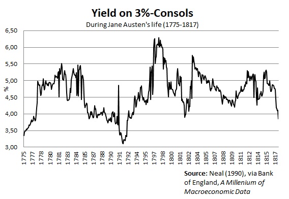
It reached a low of 3.11% in 1792 (almost at par), and a high of 6.22% in 1798 (below £50) after the suspension of the gold standard.
The Bennets and the fortunes of handsome young men
The families of Pride & Prejudice made good use of this thriving financial market – not specifically for trading but for financial planning (others, such as British economist David Ricardo, and the banking families of Rothschild and Barings, made some of their fortune trading Consols).
In the novel, Mr. Bennet – the protagonist Lizzy’s father – has an income of £2,000 a year (again, see my 2016 piece for three different attempts at “translating” these sums into today’s money). It is not clear what his income comes from, but it’s a fair guess that it stems, like many other landed gentry of the time, from renting out farm lands belonging to the family home Longbourne. In addition, we know that Mrs. Bennet’s portion to the family home is a £5,000 contribution which is the sole inheritance the (five) Bennet daughters are entitled to.
Now, the way well-off families like the Bennets would make use of Consols was to ensure that non-inheriting children had at least some source of income after the passing of their father. The underlying concern in Pride & Prejudice, causing Mrs. Bennet to worry so about fortunate marriages for her daughters, is that the Bennet estate is entailed away to Mr. Collins – and with it the presumed rental income of £2,000 a year. That would leave the girls homeless, reduced to living off Mrs. Bennet’s inheritance of £5,000.
Austen began writing First Impressions (the initial title for Pride & Prejudice) in October 1796. During the decade leading up to this, the yield on Consols had been firmly within the interval 3.5-4.5%, hovering around 4% for years. It should thus not surprise us that Mrs. Bennet’s fortune of £5,000 presumably consisting of Consols, would have been purchased at around £75, predictably yielding the family an annual return of 4%. Indeed, the characters of Pride & Prejudice seem to be squarely set on 4% being the general norm. For instance, in a desperate attempt to enhance his already-inane proposal to Lizzy, Mr. Collins explicitly says:
“To fortune I am perfectly indifferent, and shall make no demand of that nature on your father, since I am well aware that it could not be complied with; and that one thousand pounds in the 4 per cents, which will not be yours till after your mother’s decease, is all that you may ever be entitled to.”
(Chapter 19, p. 133 in the 2009 HarperCollins edition)
Here we see the great use that Consols offered families like the Bennets. Once the Bennet parents pass away, the £5,000 of Consols could be divided equally among her children; Lizzy’s share would be a thousand pounds, which earns her an annual 4% interest return, or £40 (although maybe several year’s earnings for a regular worker, this was a rather small sum for such rich families – in contemplating Lizzy’s sister Lydia’s imprudent marriage, we learn that Mr. Bennet spent almost £100/year on Lydia’s purchases and pocket money alone). Being liquid financial assets, dividing up the Consols among children was very easy, and their steady income stream ensured that they would have at least some income. Bar Napoleonic conquest, the interest payment on the Consols would reliably show up year after year.
As for the handsome young men, Mr. Bingley’s case is easier than Mr. Darcy’s. We know that Bingley’s income is not agricultural, but investments from a fortune of almost £100,000 inherited from his father, who had not yet acquired an estate. The fortune was “acquired by trade”, where (being from the North) cotton or shipping are prime candidates, but the slave trade is also a possibility. We also know that the ambiguity of his annual income (£4,000 or £5,000) lies well within the return from a fortune of that size invested in Consols. Indeed, for Bingley to hold that kind of fortune, earn that income and still not have an estate of his own, suggests that his financial wealth consists predominantly of Consols – perhaps complemented with some other stock (Bank of England or East India Company stock are plausible candidates). Clearly, new money.
Mr. Darcy, on the other hand, is plainly old money. And a lot of it. There are subtle hints in the novel that Pemberley has been in the Darcy family for generations. What we don’t know is precisely how his £10,000 a year is earned. When visiting Pemberley in Derbyshire with her aunt and uncle, Lizzy is told by the housekeeper that Mr. Darcy is such a generous and fair man: “ask any of his tenants”, she says, which indicates that Mr. Darcy, has a fair number of them – as one would expect from a sizeable estate like Pemberley. Now, what we don’t know is if the entirety of his £10,000 a year is reaped from rental income; it could be that some of his income is financial – or that either his financial or rental income is excluded from this rumoured number. Beyond a mention of his sister, Georgiana’s, fortune of £30,000 – which for convenience would likely be held in Consols – we know very little about the personal finances of Mr. Darcy.
The use and abuse of Consols
The financial market for government debt in the late-18th and early 19th century was not created with financial planning in mind, but by incremental improvements to previous government funding problems. The outcome, however, was a striking success for Britain, whose thriving financial market in no small part accounted for Britannia’s Century until WWI.
Moreover, as contemporary economists from Ricardo and John Stuart Mill to Malthus and Lauderdale observed, the recurring interest payments, funded by taxes, may have had quite large macroeconomic consequences. Taxing ‘productive’ investments and trade in order to fund ‘unproductive’ holders of government debt was, it was argued, harmful to the country – and in a time where government expenditures largely consisted of the military and debt maintenance, the impacts of funding the debt was of prime political interest.
Piketty’s use of Austen’s England (and Balzac’s France) was used for precisely the same distinction. Wealth, in Piketty’s view, perpetuates itself, and effortlessly earns its return (never mind the work, risk and selection issues involved). By continually paying the interest on its debt, the governments of Austen’s Britain financed the leisurly lifestyles of the rich, just as the “natural” return of the modern-day rich contribute and maintain today’s inequality.
The Consol was a revolutionary invention, but it is possible that it was not part of Mr. Darcy’s Ten Thousand a Year.
Interwar US inequality data are deeply flawed
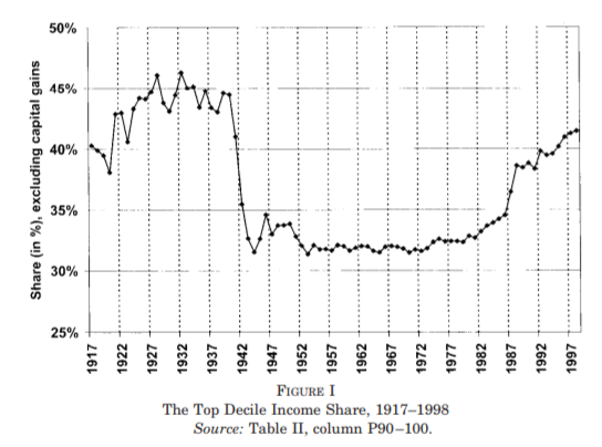
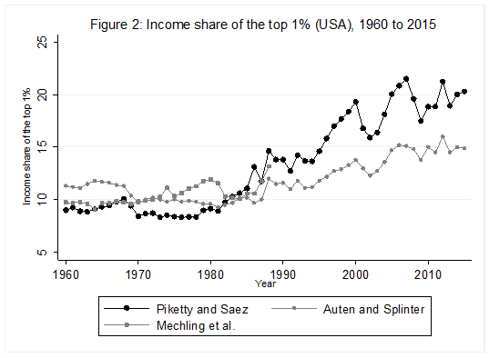
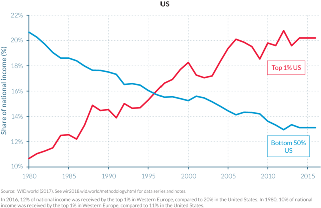
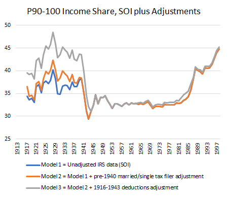
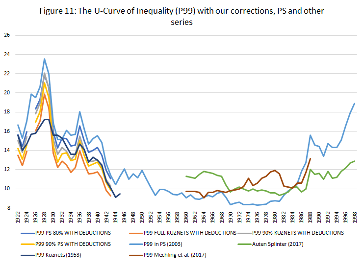
For some years now, Phil Magness and myself have been working on improving the existing income inequality for the United States prior to World War II. One of the most important point we make concerns why we, as economists, ought to take data assumptions seriously. One of the most tenacious stylized facts (that we do not exactly dispute) is that income inequality in the United States has followed a U-curve trajectory over the 20th century. Income inequality was high in the early 1920s and descended gradually until the 1960s and then started to pick up again. That stylized fact comes from the work of Thomas Piketty and Emmanuel Saez with their data work (first image illustrated below). However, from the work of Auten and Splinter and Mechling et al. , we know that the increase post-1960 as measured by Piketty is somewhat overstated (see second image illustrated below). While the criticism suggest a milder post-1960 increase, me and Phil Magness believe that the real action is on the left side of the U-curve (pre-1960).
Why? Here is our case made simple: the IRS data used to measure inequality up to at least 1943 are deeply flawed. In another paper recently submitted, I made the argument that some of the assumptions made by Piketty and Saez had flaws. This did not question the validity of the data itself. We decided to use state-level income tax data from the IRS to compute the state-level inequality and compare them with state-income tax data (e.g. the IRS in Wisconsin versus Wisconsin’s own personal income tax data). What we found is that the IRS data overstates the level of inequality by appreciable proportions.
Why is that? There are two reasons. The first is that the federal tax system had wide fluctuations in tax rates between 1917 and 1943 which means wide fluctuations in tax compliance. Previous scholars such as Gene Smiley pointed out that when tax rates fell, compliance went up so that measured inequality went up. But measured inequality is not true inequality because “off-the-books” income (which was unmeasured) divorced true inequality from measured inequality. This is bound to generate false fluctuations in measurement as long as tax compliance was voluntary (which is true until 1943). State income taxes do not face that problem as their tax systems tended to be more stable throughout the period. The same is true with personal exemptions.
The second reason speaks to the manner the federal data is presented. The IRS created wide categories with the numbers of taxpayers according to net taxable income (rather than gross income) in each categories. For example, the categories go from 0$ to 1,000$ per filler and then increase by slice of 1,000$ until 10,000$ and then by slices of 5,000$ etc. This makes it hard to pinpoint where to start each the calculations for each of the fractiles of top earners. This is not true of all state income tax systems. For example, Delaware sliced the data by categories of 100$ and 500$ instead. Thus, we can more easily pinpoint the two. More importantly, most state-income tax systems reported the breakdown both for net taxable and gross income. This is crucial because Piketty and Saez need to adjust the pre-1943 IRS data – which are in net income – to that they can tie properly with the post-1943 IRS data – which are in adjusted gross income. Absent this correction, they would get an artificial increase in inequality in 1943. The problem is that the data for this adjustment is scant and their proposed solution has not been subjected to validation.
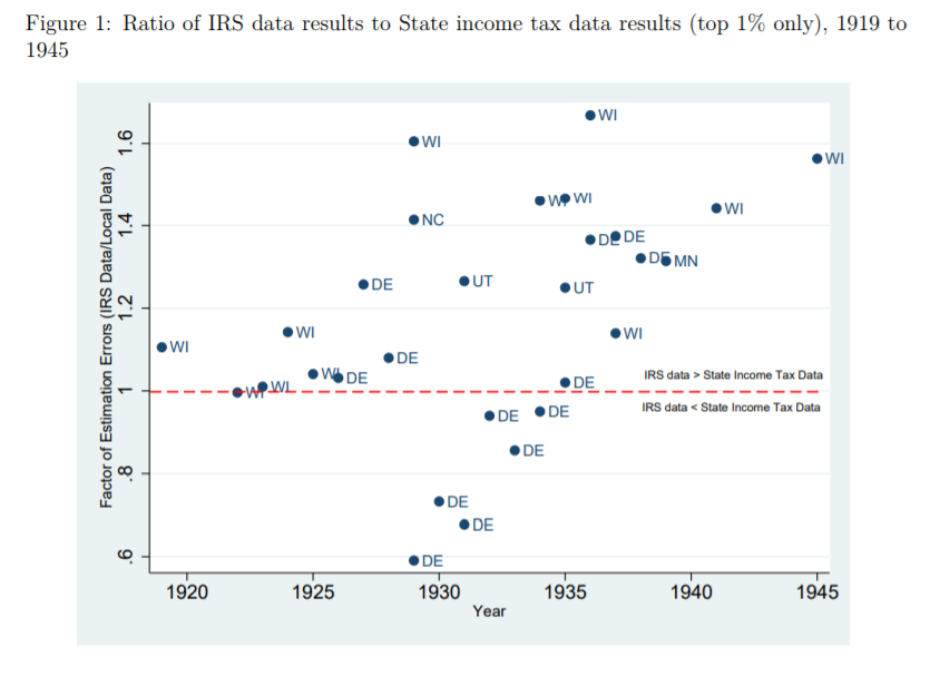
What do our data say? We compared them to the work of Mark Frank et al. who used the same methodology and Piketty Saez but at the state-level using the same sources. The image below pretty much sums it up! If the points are above the red line, the IRS data overestimates inequality. If below, the IRS underestimates. Overall, the bias tends towards overestimation. In fact, when we investigated all of the points separately, we found that those below the red line result merely from the way that Delaware’s (DE) was adjusted to convert net income into gross income. When we compared only net income-based measures of inequality, none are below the red line except Delaware from 1929 to 1931 (and by much smaller margins than shown in the figure below).
In our paper, we highlight how the state-level data is conceptually superior to the federal-level data. The problem that we face is that we cannot convert those measures into adjustments for the national level of inequality. All that our data do is suggest which way the bias cuts. While we find this unfortunate, we highlight that this would unavoidably alter the left side of the curve in the first graph of this blog post. The initial level of inequality would be less than it is now. Thus, combining this with the criticisms made for the post-1960 era, we may be in presence of a U-curve that looks more like a shallow tea saucer than the pronounced U-curve generally highlighted. The U-curve form is not invalidated (i.e. is it a quadratic-looking function of time or not), but the shape of the curve’s tails is dramatically changed.
Shares of Income – Common Left Delusions
Two big conceptual mistakes are hidden in one small graph that help the leftist delusion.
1. I do not contest the data. I have not checked them. They may be correct. I don’t know; I have another purpose.
2. People who use this graph (though not the makers of the graph, maybe) implicitly assume that those who were in the top income 1% in 1980 are the same as those who are in the top 1% in 2016, or their parents. The graph says nothing about this. One thing is clear: Steve Job or his parents would not have been in the top 1% in 1980; Steve Jobs would have been, for sure, in 2010, his estate in 2016. The graph does not show the perpetuation of privilege and of inequality, as users almost always imply. Suppose that 100% of those who were in the 1% in 2016 were not (or their parents, or their grandparents) in 1980. This would show a fast change of economic elites. It might pose a problem but not the problem the envious imply when they display the graph.
The problem here is intellectual passivity.
3. The percentage of income that accrues to a given fraction of the population – including the top 1% – tells you nothing about how well anyone has fared economically, whether anybody is richer or poorer than he was at the beginning. Here is an example: Suppose, you and I both earn $1,000 at the beginning of the period of observation. Thus, we each get 50% of our joint income (1000/2000). Suppose further that during the period observation, my income doubles while yours quadruples, I am now getting only 33% while you are getting 66% (2000/2000+4000 vs 4000/2000+4000). My share in percentage terms has declined while yours has ballooned. Question: Am I now poorer than I was at the beginning of the period? That’s a “Yes/No” question.; don’t equivocate. The problem is here is failure to understand elementary school math.
The chart is produced by the World Inequality Organization, a single purpose outfit not dedicated to the possibility that inequality may be decreasing. The data it offers have not been certified by the usual scholarly processes This organization’s executive committee includes Thomas Piketty who could not get his data straight in his best-selling book. He had to refer critics to a website to get his story down. The earlier edition of the same book became famous for not including in US calculations: food stamps, rent support, free medical care, and more, in US welfare recipients’ incomes. I don’t know the others, which may or may not matter. Too many Europeans for my taste. I don’t like it, from 40 years of observation. That last remark is somewhat subjective, of course.
Together these simple comments add up to this critical judgment of the relevant chart: Either, those who use it normally don’t know what they are talking about or, they are not saying anything that matters.
On the “tea saucer” of income inequality since 1917
I disagree often with the many details that underlie the arguments of Thomas Piketty and Emmanuel Saez. That being said, I am also a great fan of their work and of them in general. In fact, I think that both have made contributions to economics that I am envious to equal. To be fair, their U-curve of inequality is pretty much a well-confirmed fact by now: everyone agrees that the period from 1890-1929 was a high-point of inequality which leveled off until the 1970s and then picked up again.
Nevertheless, while I am convinced of the curvilinear aspect of the evolution of income inequality in the United State as depicted by Piketty and Saez, I am not convinced by the amplitudes. In their 2003 article, the U-curve of inequality really looks like a “U” (see image below). Since that article, many scholars have investigated the extent of the increase in inequality post-1980 (circa). Many have attenuated the increase, but they still find an increase (see here here here here here here here here here). The problem is that everyone has been considering the increase – i.e. the right side of the U-curve. Little attention has been devoted to the left side of the U-curve even though that is where data problems should be considered more carefully for the generation of a stylized fact. This is the contribution I have been coordinating and working on for the last few months alongside John Moore, Phil Magness and Phil Schlosser.
To arrive at their proposed series of inequality, Piketty and Saez used the IRS Statistics of Income (SOI) to derive top income fractiles. However, the IRS SOI have many problems. The first is that between 1917 and 1943, there are many years where there are less than 10% of the potential tax population that files a tax return. This prohibits the use of a top 10% income share in many years unless an adjustment is made. The second is that prior to 1943, the IRS reports net income and reports adjusted gross income after 1943. As such, to link post-1943 with pre-1943, there needs to be an additional adjustment. Piketty and Saez made some seemingly reasonable assumptions, but they have never been put to the test regarding sensitivity and robustness. This is leaving aside issues of data quality (I am not convinced IRS data is very good as most of it was self-reported pre-1943 which is a period with wildly varying tax rates). The question here is “how good” are the assumptions?
What we did is verify each assumption to see their validity. The first one we tackle is the adjustment for the low number of returns. To make their adjustments, Piketty and Saez used the fact that single households and married households filed in different quantities relative to their total population. Their idea is that a year in which there was a large number of return was used, the ratio of single to married could be used to adjust the series. The year they used is 1942. This is problematic as 1942 is a war year with self-reporting when large quantities of young American males are abroad fighting. Using 1941, the last US peace year, instead shows dramatically different ratios. Using these ratios knocks off a few points from the top 10% income share. Why did they use 1942? Their argument was there was simply not enough data to make the correction in 1941. They point to a special tabulation in the 1941 IRS-SOI of 112,472 1040A forms from six states which was not deemed sufficient to make to make the corrections. However, later in the same document, there is a larger and sufficient sample of 516,000 returns from all 64 IRS collection districts (roughly 5% of all forms). By comparison, the 1942 sample Piketty and Saez used to correct only had 455,000 returns. Given the war year and the sample size, we believe that 1941 is a better year to make the adjustment.
Second, we also questioned the smoothing method to link net income-based series with adjusted-gross income based series (i.e. pre-1943 and post-1943 series). The reason for this is that the implied adjustment for deductions made by Piketty and Saez is actually larger than all the deductions claimed that were eligible under the definition of Adjusted Gross Income – which is a sign of overshot on their parts. Using the limited data available for deductions by income groups and making some assumptions (very conservative ones) to move further back in time, we found that adjusting for “actual deductions” yields a lower level of inequality. This is contrasted with the fixed multipliers which Piketty and Saez used pre-1943.
Third, we question their justification for not using the Kuznets income denominator. They argued that Kuznets’ series yielded an implausible figure because, in 1948, its use yielded a greater income for non-fillers than for fillers. However, this is not true of all years. In fact, it is only true after 1943. Before 1943, the income of non-fillers is equal in proportion to the one they use post-1944 to impute the income of non-fillers. This is largely the result of an accounting error definition. Incomes before 1943 were reported as net income and as gross incomes after that point. This is important because the stylized fact of a pronounced U-curve is heavily sensitive to the assumption made regarding the denominator.
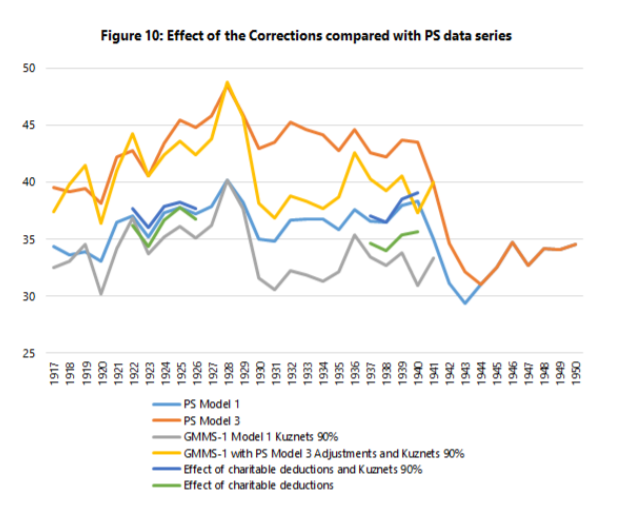
These three adjustments are pretty important in terms of overall results (see image below). The pale blue line is that of Piketty of Saez as depicted in their 2003 paper in the Quarterly Journal of Economics. The other blue line just below it is the effect of deductions only (the adjustment for missing returns affects only the top 10% income share). All the other lines that mirror these two just below (with the exception of the darkest blue line which is the original Kuznets inequality estimates) compound our corrections with three potential corrections for the denominators. The U-curve still exists, but it is not as pronounced. When you look with the adjustments made by Mechling et al. (2017) and Auten and Splinter (2017) for the post-1960 period (green and red lines) and link them with ours, you can still see the curvilinear shape but it looks more like a “tea saucer” than a pronounced U-curve.
In a way, I see this as a simultaneous complement to the work of Richard Sutch and to the work of Piketty and Saez: the U-curve still exists, but the timing and pattern is slightly more representative of history. This was a long paper to write (and it is a dry read given the amount of methodological discussions), but it was worth it in order to improve upon the state of our knowledge.
Is the U-curve of US income inequality that pronounced?
For some time now, I have been skeptical of the narrative that has emerged regarding income inequality in the West in general and in the US in particular. That narrative, which I label UCN for U-Curve Narrative, simply asserts that inequality fell from a high level in the 1910s down to a trough in the 1970s and then back up to levels comparable to those in the 1910s.
To be sure, I do believe that inequality fell and rose over the 20th century. Very few people will disagree with this contention. Like many others I question how “big” is the increase since the 1970s (the low point of the U-Curve). However, unlike many others, I also question how big the fall actually was. Basically, I do think that there is a sound case for saying that inequality rose modestly since the 1970s for reasons that are a mixed bag of good and bad (see here and here), but I also think that the case that inequality did not fall as much as believed up to the 1970s is a strong one.
The reasons for this position of mine relates to my passion for cliometrics. The quantitative illustration of the past is a crucial task. However, data is only as good as the questions it seek to answer. If I wonder whether or not feudal institutions (like seigneurial tenure in Canada) hindered economic development and I only look at farm incomes, then I might be capturing a good part of the story but since farm income is not total income, I am missing a part of it. Had I asked whether or not feudal institutions hindered farm productivity, then the data would have been more relevant.
Same thing for income inequality I argue in this new working paper (with Phil Magness, John Moore and Phil Schlosser) which is a basically a list of criticisms of the the Piketty-Saez income inequality series.
For the United States, income inequality measures pre-1960s generally rely on tax-reporting data. From the get-go, one has to recognize that this sort of system (since it is taxes) does not promote “honest” reporting. What is less well known is that tax compliance enforcement was very lax pre-1943 and highly sensitive to the wide variations in tax rates and personal exemption during the period. Basically, the chances that you will report honestly your income at a top marginal rate of 79% is lower than had that rate been at 25%. Since the rates did vary from the high-70s at the end of the Great War to the mid-20s in the 1920s and back up during the Depression, that implies a lot of volatility in the quality of reporting. As such, the evolution measured by tax data will capture tax-rate-induced variations in reported income (especially in the pre-withholding era when there existed numerous large loopholes and tax-sheltered income vehicles). The shift from high to low taxes in the 1910s and 1920s would have implied a larger than actual change in inequality while the the shift from low to high taxes in the 1930s would have implied the reverse. Correcting for the artificial changes caused by tax rate changes would, by definition, flatten the evolution of inequality – which is what we find in our paper.
However, we go farther than that. Using the state of Wisconsin which had a tax system with more stringent compliance rules for the state income tax while also having lower and much more stable tax rates, we find different levels and trends of income inequality than with the IRS data (a point which me and Phil Magness expanded on here). This alone should fuel skepticism.
Nonetheless, this is not the sum of our criticisms. We also find that the denominator frequently used to arrive at the share of income going to top earners is too low and that the justification used for that denominator is the result of a mathematical error (see pages 10-12 in our paper).
Finally, we point out that there is a large accounting problem. Before 1943, the IRS provided the Statistics of Income based on net income. After 1943, there shift between definitions of adjusted gross income. As such, the two series are not comparable and need to be adjusted to be linked. Piketty and Saez, when they calculated their own adjustment methods, made seemingly reasonable assumptions (mostly that the rich took the lion’s share of deductions). However, when we searched and found evidence of how deductions were distributed, they did not match the assumptions of Piketty and Saez. The actual evidence regarding deductions suggest that lower income brackets had large deductions and this diminishes the adjustment needed to harmonize the two series.
Taken together, our corrections yield systematically lower and flatter estimates of inequality which do not contradict the idea that inequality fell during the first half of the 20th century (see image below). However, our corrections suggest that the UCN is incorrect and that there might be more of small bowl (I call it the Paella-bowl curve of inequality, but my co-authors prefer the J-curve idea).
Did Inequality Fall During the Great Depression ?
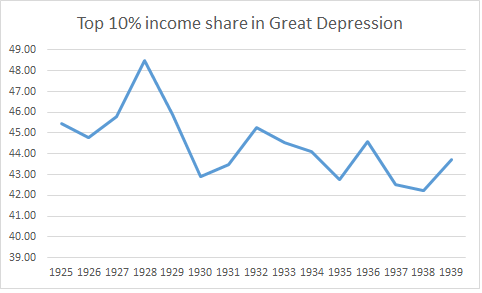
The graph above is taken from Piketty and Saez in their seminal 2003 article in the Quarterly Journal of Economics. It shows that inequality fell during the Great Depression. This is a contention that I have always been very skeptical of for many reasons and which has been – since 2012 – the reason why I view the IRS-data derived measure of inequality through a very skeptical lens (disclaimer: I think that it gives us an idea of inequality but I am not sure how accurate it is).
Here is why.
During the Great Depression, unemployment was never below 15% (see Romer here for a comparison prior to 1930 and this image derived from Timothy Hatton’s work). In some years, it was close to 25%. When such a large share of the population is earning near zero in terms of income, it is hard to imagine that inequality did not increase. Secondly, real wages were up during the Depression. Workers who still had a job were not worse off, they were better off. This means that you had a large share of the population who saw income reductions close to 100% and the remaining share saw actual increases in real wages. This would push up inequality no questions asked. This could be offset by a fall in the incomes from profits of the top income shares, but you would need a pretty big drop (which is what Piketty and Saez argue for).
There is some research that have tried to focus only on the Great Depression. The first was one rarely cited NBER paper by Horst Mendershausen from 1946 who found modest increases in inequality from 1929 to 1933. The data was largely centered on urban data, but this flaw works in favor of my skepticism as farm incomes (i.e. rural incomes) fell more during the depression than average incomes. There is also evidence, more recent, regarding other countries during the Great Depression. For example, Hungary saw an increase in inequality during the era from 1928 to 1941 with most of the increase in the early 1930s. A similar development was observed in Canada as well (slight increase based on the Veall dataset).
Had Piketty and Saez showed an increase in inequality during the Depression, I would have been more willing to accept their series with fewer questions and doubts. However, they do not discuss these points in great details and as such, we should be skeptical.
What is Wrong with Income Inequality? Five Reasons to be Concerned
I sometimes part ways with many of my libertarian and classical liberal friends in that I do have some amount of tentative concern for income/wealth inequality (for the purposes of this article, the otherwise important economic distinction between the two is not particularly relevant since the two are strongly correlated with each other). Many libertarians argue that inequality ultimately doesn’t matter. There is good reason to think this drawing from the classic arguments of Nozick and Hayek about how free exchange in a market economy can often interrupt preferred distributions.
The argument goes like this: take whatever your preferred distribution of income is, be it purely egalitarian or some sort of Rawlsian distribution such that the distribution benefits only the worst off in society. Assume there is one individual in the economy who has some product or service everyone wants to buy (in Nozick’s example it was Wilt Chamberlain playing basketball), and let everyone pay a relatively small amount of income to that one individual. For example, assume you have a society with 10,000 people all who start off with an equal endowment of $5 and all of them decide to pay Wilt Chamberlain $1 to watch him play basketball. Very few people would object to those individual exchanges, yet at the end Wilt Chamberlain ends up with $10,005 dollars and everyone else has $4, and our preferred distribution of income has been grossly upset even though the individual actions that led to that distribution are not objectionable. In other words, allowing for free exchange precludes trying to construct an optimal result of that free exchange (a basic consequence of recognizing spontaneous order).
Further, these libertarians argue, it is more important to ensure that the poor are better off in absolute terms than to ensure they are better off relative to their wealthier peers. Therefore, if a given policy will increase the wealth of the wealthiest by 10% and the poorest by 5%, there is no reason to oppose this policy on the grounds that it increases inequality because the poor are still made richer. Therefore, it is claimed, we should focus on policies that improve economic growth and the incomes of the poor and be indifferent as to its impact on relative inequality, since those policies are strongly correlated with bettering the economic conditions of the poor. In fact, as Mises Argued in Liberalism and the Classical Tradition, a certain amount of inequality is necessary for markets to function: they create a market for luxury goods that can be experimented and developed into future mass-consumption goods everyone can consume. Not everyone could afford, for an example, an IPod when it first came out, however today MP3 players are cheap and plentiful because the very wealthy were able to demand it when it was very expensive.
I agree with my libertarians in thinking that this argument is largely correct, however I do not think it proves, as Hayek argued, that social justice (understood in this context as distributive justice) is a “mirage” or that we should be altogether unconcerned with wealth or income distributions. All this argument does is mean that there is no overall deontological theory for an ideal income distribution, but there still might be good consequentialist reasons to think that excessively unequal distributions can impact many of the things that classical liberals tell us to worry about, such as the earnings of the poor, more free political economic outcomes, or overall economic growth. Further, even on Nozick’s entitlement theory of justice, we might oppose income inequality if it arises through unjust means. Here are five reasons why libertarians and classical liberals should be concerned about income inequality (note that they are mostly empirical reasons, not claims about the nature of justice):
1) Income Inequality as a Result of Rent Seeking
Certain government policies result in uneven income distribution. For an example, a paper by Patrick MacLaughlin and Lauren Stanley at the Mercatus Center empirically analyze the regressive effects of regulatory policy. Specifically, Stanley and MacLaughlin find that high barriers to entry create barriers to entry which worsens income mobility. Poorer would-be entrepreneurs cannot enter the market if they must, for an example, pay thousands of dollars for a license, or spend a large amount of time getting costly education and certifications to please some regulatory bureaucracy. This was admitted even by the Obama Administration in a recent report advising reform of occupational licensing laws. As basic public choice theory teaches, regulators are subject to regulatory capture, in which established business interests lobby regulators to erect barriers to entry to harm would-be competitors. Insofar as inequality is a result of such rent-seeking, libertarians have an obvious reason to oppose it.
Many other policies can worsen inequality. When wealthy corporations receive artificial monopolies from policies such as excessive intellectual property laws, insulating them from competition or when they gain wealth at the expense of poorer taxpayers through improper subsidies. When the government uses violent policing tactics to unequally enforce drug laws against poorer communities, or when it uses civil asset forfeiture to take the property of the worst off. When the government uses eminent domain to take the property of disadvantaged individuals and communities in the name of public works projects, or when they implement minimum wage laws that displace low-skilled workers. Or, if the structure of welfare benefits discourages income mobility, which also worsens inequality. There are a myriad of bad government policies which benefit the rich and exploit the poor, some of which are a direct result of rent-seeking on behalf of the wealthy.
If the rich are getting richer, or if the poor are stopped from becoming wealthier, as a result of government coercion, even Nozick’s entitlement theory of justice calls for us to be skeptical of the resulting income distribution. As Matt Zwolinski argues, income distributions are not only a result of, pace Nozick, a result of the free exchanges of individuals, but they are also a result of the institutions in which those individuals exchange. Insofar as inequality is a result of unjust institutions, we have good reason to call that inequality unjust.
Of course, that principle is still very hard to empirically apply. It is hard to tell how much of an unequal distribution is a function of bad institutions and how much is a function of free exchange. However, this means we can provide very limited theories of distributive justice not as constructivist attempts to mold market outcomes to our moral desires, but as rough rules of thumb. If it is true that unequal distributions are a function of bad institutions, then unequal distributions should cause us to re-evaluate those institutions.
2) Income Inequality and Government Exploitation
Of course, many with more Marxist inclinations will argue that any amount of economic inequality will inherently result in class-based exploitation. There are very good, stand-by classical liberal (and neoclassical economic) reasons to reject this as Marxian class analysis as it depends on a highly flawed labor theory of value. However, that does not mean there is not some correlation between some notion of macro-level exploitation of the worst-off and high levels of inequality which libertarians have good reason to be concerned about, for reasons closely related to rent-seeking. Those with a high amount of economic power, particularly in western democracies, are very likely to also have a strong influence over the policies set by the government. There is reason to fear that this will create a class of wealthy people who, through political rent-seeking channels discuss earlier, will control state policies and institutions to protect their interests and wealth at the expense of the worst-off in society. Using state coercion to protect oneself at the expense of others is, under any understanding of the term, coercion. In this way, income inequality can beget rent-seeking and regressive policies which lead to more income inequality which leads to more rent-seeking, leading to a vicious political-economic cycle of exploitation and increasing inequality. In fact, even early radical classical liberal economists applied theories of class analysis to this type of problem.
3) Inequality’s Impacts on Economic Growth
There is a robust amount of empirical literature suggesting that excessive income inequality can harm economic growth. How? The Economist explains:
Inequality could impair growth if those with low incomes suffer poor health and low productivity as a result, or if, as evidence suggests, the poor struggle to finance investments in education. Inequality could also threaten public confidence in growth-boosting policies like free trade, says Dani Rodrik of the Institute for Advanced Study in Princeton.
Of course, this is of special concern to consequentialist classical liberals who claim we should worry mostly about the betterment of the poor in absolute terms, since economic growth is strongly correlated with bettering living standards. There is even some reason for these classical liberals, given their stated normative reasons, to (at least in the short-term given that we have unjust institutions) support some limited redistributive policies, but only those that are implemented well and don’t worsen inequality or growth (such as a Negative Income Tax), insofar as it boosts growth and helps limited the growth of rent-seeking culture described with reasons one and two.
4) Inequality and Political Stability
There is further some evidence that income inequality increases political instability. If the poor perceive that current distributions are unjust (however wrong they may or may not be), they might have social discontent. In moderate scenarios, (as the Alsenia paper I linked to argue) this can lead to reduced investment, which aggravates third problem discussed earlier. In some scenarios, this can lead to support for populist demagogues (such as Trump or Bernie Sanders) who will implement bad policies that not only might harm the poor but also limit individual liberty in other important ways. In the most extreme scenarios (however unlikely, but still plausible), it can lead to all-out violent revolutions and warfare. At any rate, libertarians and classical liberals concerned with ensuring tranquility and freedom should be concerned if inequality increases.
5) Inequality and Social Mobility
More meritocratic-leaning libertarians might say we should be concerned about equal opportunities rather than equal outcomes. There is some evidence that the two are greatly linked. In particular, the so-called “Great Gatsby Curve,” which shows a negative relationship between economic mobility and income inequality. In other words, unequal outcomes can undermine unequal opportunities. This can be because higher inequality means unequal access to certain services, eg. Education, that can enable social mobility, or that the poorer may have fewer connections to better-paying opportunities because of their socio-economic status. Of course, there is likely some reverse causality here; institutions that limit social mobility (such as those discussed in problem one and two) can be said to worsen income mobility intergenerationally, leading to higher inequality in the future. Though teasing out the direction of causality empirically can be challenging, there is reason for concern here if one is concerned about social mobility.
The main point I’m getting at is nothing new: one need not be a radical leftist social egalitarian who thinks equal economic outcomes are necessarily the only moral outcomes to be concerned on some level with inequality. How one responds to inequality is empirically dependent on the causes of the problems, and we have some good reasons to think that more limited government is a good solution to unequal outcomes.
This is not to say inequality poses no problem for libertarians’ ideal political order: if it is the case that markets inherently beget problematic levels of inequality, as for example Thomas Piketty claims, then we might need to re-evaluate how we integrate markets. However, there is good reason to be skeptical of such claims (Thomas Piketty’s in particular are suspect). Even if we grant that markets by themselves do lead to levels of inequality that cause problems 3-5, we must not commit the Nirvana fallacy. We need to compare government’s aptitude at managing income distribution, which for well-worn public choice reasons outlined in problems one and two as well as a mammoth epistemic problem inherent in figuring out how much inequality is likely to lead to those problems, and compare it to the extent to which markets do generate those problems. It is possible (very likely, even) that even if markets are not perfect in the sense of ensuring distribution that does not have problematic political economic outcomes, the state attempting to correct these outcomes would only make things worse.
But that is a complex empirical research project which obviously can’t be solved in this short blog post, suffice it to say now that though libertarians are right to be skeptical of overarching moralistic outrage about rising levels of inequality, there are other very good empirical reasons to be concerned.
Can we use tax data to measure living standards (part 2)?
Yesterday, my post on the differences in per capita income and total income per tax unit caused some friends to be puzzled by my results. To their credit, the point can be defended that tax units are not the same as households and the number of tax units may have increased faster than population (example: a father in 1920 filled one tax unit even though his household had six members, but with more single households in the 1960s onwards the number of tax units could rise faster than population for a time).
The problems regarding the use of tax units instead of households is not new. In fact, it is one of the sticking point advanced by skeptics like Alan Reynolds (see his 2006 book) and, more recently, by Richard Burkhauser of Cornell University (see his National Tax Journal article here).
Could it be that all the differences between GDP per person and income per tax unit are caused by this problem? Not really.
There is an easy to see if the problem is real. Both measures are ratios (income over a population). Either the numerator is wrong or the denominator is wrong. Those who view tax units as the problem argue that the problem is the denominator. I do not agree since I believe that the numerator is at fault. The way to see this is simply to plot total income reported by all tax units and compare this with real GDP. What’s the result?
Even with tax-reported income being deflated with the Implicit Price Deflator (IPD) instead of the consumer price index, we end up with a difference (in 2013) of roughly 3 orders of magnitude between GDP and tax-reported income relative to the 1929 base point. Basically, GDP has increased by a factor of 14.749 since 1929 while IPD-deflated tax-reported income has only increased by a factor of 11.546.
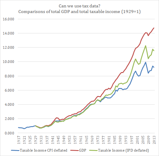
As a result, I do not believe that the problem is the tax unit issue. The problem seems to be that tax data is not capturing the same thing as GDP is!
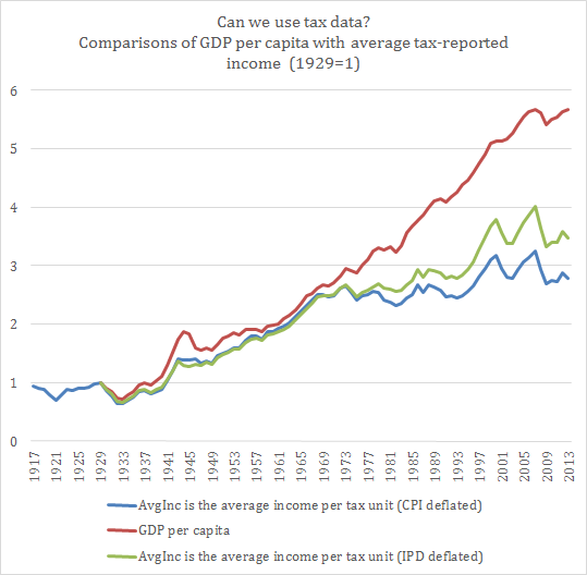
Can we use tax units to measure living standards?
In the debate on inequality, I am a skeptic of how large a problem the issue is. Personally, I tend to believe that worries of inequality only increase when growth is stagnant. In fact, I also believe that there are numerous statistical biases causing us to misidentify stagnation as rising inequality. Most of the debate on inequality is plagued with statistical problems of daunting magnitudes (regional convergence in income, regional price levels, demographic changes, increasing heterogeneity of preferences, increasing heterogeneity of personal characteristics, income not being purely monetary, the role of taxes and transfers etc.)
One of them centers around the use of tax data. This has been the domain of Thomas Piketty and Emmanuel Saez. I can understand the appeal of using tax data since it is easily available and usable. Yet, is it perfect?
A year or two ago, I would have been inclined to simply say “yes” and not bother with the details. Theoretically, taxes should be an “okay” proxy for the income distribution and should follow average income even if at different levels. Yet, after reading the article of Phil Magness and Robert Murphy in the Journal of Private Enterprise, I confess that I am no longer accepting anything as “granted” in the inequality debate. So, I simply decided to chart GDP per capita with the average taxable income per tax unit. Just to see what happens. Both are basically averages of the overall population, they should look pretty much the same (theoretically). The data for the tax units is made available in the Mark W. Frank dataset based on the Piketty-Saez data (see here) and I deflated with both the CPI and the implicit price deflator available at FRED/St-Louis.
The result is the following and it shows two very different stories! Either the GDP statistics are wrong and we have average stagnation (which does not mean that there is no increase in inequality) or the taxable income data is wrong in estimating the trend of living standards and the GDP are closer to reality (which does not that there is no increase in inequality). In the end, there is a problem to be assessed with the quality of the data used to measure inequality.
Around the Web
- Paupers and Richlings: Piketty’s ‘Capital’ by Benjamin Kunkel (h/t Mark Brady)
- The neoconservatives have ramped up their attacks on Rand Paul. This means his foreign policy ideas are winning out, of course. Neoconservatives have also begun blaming libertarians rather than liberals for the failure of their Iraq war campaign
- Liberals and libertarians have been finding common ground in the US House of Representatives
- What does the BRICS bank mean? From Dan Drezner
- Want to solve the border crisis? Give free drugs to addicts. This is from Marc Joffe, and includes a very thoughtful analysis of charter cities and how they can help improve the institutional problems that would still plague Central America even if the drug war were to end
- Help! I’m a Marxist who defends capitalism
Karl Marx versus Thomas Piketty
Both [Marx and Piketty] protest economic disparities, but move in opposite directions. Piketty advances into the domain of salaries, income and wealth; he wants to temper these extremes and give us—to alter the slogan of the ill-fated Prague Spring of 1968—capitalism with a human face. Marx advances into the domain of commodities, work, and alienation; he wants to undo these relations and give us a transformed society.
This is from UCLA historian Russell Jacoby in the New Republic. The rest of the article is not that great, to be honest (I’ll bet you ten bucks that Jacoby – whom I never took during my time in Westwood – is an old man; I can safely assume this because of the praise he lavishes upon Karl Marx at the expense of Piketty and other economists), but I thought this excerpt was a good opportunity to enhance my argument that Murray Rothbard was a great Cold War scholar and a terrible role model for the world we live in today.
Rothbard’s argument – exemplified by this excerpt that Adam provided in the ‘comments’ threads a while back – devastated the Marxist notions of the world held in the 1960s and 1970s, but Rothbard’s argument simply does not grapple with Piketty’s. It’s a whole new ball game, and one that newer scholars who have built upon Rothbard’s foundations are now grappling with. It does us no good to continue parroting a line of reasoning that has long since outlived its usefulness.
Around the Web
- Political scientist Jason Sorens on the elections in Europe (best summary I’ve read; it’s short, sweet, and to the point)
- Examining Piketty’s data sources for US wealth inequality (Part 4 of 4)
- Greece the Establishment Clause: Clarence Thomas’s Church-State Originalism
- Strong Words and Large Letters
- The African Muslim Fist-Bump
- Why US Intervention in Nigeria is a Bad Idea
Piketty’s numbers on inequality don’t add up
The Financial Times, a center-Left British publication, has the story here.
Piketty, an economist at France’s most prestigious business school, recently wrote an almost 600-page treatise on the growth of economic inequality in the West. The book has earned him lots of fame and has been discussed ad nauseum for about a month now.
Here is what I have found most interesting up to this point on the debate about inequality: The factions and their strategies regarding data and how it is interpreted. I think Dr Delacroix’s approach to the way data is interpreted is best, namely that the study design itself should be analyzed first and foremost.
Regarding factions, remember when that graduate student from the heavily neo-Keynesian UMass-Amherst found discrepancies in the work of Kenneth Rogoff and Carmen Reinhart on austerity in the West? The Left attacked savagely. The Right came up with excuses that would have earned an ‘F’ on most undergraduate tests.
Now that the Left’s own preferred conclusions have been borne out by bad data, what do you think is going to happen? Who wants to bet that the roles of Left and Right will be reversed? When Rogoff’s and Reinhart’s mistakes went public, the graduate student was invited to speak on televised talk and radio shows around the world. His work was (justifiably) hailed in the national and international press, and also (much less justifiably) as an answer to the deplorable state of the discipline of economics. What do you think the odds will be that the researchers responsible for finding flaws in Piketty’s data will get the same reception?
My money is on the answer “not good.”
All of this discussion about austerity and inequality is great, of course. The fact that researchers are expanding their findings to include more than just the data within their own countries is perhaps the most satisfying development in regards to epistemological human progress. I will await further developments to lay down my own verdict on the matter of inequality in the West. With the mistake of Rogoff and Reinhart, I decided, after carefully reading the merits and weaknesses of both sides of the debate, that their mistake was small enough to overlook and that austerity generally leads to better economic outcomes in the near- and long-term and that public debt is a drag on economic growth.
Depending on how the Left responds to its critics, I will see if economic inequality is indeed growing in the West.
