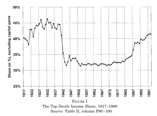
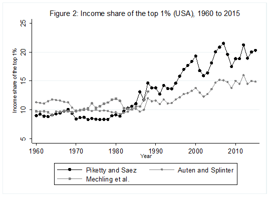
For some years now, Phil Magness and myself have been working on improving the existing income inequality for the United States prior to World War II. One of the most important point we make concerns why we, as economists, ought to take data assumptions seriously. One of the most tenacious stylized facts (that we do not exactly dispute) is that income inequality in the United States has followed a U-curve trajectory over the 20th century. Income inequality was high in the early 1920s and descended gradually until the 1960s and then started to pick up again. That stylized fact comes from the work of Thomas Piketty and Emmanuel Saez with their data work (first image illustrated below). However, from the work of Auten and Splinter and Mechling et al. , we know that the increase post-1960 as measured by Piketty is somewhat overstated (see second image illustrated below). While the criticism suggest a milder post-1960 increase, me and Phil Magness believe that the real action is on the left side of the U-curve (pre-1960).
Why? Here is our case made simple: the IRS data used to measure inequality up to at least 1943 are deeply flawed. In another paper recently submitted, I made the argument that some of the assumptions made by Piketty and Saez had flaws. This did not question the validity of the data itself. We decided to use state-level income tax data from the IRS to compute the state-level inequality and compare them with state-income tax data (e.g. the IRS in Wisconsin versus Wisconsin’s own personal income tax data). What we found is that the IRS data overstates the level of inequality by appreciable proportions.
Why is that? There are two reasons. The first is that the federal tax system had wide fluctuations in tax rates between 1917 and 1943 which means wide fluctuations in tax compliance. Previous scholars such as Gene Smiley pointed out that when tax rates fell, compliance went up so that measured inequality went up. But measured inequality is not true inequality because “off-the-books” income (which was unmeasured) divorced true inequality from measured inequality. This is bound to generate false fluctuations in measurement as long as tax compliance was voluntary (which is true until 1943). State income taxes do not face that problem as their tax systems tended to be more stable throughout the period. The same is true with personal exemptions.
The second reason speaks to the manner the federal data is presented. The IRS created wide categories with the numbers of taxpayers according to net taxable income (rather than gross income) in each categories. For example, the categories go from 0$ to 1,000$ per filler and then increase by slice of 1,000$ until 10,000$ and then by slices of 5,000$ etc. This makes it hard to pinpoint where to start each the calculations for each of the fractiles of top earners. This is not true of all state income tax systems. For example, Delaware sliced the data by categories of 100$ and 500$ instead. Thus, we can more easily pinpoint the two. More importantly, most state-income tax systems reported the breakdown both for net taxable and gross income. This is crucial because Piketty and Saez need to adjust the pre-1943 IRS data – which are in net income – to that they can tie properly with the post-1943 IRS data – which are in adjusted gross income. Absent this correction, they would get an artificial increase in inequality in 1943. The problem is that the data for this adjustment is scant and their proposed solution has not been subjected to validation.
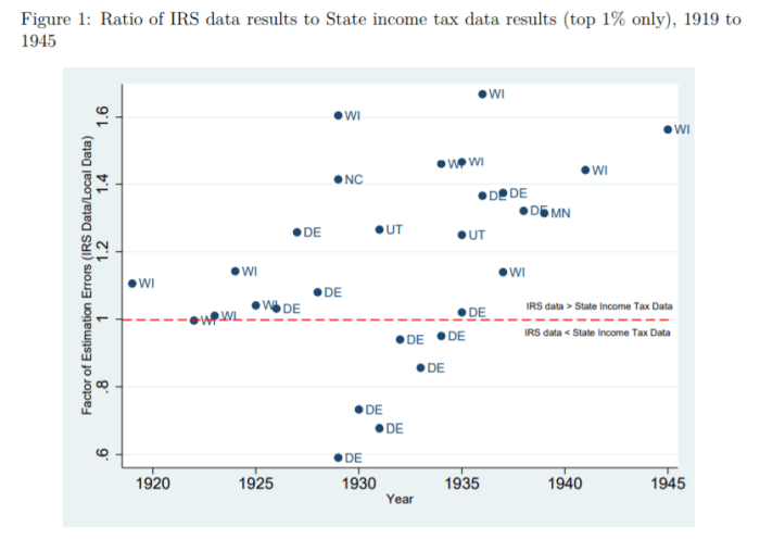
What do our data say? We compared them to the work of Mark Frank et al. who used the same methodology and Piketty Saez but at the state-level using the same sources. The image below pretty much sums it up! If the points are above the red line, the IRS data overestimates inequality. If below, the IRS underestimates. Overall, the bias tends towards overestimation. In fact, when we investigated all of the points separately, we found that those below the red line result merely from the way that Delaware’s (DE) was adjusted to convert net income into gross income. When we compared only net income-based measures of inequality, none are below the red line except Delaware from 1929 to 1931 (and by much smaller margins than shown in the figure below).
In our paper, we highlight how the state-level data is conceptually superior to the federal-level data. The problem that we face is that we cannot convert those measures into adjustments for the national level of inequality. All that our data do is suggest which way the bias cuts. While we find this unfortunate, we highlight that this would unavoidably alter the left side of the curve in the first graph of this blog post. The initial level of inequality would be less than it is now. Thus, combining this with the criticisms made for the post-1960 era, we may be in presence of a U-curve that looks more like a shallow tea saucer than the pronounced U-curve generally highlighted. The U-curve form is not invalidated (i.e. is it a quadratic-looking function of time or not), but the shape of the curve’s tails is dramatically changed.

“While the criticism suggest a milder post-1960 increase, me and Phil Magness believe that…”
“…me and Phil…”?
What? Did you skip third grade? It seems you did or you’d know that the correct way to phrase that would have been “…Phil and I…” This sort of abuse of the language makes it difficult to take the content of your observations seriously.
That English might not be your primary language is no excuse. Surely you could have found a proofreader who was proficient in English.
(I won’t be so pedantic as to point out that your prior “…Phil Magness and myself…” could be more succinctly phrased as “…Phil and I…”)
That’s perfectly good English, Henry. Sheesh. Were you taught grammar in a barn in Ohio or something?
[…] Piketty’s use of Austen’s England (and Balzac’s France) was used for precisely the same distinction. Wealth, in Piketty’s view, perpetuates itself, and effortlessly earns its return (never mind the work, risk and selection issues involved). By continually paying the interest on its debt, the governments of Austen’s Britain financed the leisurly lifestyles of the rich, just as the “natural” return of the modern-day rich contribute and maintain today’s inequality. […]
[…] only had two posts at NOL in 2019, but boy were they good: “Interwar US inequality data are deeply flawed” and “Not all GDP measurement errors are greater than zero!” Dr Geloso focused […]
[…] Notes On Liberty Vincent Gelloso presents data suggesting that, due to inadequacies of the pre-World War II data, […]