Two big conceptual mistakes are hidden in one small graph that help the leftist delusion.
1. I do not contest the data. I have not checked them. They may be correct. I don’t know; I have another purpose.
2. People who use this graph (though not the makers of the graph, maybe) implicitly assume that those who were in the top income 1% in 1980 are the same as those who are in the top 1% in 2016, or their parents. The graph says nothing about this. One thing is clear: Steve Job or his parents would not have been in the top 1% in 1980; Steve Jobs would have been, for sure, in 2010, his estate in 2016. The graph does not show the perpetuation of privilege and of inequality, as users almost always imply. Suppose that 100% of those who were in the 1% in 2016 were not (or their parents, or their grandparents) in 1980. This would show a fast change of economic elites. It might pose a problem but not the problem the envious imply when they display the graph.
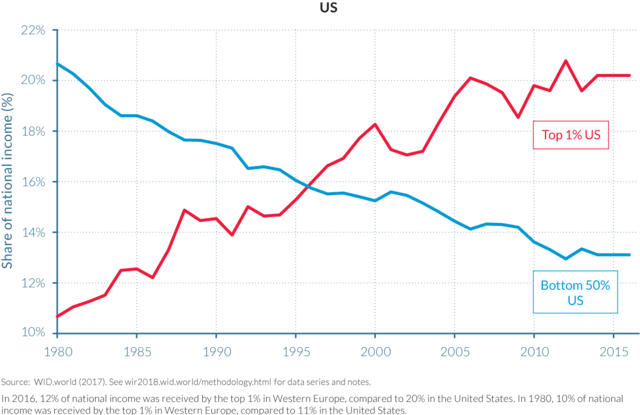
The problem here is intellectual passivity.
3. The percentage of income that accrues to a given fraction of the population – including the top 1% – tells you nothing about how well anyone has fared economically, whether anybody is richer or poorer than he was at the beginning. Here is an example: Suppose, you and I both earn $1,000 at the beginning of the period of observation. Thus, we each get 50% of our joint income (1000/2000). Suppose further that during the period observation, my income doubles while yours quadruples, I am now getting only 33% while you are getting 66% (2000/2000+4000 vs 4000/2000+4000). My share in percentage terms has declined while yours has ballooned. Question: Am I now poorer than I was at the beginning of the period? That’s a “Yes/No” question.; don’t equivocate. The problem is here is failure to understand elementary school math.
The chart is produced by the World Inequality Organization, a single purpose outfit not dedicated to the possibility that inequality may be decreasing. The data it offers have not been certified by the usual scholarly processes This organization’s executive committee includes Thomas Piketty who could not get his data straight in his best-selling book. He had to refer critics to a website to get his story down. The earlier edition of the same book became famous for not including in US calculations: food stamps, rent support, free medical care, and more, in US welfare recipients’ incomes. I don’t know the others, which may or may not matter. Too many Europeans for my taste. I don’t like it, from 40 years of observation. That last remark is somewhat subjective, of course.
Together these simple comments add up to this critical judgment of the relevant chart: Either, those who use it normally don’t know what they are talking about or, they are not saying anything that matters.
