I recently gave an interview on Economics Detective Radio with Garrett Petersen to talk about my forthcoming article in Economics & Human Biology (with Vadim Kufenko and Alex Arsenault Morin). In the interview, I explain why anthropometric history is important to our understanding of living standards, their evolution and short-term trade-offs in economic history. The interview is below, but you should subscribe to Garrett’s podcast as he is well on his way to becoming a serious competitor to EconTalk with the bonus that he does lots of economic history.
living standards
Ten best papers/books in economic history of the last decades (part 2)
Yesterday, I published part 1 of what I deemed were the best papers and books in the field of economic history of the last few decades. I posted only the first five and I am now posting the next five.
- Carlos, Ann M., and Frank D. Lewis. Commerce by a frozen sea: Native Americans and the European fur trade. University of Pennsylvania Press, 2011.
This book is not frequently cited (only 30 cites according to Google Scholar), but it has numerous gems for scholars to include in their future work. The reason for this is that Carlos and Lewis have pushed the frontier of economic history into the history of Natives in the New World. This issue of Natives in North America is one of those topics that irritates me to no end as an economic historian. A large share of the debates on economic growth in the New World have been centered on the idea that there was either some modest growth (less than 0.5% per year in per capita income) or no growth at all (which is still a strong testimonial given that the population exploded). But all that attention centres on comparing “whites” (and slaves) in the New World with everyone in the Old World. In the first decades of the colonies of Canada and the United States, aboriginals clearly outnumbered the new settlers (in Canada, the native population around 1736 was estimated at roughly 20,000 which was slightly less than the population of Quebec – the largest colony). Excluding aboriginals, who comprised such a large share of the population, at the starting point will indubitably affect the path of growth measured thereafter. My “gut feeling” is that anyone who includes natives in GDP accounting will lower the starting point dramatically. That will increase the rate of long-term growth. Additionally, the output that aboriginals provided was non-negligible and probably grew more rapidly than their population (the rising volume of furs exported was much greater than their population growth). This is why Carlos and Lewis’s work is so interesting: because it is essentially the first to assemble economic continuous time series regarding trade between trappers and traders, the beaver population, property rights and living standards of natives. From their work, all that is needed is a few key defensible assumptions in order to include natives inside estimates of living standards. From there, I would not be surprised that most estimates of growth in the North American colonies would be significantly altered and the income levels relative to Europe would also be altered.
- Floud, Roderick, Robert W. Fogel, Bernard Harris, and Sok Chul Hong. The changing body: Health, nutrition, and human development in the western world since 1700. Cambridge University Press, 2011.
This book is in the list because it is a broad overview of the anthropometric history that has arisen since the 1980s as a result of the work of Robert Fogel. I put this book in the list because the use of anthropometric data allows us to study the multiple facets of living standards. For long, I have been annoyed at the idea of this unidimensional concept of “living standards” often portrayed in the general public (which I am willing to forgive) and the economics profession (which is unforgivable). In life, everything is a trade-off. A peasant who left the countryside in the 19th century to get higher wages in a city manufacture estimated that the disamenities of the cities were not sufficient to offset wage gains (see notably Jeffrey Williamson’s Coping with City Growth during the British Industrial Revolution on this). For example, cities tended to have higher food prices than rural areas (the advantage of cities was that there were services no one in the countryside could obtain). Cities were also more prone to epidemics and pollution implied health costs. Taken together, these factors could show up in the biological standard of living, notably on heights. This is known as the “Antebellum puzzle” where the mean heights of individuals in America (and other countries like Canada) fell while there was real income and wage growth. The “Antebellum puzzle” that was unveiled by the work of Fogel and those who followed in his wake represents the image that living standards are not unidimensional. Human development is about more than incomes. Human development is about agency and the ability to choose a path for a better and more satisfying life. However, with agency comes opportunity costs. A choice implies that another path was renounced. In the measurement of living standards, we should never forget the path that was abandoned. Peasants abandoned lower rates of infant mortality, lower overall rates of mortality, the lower levels of crowding and pollution, the lower food prices and the lower crime rates of the countryside in favor of the greater diversity of goods and services, the higher wages, the thicker job market, the less physically demanding jobs and the more secure source of income (although precarious, this was better than the volatile outcomes in farming). This was their trade-off and this is what the anthropometric literature has allowed us to glean. For this alone, this is probably the greatest contribution in the field of economic history of the last decades.
- De Vries, Jan. The industrious revolution: consumer behavior and the household economy, 1650 to the present. Cambridge University Press, 2008.
Was there an industrious revolution before the industrial revolution? More precisely, did people increase their labour supply during the 17th and 18th centuries which lead to output growth? In proposing this question, de Vries provided a theoretical bridge of major significance between the observations of wage behavior and incomes in Europe during the modern era. For example, while wages seemed to be stagnating, incomes seemed to be increasing (in the case of England as Broadberry et al. indicated). The only explanation is that workers increased their labor supply? Why would they do that? What happened that caused them to increase the amount of labor they were willing to supply? The arrival of new goods (sugar, tobacco etc.) caused them to change their willingness to work. This is a strong illustration of how preferences can change more or less rapidly (when new opportunities are unveiled). In fact, Mark Koyama (who blogs here) managed to insert this narrative inside a very simple restatement of Gary Becker’s model of time use. Either you have leisure that is cheap but time-consuming (think of leisure in the late middle ages) or leisure that is more expensive but does not consume too much time (think the consumption of tea, sugar and tobacco). Imagine you only have the time-expensive leisure which you value at level X. Now, imagine that the sugar and tea arrive and, although you pay a higher price, it provides more utility than the X level and it takes less time. In such a context, you will likely change your preferences between leisure and work. I am grossly oversimplifying Mark’s point here, but the idea is that the industrious revolution argument advanced by de Vries can easily fit inside a simple neoclassical outlook. On top of solving many puzzles, it also shows that one does not need to engage in some fanciful flight of Marxian theory (I prefer Marxian to Marxist because it is one typo away from being Martian which would adequately summarize my view of Marxism as a social theory). If it fits inside the simpler model, then you don’t need the rest. De Vries does just that.
- Anderson, Terry Lee, and Peter Jensen Hill. The not so wild, wild west: Property rights on the frontier. Stanford University Press, 2004.
Governance is not the same as government (in fact, they can be mutually exclusive). In recent years, I have been heavily influenced by Elinor Ostrom’s work on how communities govern the commons in very subtle (but elaborate) ways without the use of coercion. These institutional arrangements are hard to simplify into one variable for a regression, but they are theoretically simple to explain: people respond to incentives. Ostrom’s entire work shows that people on the front line of problems generally have the best incentives to get the right solution because they have skin in the game. What her work shows is that individuals govern themselves (see also Mike Munger’s Choosing in Groups) by generating micro-institutions that allow exchanges to continue. Terry Anderson and Peter Hill provide the best illustration in economic history in that regard by studying the frontier of the American west. Settlers moved to the American West faster than the reach of government and the frontier was thus an area more or less void of government action. So, how did people police themselves? Was it the wild west? No, it was not. Private security firms provided most of the policing, mining clubs established property rights without the need for government, farmers established constitutions in voluntary associations that they formed and many “public goods” were provided privately. The point of Anderson and Hill is that governance did exist on the frontier in a way that demonstrates the ability of voluntary actions (as opposed to coercive government actions) to generate sustainable and efficient solutions. The book has a rich theoretical framework on top of a substantial body of evidence regarding the emergence of institutions. Any good economic historian should own and read this book.
- Vedder, Richard K., and Lowell E. Gallaway. Out of work: unemployment and government in twentieth-century America. NYU Press and Independent Institute, 1997.
The last book on the list is an underground classic for me. Richard Vedder and Lowell Gallaway are very good economic historians. It was produced like many other underappreciated classics (like Higgs’s Crisis and Leviathan) by the Independent Institute (see their great book list here). Most of their output was produced from the 1960s to the 1980s. However, as the 1990s came, they moved towards the Austrian school of Economics. With them, they brought a strong econometric knowledge – a rarity among Austrian scholars. They attempted one of the first (well-regarded) econometric studies that relied on Austrian theory of the labor-market (a mixture of New Classical Theory with Austrian Theory). Their goal was to explain variations in unemployment in the United States by variations in “adjusted real wages” (i.e. unit labor costs) all else being equal. At the time of the publication, they used very advanced econometric techniques. The book was well received and even caught the attention of Brad DeLong who disagreed with it and debated Vedder and Gallaway in the pages of Critical Review. Although there are pieces that I disagree with, the book has mostly withstood the test of time. The core insights of Out of Work regarding the Great Depression (and many of its horrible policies like the National Industrial Recovery Act) have been conserved by many like Scott Sumner in his Midas Paradox and they feature prominently in the works of scholars like Lee Ohanian, Harold Cole, Jason Taylor, Price Fishback, Albrecht Ristchl and others. In the foreword to the book, they mention that D.N. McCloskey (then the editor of the Journal of Economic History) had pushed hard for them to publish their work regarding the 1920s and 1930s. McCloskey was right to do so as many of their contentions are now accepted as a legitimate (if still debated) viewpoint. The insights regarding the “Great Depression of 1946” (a pun to ridicule the idea that the postwar reduction in government expenditures led to a massive reduction in incomes) have been generally conserved by Robert Higgs in his Journal of Economic History article I mentioned yesterday (and in this article as well) and even by Alexander Field in his Great Leap Forward. However, Out of Work remains an underground classic that is filled with substantial pieces of information and data that remains unused. There are numerous unexploited insights (some of which Vedder and Gallaway have followed on) as well. The book should be mandatory reading for any economic historian.
Sensitive and Crucial: on Measuring Living Standards in the 18th Century
In the course of the twitterminar on the High-Wage Economy argument (HWE) which generated responses from John Styles on his blog (who has convinced me that the key solution to HWE rests in Normandy, not the Alsace) and many other on Twitter. In the course of that discussion, I skirted a point I have been meaning to make for a long time. However, I decided to avoid it because it is tangentially related to the HWE story. Its about how we measure living standards over space in the past.
Basically, the HWE story is a productivity story and all that matters in such a story is wage rates relative to other input prices. Because we’re talking about relatives, the importance of proper deflators is not that crucial. However, when you move beyond HWE and try to ask the question regarding absolute differences over space in living standards, the wage rates are not sufficient and proper deflators are needed.
They are many key issues to estimating living standards across space. The largest is that given that very few goods crossed borders in the past, converting American incomes into British sterling units using reported exchange rates would be rife with errors and calculating purchasing power parities would be complicated. The solution, very simple and elegant by its simplicity, is to rely on the logic of the poverty measures. Regardless of where you are, there is a poverty threshold. Then, all that is needed is to express incomes as the ratio of income to the poverty line. If the figure is three, then the average income buys three times the poverty line. Expressed as such, comparisons are easy to do. This is what Robert Allen did and it was basically a deeper and more complete approach than Fernand Braudel’s “Grain-Wages” (wage rates divided by grain prices).
Where should the line be?
While this represents a substantial improvement for economic historians like me who are deeply interested in “getting the data right”, there are flaws. In the course of my dissertation on living standards in Canada (see also my working papers here and here), I saw one such flaw in the form of how long the length of the work year was. In fact, a lot of my comments in this post were learned on the basis of Canada as an extreme outlier in terms of sensitivity. In Canada, winter is basically a huge preindustrial limitation on the ability to work year-round (thus, the expression mon pays ce n’est pas un pays, c’est l’hiver). But this flaw is only the tip of the iceberg. First of all, the winter means that the daily energy intake must substantially greater than 2,500 calories in order to maintain body mass. The mechanism through which the temperature increases the energy requirements of the human metabolism is in part the greater weight carried by the heavier clothing in addition to the energy needed by the body to maintain body temperature. At higher altitudes, these are compounded by the difference in air pressure.In their attempt to construct estimates of the living standards of Natives in the Canadian north during the fur trade era, Ann Carlos and Frank Lewis assert that it is necessary to adjust the basket of comparison to include more calories for the natives given the climate – they assert that 3500 calories were needed rather 2500 calories for English workers.In Russia, Boris Mironov estimated that the average calories ingested stood at 2952 per day between 1865 and 1915 while the adult male had to consume 3204 calories per day. In Canada in the 18th century, it was estimated that patients at the Augustines hospital in Quebec City required somewhere 2628 calories and 3504 calories per day while soldiers consumed on average 2958 calories per day and the average population consumed 2845 calories per day (see my papers linked up above). The range of calorie requirements for soldiers (which I took from a reference inside my little sister’s military stuff) is quite large: from 3,100 in the desert at 33 degrees Celsius to 4,900 in artic conditions (minus 34 degrees Celsius) – a 58% difference. So basically, when we create welfare ratios for someone in, say, Mexico, the calories needed in the basket should be lower than in the Canadian basket.
Another issue, of greater importance, is the role of fuel. In the welfare ratios commonly used, fuel is alloted at 2MBTU for the basic level of sustenance which. This is woefully insufficient even in moderately warm countries, let alone Canada. My estimates of fuel consumption in Canada is that the worst case hovers around 20MBTU (ten times above the assumption) if the most inefficient form of combustion (important losses) and the worst kind of wood possible (red pine). Similar levels are observed for the American colonies.
Combined together, these corrections suggest that the Canadian poverty threshold should be higher than the one observed in France, England, South Carolina or Argentina. These adjustments can more or less be easily made by using military manuals. The army measures the basic calories requirements for all types of military theaters.
How to factor in family size and use equivalence scales.
Equivalence scales refer to the role of family size. Given the same income, families of different size will have different levels of welfare. Thanks to economies of scale in housing, cooking, lighting and heating, larger households can get more utility out of one dollar of income. That adjustments are required to render different households comparable is well accepted amongst economists. However, given the sensitivity of any analysis to the assumptions underlying any adjustments, there is an important debate to be had.
The convention among economic historians has been to assume that households have three adult equivalents. This assumption has gone largely undiscussed. The problem is “which scale to use”. The conversion into adult equivalents is subject to debates. Broadly speaking, three approaches exist. The first uses the square root of the number of individuals. The second attributes the full weight of the first adult, half the weight of the second adult and 30% for each child. This approach is commonly used by the OECD, Statistics Canada and numerous government agencies in Canada The third approach is the one used by the National Academy of Sciences in the United States which proposed to use an exponent ranging between 0.65 and 0.75 to household size but only after having multiplied the number of children by 0.7. As a result, a family of four (two parents, two infants) can have either 2 adult equivalents (square root), 2.1 adult equivalents (OECD and Statistics Canada approach) or 2.36 adult equivalent (NAS approach). The differences relative to the square roots approach are 5% and 18%. If we move to a family of 6 persons, the differences increase to 10.22% and 34.72%. If we are comparing regions with identical family structures, this would not be a problem. If not, then it is an issue. The selection of one method over another would have important effect on the cost of the living basket, with the NAS approach showing the costliest basket. Using a method relatively close to that of the OECD (although not exactly that measure), Eric Schneider found that the relatively small size of families in England led Allen to underestimate living standards. In a more recent paper, Allen alongside Schneider and Murphy pointed out that extending Schneider’s analysis to Latin America where “family sizes were likely larger (…) than in England and British North America” would amplify the wage gap between the two regions.

The table above shows how much family size varied around the late 17th century across region. Clearly, this is a non-negligible issue.
Sensitivity of estimates
Just to see how much these points matter, let’s modify for two easily modifiable factors: household size (given the numbers above) and fuel requirements (calories from food are harder to adjust for and I am still in the process of doing that). Let’s recompute the welfare ratios (those classified as bare bones) of Canada (the outlier) relative to the other according to different changes circa the end of the 17th century. How much does it matter?
Comparing New World places like Canada and Boston does not change much – they are more or less similar (family size and relative price-wise). However, just adjusting for family size eliminates a quarter of the gap between Canada and Paris (from 61% to somewhere 43.9% and 49.5%). Then, the adjustment for the fact that it is freezing cold in Canada eliminates a little more than half the advantage Canada enjoyed. So roughly two third of the Canadian advantage over Paris (the richest place in France) is eliminated by adjusting for family size and fuel consumption without adjusting for food requirements. However, family size does not affect dramatically the comparison between Paris and London (regardless of whether we use the Allen figures or the Stephenson-Adjusted figures). Thus, most of the sensitivity issues are related to comparing the New World with the Old World. 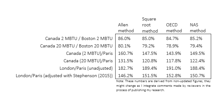
Still, there are some appreciable differences from family structures within Europe (i.e. the Old World) that may alter the relative positions. For example, Ireland had much larger families than England in the 18th century (see here – the authors shared their dataset with me and a co-author): in 1700, England & Wales had an average household size of 4.7 compared with 5.32 in Ireland. That would moderately disrupt the comparison. Not as much as comparison between the New World and Old World, but enough to make cautious about European differences.
Conclusion
I have seen many discussions regarding the sensitivity of welfare ratios in numerous papers. I am not attempting to make my present point into some form of revolutionary issue. However, all the sensitivity estimates were concentrated on a case or another and they all concern a specific problem. No one has gathered all the problems in one place and provided a “range of estimates”. Maybe its time to go in that direction so that we know which place was poor and which was not (relative to one another, since anything preindustrial was basically dirt-poor by our modern standards).
Percentages that Fairly Scream and, “Catastrophe” is a Greek Word
The WSJ of 7/9/15 shows a comparative table for some European Union countries of spending on pensions as a share of GDP. This comparison denotes roughly the drag effect that payments to retirees has on the whole national economy. To no one’s surprise, Greece tops the list with 14.4%. Germany is at 9.1%. This may seem like a small difference but when it’s turned into actual, absolute figures, the difference becomes downright striking. They scream!
The 5.3 percentage points difference can be applied to both countries’ GDPs (or GDPs per capita, same thing in this case). The International Monetary Fund gives Germany’s GDP per capita for 2014 at about $46,000 and Greece’s at about $26,000*. Pensions cost Germany $4,150 annually for each man, woman and child. Pensions cost Greece $3,400 annually for each Greek. It does not look like the Greeks should be able to afford this kind of disproportionate burden.
Suppose Greece’s pensions took the same bite out of its GDP as Germany ‘s does out of its GDP, 9.1% . In this scenario, today, the Greek economy would have about $1,400 each year unspoken for for each man, woman and child. This money would still be available for spending, as it is through pensions. It would also, however, be available for both public and private investment. That’s $1,400 each year; that’s a lot by any standard. That’s money needed to rejuvenate the Greek aging economic plant.
How realistic would such a change be, involving raising the legal age of retirement, I mean? The Germans’ and the Greeks’ life expectancies are virtually identical ( 80.44 vs 80.30, in CIA Handbook). There seems to be a little wiggle room to move there. Note that raising the age at which people can claim a pension is doubly beneficial: It reduces the number of pensioners while raising the number of workers who support the pensioners. Some will argue that raising the age of retirement is a pipe-dream in a country such as Greece where there is chronically high unemployment. I think this reasoning is wrong. Many Greeks don’t find a job because investment in Greece is insufficient. People need tools to work. What is certain is that the current dishonest Greek government policies, soundly supported by the exercise of a majority of Greeks’ votes cast, are not going to draw foreign investment. The money to improve both Greeks’ chances of employment and their productivity will have to come from within. One significant source is described above: Close the pension option for one or more years to healthy Greeks. It will provide both ready investment money and confidence abroad.
Note that raising the legal age of retirement is a purely political decision. The Greeks can do it any time they want. They can do it overnight. Perhaps, there will soon arise a political party in Greece that will proclaim the truth: It’s not the mean lenders, it’s us!
This is a fairly simplistic reasoning, I know. The general age of the population places constraints on the practicality of raising the age of legal retirement (but an older population also makes it more desirable; think it through). I have heard leftist demagogues on National Public Radio argue that the big bite that pensions take out of the Greek economy is not the Greeks’ fault, that it results more or less directly from the fact that Greece has an old population. Sounds good but the fact is that the Germans are, on the average, quite a bit older than the Greeks (Median age of 46.5 vs 43.5 according to Wikipedia.) Don’t believe experts on NPR, not even on simple facts!
Alternatively, the Greeks could begin collecting their moderate taxes like the Germans instead of like the Italians. They might also remember that “catastrophe” is a Greek word.
* The figures are “PPP” meaning that they take differences in buying power in the two countries into account.
From the Comments: Greece, the Euro zone, and Russian prowess
I just returned yesterday from a week in Athens for an academic conference. There seemed to be a big socio-economic divide in voting intentions. The unemployed and menial workers were definite No votes. The Yes votes were physicians and a few academics. Personally I think they should bag the euro and go back to the drachma.
Brandon: how long do you think it will be before Putin is making deals in Athens? Might be nice to have a friend in the EU when sanctions come up again. Port privileges for the Russian navy would be very conveniently located as well.
Jacques has a good, thoughtful response (“Leaving the Euro zone does not require leaving the European Union”) that I wholeheartedly agree with (and that I’ve blogged about here and here), and it appears Dr Amburgey is in agreement with us (though does he think Greece should stay in the EU?). Contra Dr Foldvary, I do not think there is any need for Greece to leave the EU. If anything, the EU should be adding more states, though not expanding its geographic space.
Regarding Russia, I simply don’t know. Russia – along with Turkey, Iran, and China – is a society that is very hard to understand let alone predict (I would add India/Pakistan to this list, but the states of the Indian subcontinent are traditional post-colonial states and are therefore much easier to predict; the other four were never conquered or carved up by imperial cartographers). The whole Crimea debacle still has me smarting. Nevertheless I’ll add my thoughts to the conversation.
I don’t think Athens will grow closer to Moscow. There are two major reasons:
- Greece fears Russia, which is why Athens has remained in NATO for so long.
- Most Greeks – even the ‘No’ voters in this recent referendum – don’t want to leave the EU; Greeks overwhelmingly want to be a part of ‘Europe’.
There are couple of minor reasons, too, though I don’t know how minor they are. 1) Greece is not Ukraine. 2) Russia’s economy is in shambles. Greeks have a higher standard of living than do Russians.
On the flip side, the Greeks are always thinking about the Turks. If an opportunity presents itself (though I cannot think of any arising), Athens may start to edge closer to Russia (a traditional enemy of Turkey) if it thinks Ankara is getting antsy about its former province. This is pretty extreme, though. Also, Russia’s economy may be in shambles, but it seems like Moscow always has plenty of money for military expenditures, and rent stemming from a Russian port in the Mediterranean Sea might be too tasty to resist for a country saddled with so much debt.
At this point I don’t think Greece has much clout in European politics, so I don’t see Moscow viewing Athens as a reliable friend in Brussels.
Eye Candy: the GDP (PPP) per capita of OECD Administrative Units (UPDATED)
The countries I’ve filled in were about half of the OECD. The data is hard to get on administrative units elsewhere in the world (I got my data from the OECD website), but it was also hard to get for OECD states. The reason it was hard is because OECD data collectors divide up administrative units into two separate categories (TL2 and TL3) that sometimes correlate to traditional administrative units (such as California or New South Wales) and are sometimes arbitrary creations of EU or OECD bureaucrats designed specifically for data collection (rather than for understanding the historical trajectory of regions within a state).
Does this make sense?
To make matters worse, sometimes the TL2 category correlated with an actual administrative unit with political representation in a capital, and sometimes the TL3 category was the actual administrative unit with political representation. So I had to thumb through the nitty-gritty details of how OECD states send representatives to central parliaments and then match those real-life details to the data collectors TL2 and TL3 categories.
Does this make sense?
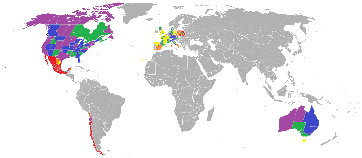
The map above highlights the US, Canada, Australia, Germany, France, the UK, Spain, Poland, Austria, Italy, Czech Republic, Chile, Denmark, and Mexico. These countries are all TL2 states.* I have no idea what that is supposed to mean for data collectors, but it means to dorks like me that their TL2 categories send political representatives to capital cities, whereas their TL3 categories likely send political representatives to regional capitals.
Does this make sense?
I have continued entering the data that the OECD has provided for the GDP (PPP) per capita of TL3 units (which send political representatives to capital cities), but the map I downloaded does not outline TL3 units (it only outlines TL2 units). So unless I want to spend time carving out TL3 units onto a TL2 map I am going to have to stop filling out the map. I’m all for collaboration on this, of course.
Here is the table I have (very slowly) been working on, but when I colored in the map above (the TL2 states), I divided them up into six groups based on highest GDP (PPP) per capita to lowest. The richest administrative units were purple, followed by blue, followed by green, followed by yellow, followed by orange, followed by red. So: purple is rich, red is poor. Got it? Because I started adding the TL3 states to the table, and because the map doesn’t allow for me to add the TL3 states to it, I forgot the range of the colored TL2 units. Dividing them up into six groups is a pretty easy task, though, so you should just trust my coloring scheme.
The map I created doesn’t have a very good zoom-in function, but what I found interesting is that Europe has a lot more economic inequality than the US, Canada, and Australia. Look at France. It’s mostly yellow, and the only purple (rich) administrative unit is Paris metro. This suggests, of course, that wealth in France is concentrated in the capital. The UK looks just like France (as does Spain). Germany is divided in half (as is Italy), and Austria and Denmark are cool, rich colors. Canada and Australia only have one yellow province each, and the US has none. Mexico looks just as Michelangelo described it, and Chile looks like Spain.
This is the OECD page I’ve been using. Here’s how I find regional GDP (PPP) per capita:
- select “Regions and Cities”
- select “Large (TL2) and Small (TL3) regions” – remember it’s either/or here: either TL2 or TL3 but not both
- select “regional GDP per capita”
- Then for measures (top of table) select “per head, current prices, current PPP”
I’ve been using 2011.
This pdf lists the “territorial grids” (TL2 and TL3 regions) of the OECD. The pdf didn’t help me figure out which regions send political representatives to capital cities and which are arbitrary, bureaucratic creations (I got to do that on my own!), but lists can definitely be helpful. In many cases I was able to figure out which units are politically viable and which are arbitrary for data collecting purposes just by looking at the list.
Finally, here is a map – courtesy of kelsocartography.com – of the world’s administrative units, at the TL2 level. Lots of work to do.

I like using the GDP (PPP) per capita of administrative units because I think it gives a much more stark picture of life around the world. I have pointed out before that the UK is now poorer than Mississippi, but breaking down the UK in the same manner as we do the US reveals that not only is the UK poorer than the poorest US state, the purchasing power parity of British citizens within the UK looks a lot more unequal than what we see in the United States. What is going on in the UK? The NHS can’t be that bad.
* – Oops, except for Denmark (it’s TL3)
UPDATED (3/11/2015): Continue reading
What Would A Political Union of the EU, the NAFTA States and Japan-South Korea Look Like?
I’ve known about the relative poverty of Western Europe compared to the United States for quite some time now, but it’s always nice to see this little tidbit get some love in the national and international press. Fraser Nelson, a journalist at the Spectator (in the UK) gives us the run-down on the numbers. According to Nelson, the UK is poorer than any US state save for Mississippi. Over at Forbes, Tim Worstall points out that the UK is actually poorer than Mississippi, too. Poor Mississippi!
Both men are calculating wealth with GDP (PPP) per capita, which is what I use as well. GDP (PPP) per capita means Gross Domestic Product (Purchasing Power Parity) per capita. Worstall explains how and why social scientists like using GDP (PPP) per capita to gauge a society’s standard of living:
Just to explain PPP for you. Prices vary across places. In the US food is generally cheaper than it is in Europe, medical care generally more expensive. So what we try to do with PPP is work out what exchange rates would need to be in order to make prices of all of these different things the same in the different places. It’s not an exact science, more of an art. But if what you’re trying to measure is living standards then it’s somewhere between useful and essential as a part of your workings.
It isn’t just the UK that is poorer than the poorest US state, either. Economist Mark Perry did these same calculations using 2010 data back in 2011 and pointed out that only Luxembourg and Norway would be in the Top 30 states were Western Europe and the United States to meld into one federal republic. The rest of Western Europe is on par with the living standards of the American South (which is considered to be the poor, culturally backwards region of the US). Be sure to check out Perry’s 2010 data and compare it to Worstall’s and Nelson’s 2013 data, too.
Careful readers will notice extremely small differences in the calculated purchasing power parity of all three authors (the IMF’s is also a little different), but each data gives us a similar approximation for standards of living in each country and each US state. Suffice it to say here a political union between the United States and the wealthy countries of Western Europe would significantly diminish the GDP (PPP) per capita of the US overall. A political merger with Japan, South Korea, and Mexico would also diminish the overall purchasing power parity of the average US citizen. Canada might (might) make the Top 40 for US states (somewhere between Michigan and Ohio – states of the Rust Belt).
Now, if I had my way, the calculation standards for non-US countries would be the same as they are for US states. That is to say, I think a better way of measuring standards of living would be to break up the countries I’ve mentioned and measure the GDP (PPP) per capita of the administrative units that operate just below the national governments of these states. So, for example, instead of measuring the GDP (PPP) per capita of the Netherlands, I’d measure the GDP (PPP) per capita of the 12 provinces that make up the Netherlands.
Then, in my libertarian utopia, the 50 US states would join together politically with the various administrative units of Western Europe, Canada, Mexico, Japan, and South Korea. Instead of 50 administrative units (the US states) there would be hundreds, maybe even thousands, of them. Talk about decentralization!
Given that a political (and therefore economic and social) merger between Western Europe, the NAFTA states, and Japan-South Korea would diminish my PPP, why should I support such a proposal?
Update 8/30: Some commentators on Facebook have been clamoring for a map, and I found a great website that has devoted lots of time to creating maps based solely on administrative units. The name of the site is Kelso’s Corner and they have a great blog post on the “Natural Earth Vector,” which is the project that maps out administrative units.
It doesn’t have detailed maps of the Anglo-Saxon world or Mexico (presumably because these are so well known), but I found a couple of great maps of Western Europe and Southeast Asia.


Imagine if all of these units were to send representatives and senators to Washington (or a new geographic equivalent): Decentralized political power and integrated markets and cultures would be the new norm for much of the world in a political system based on Madison’s federal republic. I reckon that, in a libertarian utopia, the world would look like this map and be united under Madison’s minarchist federal government:

I understand that my utopia is not much of a utopia (people will still die and there will be plenty of conflict), but I think this is actually a strength rather than a weakness.
1953
In 1953 I was just old enough to have some sense of what was going on in the world. Have things gotten better since then or worse? On the whole, better, I’d say. Herewith, two lists to which many more items could be added.
Ten things that were better then:
- Clean entertainment, tuneful music
- Safe streets
- Good schools
- Low rate of illegitimate birth
- Predominance of two-parent families, most mothers staying at home
- Stable neighborhoods
- High standards of dress and deportment
- Less intrusive government
- Lower tax burden
- Korean war ending, cold war not yet ramped up
Amplifications:
- That great scourge of western civilization, rock-and-roll “music,” was still over the horizon.
- The best schools were not as good as today’s best schools: no AP programs, limited facilities. The worst schools were far better than today’s worst schools. On average, I would say schools were better.
- The top marginal income tax rate was very high but hardly anyone paid that rate. In Ohio, there was no state income tax and the state sales tax was 3%.
Ten things that weren’t so good
- Polio
- Crummy cars
- Three TV channels, primitive receivers
- Expensive monopoly telephone service
- De facto segregation, marginalization of women
- Air and water pollution
- Primitive medicine and dentistry
- The military draft
- Atmospheric nuclear weapons tests
- CIA overthrow of elected leaders in Guatemala and Iran
Amplifications:
- Polio was a crippling and and contagious disease. Our municipal swimming pool was closed during the summer of 1953 because of fears of polio. The Salk vaccine was just over the horizon.
- Car fenders would begin to rust through after a couple of years because of road salt. It was common to have to grind the valves at 35,000 miles or so. A 60,000-mile car was ready for the junk pile.
- Air quality had improved somewhat due to the post-war switch from coal-fired furnaces to natural gas. But if you painted your house white it would gradually take on a reddish tinge due to emissions from factories and foundries. Lake Erie was unsafe for swimming within 50 miles either side of Cleveland.
- If you were black, you couldn’t buy a house or rent an apartment in suburbs like Cleveland Heights where I lived. There were no legal barriers, just an understanding among sellers and landlords.
- The detrimental effects of ionizing radiation were not well recognized, not just with regard to weapons tests. Dental X-rays inflicted 50 times as much radiation as they do now. When my mother took me shopping for shoes, I stuck my feet into slots at the bottom of a machine called a fluoroscope with three viewing ports on top that showed X-ray images of my feet, to show whether a candidate pair of shoes fit well. One such exposure probably didn’t hurt me, but the cumulative effect of many such exposures might have.
- Opportunities for women were beginning to spread beyond the traditional fields of nursing, teaching, clerking and a few others. Professions weren’t closed to women, but there were hurdles.
From the Comments: Is US Economic Stagnation A Myth?
The short answer is “yes.”
In the ‘comments’ section of Dr Delacroix’s recent article on the myth of American economic stagnation, Dr Amburgey, who works at the University of Toronto’s business school, dropped three arguments at my feet. I gave him three responses and he chose to address Issue #2 first. I will await his responses to Issues #1 and #3 respectively, but I want to make sure that we are all on the same page before we get to Issues #1 and #3.
At the heart of this discussion lies Dr Delacroix’s observation:
So, the implication here is that when it comes to the unequal distribution or real economic growth you have to do two things:
A You have to slow down and make sure you understand what’s being said; it’s not always easy. Examples below.
B You have to decide whether the inequality being described is a moral problem for you or, otherwise a political issue. (I, for one, would not lose sleep over the increased poverty of the stock exchange players in my fictitious example above. As for the lady typists, I am sorry but I can’t be held responsible for people who live under a rock on purpose.)
With this in mind I think it is important to point out that because what we are discussing brings out a lot of passion, it is easy for people to look at some numbers and believe them just on principle. For example, Dr Amburgey writes:
The numbers I use come from [here]. Median household income for 1975-2012 in constant (2012) dollars. There is a picture on the wikipedia entry I gave above [found here – bc] that charts GDP per capita and median household income. Go look at it. It’s pretty much flat for median household income. In other words pretty stagnant. Numbers wise in 1975 its $45788. In 2012 it’s $51017 (less than it was in 1989 by the way). Plug the numbers into my handy dandy econometrics software and regress median household income on year and the average annual change is $232.32 per year.
I suppose ‘stagnant’ is in the eye of the beholder but I’d say that’s 38 years of economic stagnation for the American economy as a whole.
Can you see why Dr Amburgey’s statement above is untrue? I can spot two big errors in his logic (feel free to correct me or add your own in the ‘comments’ section):
- Median household income has, on paper, indeed stagnated. Yet this says nothing about economic decline or stagnation in the US because median household income cannot tell us what such income has been able to buy in the past 40 years. That is to say, the measurement used by Dr Amburgey, and the ensuing numbers they produced, tells us nothing about the purchasing power of the American consumer.
- This second error is huge in my mind. Dr Amburgey and others are plainly stating that the American economy has been economically stagnate for 40 years. This is a good example of looking superficially at some numbers and then kowtowing to proper social norms. After all, Dr Amburgey’s handy-dandy econometrics software was around in 1973, right?
None of what I am arguing denies that the US economy sucks today. I am not blaming this on the Obama administration (though it has certainly kicked us while down). Nor am I denying that there are real structural issues that need to be addressed. What I am arguing, and what I think Dr Delacroix is arguing, is that the numbers and the issues used by Leftist factions to push their beliefs through the political process are based on faulty assumptions and even faultier logic.
I am still waiting for Issues #1 and #3 to be addressed. Dr Amburgey actually has access as an author on this blog, so maybe Christmas will come early for me this year and I’ll be able to read one of his posts here at NOL.
Unequal Poverty: Tricks (Part Two of two)
I explained how the general standard of living in America, denoted by real income, grew a great deal between 1975 and a recent date, specifically, 2007. This, in spite of a widespread rumor to the contrary. The first installment touched only a little on the following problem: It’s possible for overall growth to be accompanied by some immobility and even by some regress. Here is a made-up example:
Between the first and the second semester, grades in my class have, on the average, moved up from C to B. Yet, little Mary Steady’s grade did not change at all. It remained stuck at C. And Johnny Bad’s grade slipped from C to D.
Flummoxed by the sturdiness, the blinding obviousness of the evidence regarding general progress in the standard of living, liberal advocates like to take refuge in more or less mysterious statements about how general progress does not cover everybody. Or not everybody equally, which is a completely different statement. They are right either way and it’s trivial that they are right. Let’s look at this issue of unequally distributed economic progress in a skeptical but fair manner.
It’s awfully hard to prevent the poor, women and minorities from benefiting
I begin by repeating myself. As I noted in Part One, it’s too easy to take the issue of distribution of income growth too seriously. Some forms of improvements in living standard simply cannot practically be withheld from a any subgroup, couldn’t be if you tried. Here is another example: Since 1950, mortality from myocardial infarctus fell from 30-40% to 5-8%. (from a book review by A. Verghese in Wall Street Journal 10/26 and 10/27 2013). When you begin looking at these sort of things, unexpected facts immediately jump at you.
Fishing expeditions
The US population of 260 millions to over 300 million during the period of interest 1975-2007 can be divided in an infinity of segment, like this: Mr 1 plus Mr 2; Mr 2 plus Mrs 3; Mr 2 and Mrs 3 plus Mr 332; Mr 226 plus Mrs 1,000,0001; and so forth.
Similarly, the period of interest 1975 to 2007 can be divided in an infinity of subperiods, like this: Year 1 plus year 2; year 1 plus year 3; years 1, 2, 3 plus year 27; and so forth. You get the idea.
So, to the question: Is there a subset of the US population which did not share in the general progress in the American standard of living during some subperiod between 1975 and 2007?
The prudent response is “No.” It’s even difficult to imagine a version of reality where you would be right to affirm:
“There is no subset of the US population that was left behind by general economic progress at any time during the period 1975- 2007.”
Let me say the same thing in a different way: Given time and good access to info, what’s the chance that I will not find some Americans whose lot failed to improve during the period 1975 to 2007? The answer is zero or close to it.
This is one fishing expedition you can join and never come back empty-handed, if you have a little time.
Thus, liberal dyspeptics, people who hate improvement, are always on solid ground when they affirm, “Yes, but some people are not better off than they were in 1975 (or in _____ -Fill in the blank.)” The possibilities for cherry-picking are endless (literally).
Everyone therefore has to decide for himself what exception to the general fact of improvement is meaningful, which trivial. This simple task is made more difficult by the liberals’ tendency to play games with numbers and sometimes even to confuse themselves in this matter. I will develop both issues below.
To illustrate the idea that you have to decide for yourself, here is a fictitious but realistic example of a category of Americans who were absolutely poorer in 2007 that they were in 1975. You have to decide whether this is something worth worrying about. You might wonder why liberals never, but never lament my subjects’ fate.
Consider any number of stock exchange crises since 1975. There were people who, that year, possessed inherited wealth of $200 million each, generating a modest income of $600,000 annually. Among those people there were a number of stubborn, risk-seeking and plain bad investors who lost half of their wealth during the period of observation. By 2007, they were only receiving an annual income of $300,000. (Forget the fact that this income was in inflation shrunk dollars.) Any way you look at it, this is a category of the population that became poorer in spite of the general (average) rise in in American incomes. Right?
Or, I could refer to the thousands of women who were making a living in 1975 by typing. (My doctoral dissertation was handwritten, believe it or not. Finding money to pay to get it typed was the hardest part of the whole doctoral project.) One of the many improvements brought about by computers is that they induced ordinary people to learn to do their own typing. Nevertheless, there was one older lady who insisted all along on making her living typing and she even brought her daughter into the trade. Both ladies starved to death in 2005. OK, I made them up and no one starved to death but you get my point: The imaginary typists fell behind, did not share in the general (average) improvement and their story is trivial.
So, I repeat, given some time resources, I could always come up with a category of the US population whose economic progress was below average. I could even find some segment of the population that is poorer, in an absolute sense, than it was at the beginning of the period of observation. Note that those are two different finds. Within both categories, I could even locate segments that would make the liberal heart twitch. It would be a little tougher to find people who both were poorer than before the period observation and that would be deserving of liberal sympathy. It would be a little tough but I am confident it could be done.
So, the implication here is that when it comes to the unequal distribution or real economic growth you have to do two things:
A You have to slow down and make sure you understand what’s being said; it’s not always easy. Examples below.
B You have to decide whether the inequality being described is a moral problem for you or, otherwise a political issue. (I, for one, would not lose sleep over the increased poverty of the stock exchange players in my fictitious example above. As for the lady typists, I am sorry but I can’t be held responsible for people who live under a rock on purpose.)
Naively blatant misrepresentations
A hostile liberal commenter on this blog once said the following:
“Extreme poverty in the United States, meaning households living on less than $2 per day before government benefits, doubled from 1996 to 1.5 million households in 2011, including 2.8 million children.”
That was a rebuttal of my assertion that there had been general (average) income growth.
Two problems: first, I doubt there are any American “households” of more than one person that lives on less than $2 /day. If there were then, they must all be dead now, from starvation. I think someone stretched the truth a little by choosing a misleading word. Of maybe here is an explanation. The commenter’s alleged fact will provide it, I hope.
Second, and more importantly, as far as real income is concerned, government benefits (“welfare”) matter a great deal. Including food stamps, they can easily triple the pitiful amount of $2 a day mentioned. That would mean that a person (not a multiple person- household ) would live on $1080 a month. I doubt free medical care, available through Medicaid, is included in the $2/day. I wonder what else is included in “government benefits.”
The author of the statement above is trying to mislead us in a crude way. I would be eager to discuss the drawbacks of income received as benefits in- instead of income earned. As a conservative, I also prefer the second to the first. Yet, income is income whatever its source, including government benefits.
The $2/day mention is intended for our guts, not for our brains. Again, this is crude deception.
Pay attention to what the other guy asserts sincerely about economic growth.
Often, it implies pretty much the reverse of what he intends. In an October 2013 discussion on this blog about alleged increasing poverty in the US, I asked the following rhetorical question:
“Or have Americans’ standard of living only improved as the gap [between other countries and the US] closed?“
I meant to smite the other guy because the American standard of living has only increased, in general, as we have seen (in Part One of this essay posted). A habitual liberal commenter on my blog had flung this in my face:
“….Since 1975, practically all the gains in household income have gone to the top 20% of households…” (posted 10/23/13)
(He means in the US. And that’s from a source I am not sure the commenter identified but I believe it exists.)
Now, suppose the statement is totally true. (It’s not; it ignores several things described in Part One.) The statement says that something like roughly 60 million Americans are richer than they, or their high income equivalents were in 1975. It also says that other households may have had almost stationary incomes (“practically”). The statement does not say in any way that anyone has a lower income in 1975. At best, the statement taken literally, should cause me to restate my position as follows:
“American standards of living have remained stationary or they have improved….”
You may not like the description of income gains in my translation of the liberal real statement above. It’s your choice. But the statement fails to invalidate my overall assertion: Americans’ standard of living improved between 1975 and 2007.
What the liberal commenter did is typical. Liberals always do it. They change the subject from economic improvement to something else they don’t name. I, for one, think they should be outed and forced to speak clearly about what they want to talk about.
Big fallacies in plain sight
Pay attention to seemingly straightforward, common liberal, statist assertions. They often conceal big fallacies, sometimes several fallacies at once.
Here is such an assertion that is double-wrong.
“In the past fifteen years the 20% of the population who receive the lowest income have seen their share of national income decrease by ten percentage points.” (Posted as a comment on my blog on 10/21/13)
Again, two – not merely one – strongly misleading things about this assertion. (The liberal commenter who sent it will assure us that he had no intention to mislead; that it’s the readers’ fault because, if…. Freaking reader!)
A The lowest 20% of the population of today are not the same as those of fifteen years ago, nor should you assume that they are their children. They may be but there is a great deal of vertical mobility in this country, up and down. (Just look at me!) The statement does not logically imply that any single, one recognizable group of social category became poorer in the interval. The statement in no way says that there are people in America who are poor and that those same people became poorer either relatively or in an absolute sense. Here is a example to think about: The month that I was finishing my doctoral program, I was easily among the 20% poorest in America. Hell, I probably qualified for the 5% poorest! Two months later, I had decisively left both groups behind; I probably immediately qualified for the top half of income earners. Yet, my progress would not have falsified the above statement. It’s misleading if you don’t think about it slowly, the way I just did.
I once tried to make the left-liberal vice-president of a Jesuit university understand this simple logical matter and I failed. He had a doctorate from a good university in other than theology. Bad mental habits are sticky.
B Percentages are routinely abused
There is yet another mislead in the single sentence above. Bear with me and ignore the first fallacy described above. The statement is intended to imply that the poorer became poorer. In reality, it implies nothing of the sort. Suppose that there are only two people: JD and my neighbor. I earn $40, neighbor earns $60. In total, we earn $100. Thus my share of our joint income is 40%, neighbor’s is 60%. Then neighbor goes into business for himself and his income shoots up to $140. Meanwhile, I get a raise and my income is now $60.
In the new situation, my share of our joint income has gone down to 30% (60/60+140), from 40%. (Is this correct? Yes, or No; decide now.) Yet, I have enjoyed a fifty percent raise in income. That’s a raise most unions would kill for. I am not poorer, I am much richer than I was before. Yet the statement we started with stands; it’s true. And it’s misleading unless you pay attention to percentages. Many people don’t. I think that perhaps few people do.
My liberal critic was perhaps under the impression that his statement could convince readers that some Americans had become poorer in spite of a general (average rise) in real American income. I just showed you that his statement logically implies no such thing at all. If he want to demonstrate that Americans, some Americans, have become poorer, he has to try something else. The question unavoidably arises: Why didn’t he do it?
Was he using his inadequate statement to change the subject without letting you know? If you find yourself fixating on the fact that my neighbor has become even richer than I did because he more than doubled his income, the critic succeeded in changing the subject. It means you are not concerned with income growth anymore but with something else, a separate issue. That other issue is income distribution. Keep in mind when you think of this new issue that, in my illustration of percentages above, I did become considerably richer.
Liberals love the topic of unequal progress for the following reason:
They fail to show that, contrary to their best wish, Americans have become poorer. They fail almost completely to show that some people have become absolutely poorer. They are left with their last-best. It’s not very risky because, as I have already stated, it’s almost always true: Some people have become not as richer as some other people who became richer!
Policy implications of mis-direction about income growth
The topic matter because, in the hands of modern liberals any level of income inequality can be used to call for government interventions in the economy that decrease individual liberty.
Here are a very few practical, policy consequences:
A Income re-distribution nearly always involves government action that is, force. (That’s what government does: It forces one to do what one wouldn’t do out of own inclination.) That’s true for democratic constitutional governments as well as it is for pure tyrannies. In most countries, to enact a program to distribute the fruits of economic growth more equally it to organize intimidation and, in the end, violence against a part of the population. (For a few exceptions, see my old but still current journal article: “The Distributive State in the World System.“ Google it.) This is a mild description pertaining to a world familiar to Americans. In the 1920s, in Russia, many people (“kulaks”) were murdered because they had two cows instead of one.
Conservatives tend to take seriously even moderate-seeming violations of individual liberty, including slow-moving ones.
B Conservatives generally believe that redistribution of income undermines future economic growth. With this belief, you have to decide between more equality or more income for all, or nearly all (see above) tomorrow?
It’s possible to favor one thing at the cost of bearing the travails the other brings. It’s possible to favor the first over the second. This choice is actually at the heart of the liberal/conservative split. It deserves to be discussed in its own right; “Do your prefer more prosperity or more equality?” The topic should not be swept under the rug or be made to masquerade as something else.
If you are going to die for a hill, make sure it’s the right hill.
PS: There is no “income gap.”
Growing Poverty, a Declining Standard of Living: Watch Out for…. Part 1.
It’s vital to the liberal narrative that pretty much everything has to go generally downhill (except global warming, of course, which is always going up even when it’s not, like right now). Life has to deteriorate, they think. That things are getting worse is an article of faith among liberals; it’s even a tenet of their faith. (If things are swimming along fine, what excuse is there for government intrusion?) You might even say that most liberals hate most good news. Prominent among the liberals’ permanent myths is the belief that Americans have become poorer except for a tiny minority of the very rich __________% (Fill in the blank.) In its most common version the idea is that Americans’ real standard of living has done nothing but decline since sometimes in the seventies. This, whatever the numbers say.
I, for one, know it’s not true. I was there, after all, from the beginning, even from before the beginning! I remember well how bad the good old days were in many respects. I am distressed that some people with apparently conservative or libertarian ideas have now also espoused this false belief. In this essay in two parts, I try to help readers find their way in the midst of often misleading or downright false statements that seem to support this erroneous belief. As usual, I do not address myself to specialists but rather to the intelligent but ignorant. Specialists are welcome to comment if they agree to do it in English or in some other official language.
Two forewords
1 I don’t contend that I understand what happened to American real incomes during the current crisis, say, between 2009 and 2013. I will say nothing about this recent period. (If I told you what I suspect happened, you might be astounded, though.) I refer in this essay only to the period 1975-2007.
2 I believe poverty and prosperity have to be measured in terms of real income, income as experienced by real human beings: It’s not how many dollar bills you have in your wallet, it’s what your paycheck actually buys that matters. This brings up several tough technical problems we will get into presently or in the next episode. If you think of poverty in different terms, I am not sure I have anything useful to say to you.
The superficial facts
General federal statistics, all OECD figures, all World Bank numbers show that on the average Americans have become considerably richer since 1975. Nevertheless, these statistics, contrary to a now common belief – significantly understate the economic progress of Americans. We, in general, have become vastly richer than were were then.
I will deal later explicitly with the issue of possible differences between what the average shows and the economic progress of sub-categories of the US population. In the meantime, I must point out that some common forms of enrichment cannot be confined to a particular group. Cleaner drinking water, for example, is usually cleaner for everyone. It would be impractical to reserve wells of dirty, polluted water for the poor or for racial minorities. (However, if you search a little you might actually find liberal allegations of such segregation or, at least, the intimations of such. National Public Radio is a good bet.)
Here is what I don’t intended to do, don’t do: I do not accuse government statistics of lying. I help others read them and complement them where they need to be complemented. There is not government conspiracy designed to mislead us about the living standards of Americans, I think.
Major (unintended) sources of bias.
There are three major sources of bias in expressing standard of living that understate, underestimate, understate economic betterment. I explain them below.
Ballooning health expenditures
Since the seventies, most employed Americans have taken most of their pay raises in the form of health benefits. This results from a historically accidental peculiarity of the American wage and benefit system going back to WWII. (It may be getting removed by the implementation of Obamacare as I write in 2013). The large increase in health expenditures provided by employers do not appear in wage statistics. Yet, they constitute consumption in a way similar to straight wages. In fact, wherever people are given a choice between more steak and more health care, they seem to chose more steak and more health care. Health care possesses an interesting characteristic all of its own: While there is a limit to how much steak an individual can ingest, there is no limit at all to how much health care -broadly defined – the same individual can absorb. It’s close to infinite. Why, I am considering right now some surgery to correct a nose I have not really liked for more than sixty years!
Whether it is a wise societal choice to spend apparently limitless resources on health care, much of it for the old and economically unproductive is an interesting issue in its own right. However, it’s not my issue here. Health services have been produced in vast quantities since 1975. They were eagerly consumed by Americans. Health expenditures constitute a part of the standard of living. If you don’t believe this, just ask yourself if the withdrawal of all health care would not be a lowering of the standard of living.
Better quality of common goods
Common objects on which comparisons of living standard across time are based have improved tremendously in quality. This is difficult, sometimes impossible to measure. Indices of comparison across time (1975 to 2007) don’t do a good job of it.
Nominal wages, the numbers printed on your paychecks, have to be corrected for inflation. We all know that a dollar does not buy as much as it did in 1975. (Around that time, my salary of $20,000/year was quite comfortable.) Federal international and private organizations in charge of these things do their very best to correct raw numbers in meaningful ways. However, they meet with several limitations because things of 1975 are often radically different from what bears the same name in 2007.
(Note: The agencies in charge do their best and mostly intelligently. Again, I am not faulting their efforts. Also, I think there is little intellectual fraud involved in this work because their results are among the most and best scrutinized in the history of the world.)
Here is an example: I suspect that the average television set of 1975 was like mine was then: It was small, offered only black and white images, often had scratchy sound, and gave access to little more than three national networks. Watching television then was like eating in a mediocre restaurant that offered only three dishes ( and there was maybe a hot dog stand outside).
When economists correct for inflation, they have little choice but to compare that television set with a modern ultra-flat etc… Hence, when they report that the cost of a television set has increased in face dollars by, say, 100%, they are not able to take into account that the actual service (the enjoyment) attached to a contemporary set with precise colors, faithful sound that is a gateway to 300 sources is ten times, or one hundred times, greater than what I derived from my 1975 B&W set.
This example can pretty much be turned into a general rule: Everything is better, works better, tastes better, gives more service than its equivalent back then. When you find a seeming exception, you soon discover that it’s not real. Two examples of exceptions that don’t resist examination:
A Cars are more expensive now than then by several measures. This means that it takes more days of mean (average) American wages to buy the cheapest car in American than it did then. But the cheapest car on American roads today are vastly better in every way than their supposed equivalent back then. They break down less often; they are safer (weight for weight); they require much less maintenance. (Older people will remember the days when every car required an oil change every 5,000 miles and when prudent car owners changed oil every 3,500 miles.)
In addition, much of the rise in real car prices is due to mandated safety and environmental buffers now built into them that did note exist in 1975. (It’s startling to see in not-so-old movies parents getting into the family car with their children and driving off with no one buckling safety belts because there aren’t any.) No matter how one feels about the current health and environmental restrictions pushing upward car prices, they are undeniably form of consumption. It’s useless to cry,” I don’t want it” when you imposed it on yourself through the political process you deem legitimate in every way.
B Many older people, and I am often tempted to join them, believe that any number of produce just tasted better back then, produce such as tomatoes and strawberries, for example. This is pure delusion. Here is how I know: Several times, I have steeled my resolve, put cash in my pocket and directed my steps to the local farmers’ market. There, against all my instincts, I purchase a pound of organic tomatoes or a tiny basket of grossly priced strawberries. Now organic produce is not better for you (See “organic food” on this blog.) but it’s often fresher, and often handpicked. Each time, I recovered in my mouth the taste of produce of my youth. Each time, I did the calculations only to rediscover anew that the outrageous cost of the farmer’s market produce was actually less, as a percentage of any income, or in inflation-corrected dollars, than the equivalents did when I was young.
We have become used to paying little for mediocre produce, the better produce of yesteryear are still available. They are not even especially expensive. They appear expensive because we are spoiled by general low food prices.
An then, of course, there is the coffee. It was so vile then, coast-to-coast, in 1975 that if anyone but a drunks’ bar served it today he would probably be indicted. And then, there is bread that would have qualified as light construction material. The list is endless: In the good old days, most things were mediocre to very bad and they were, in fact expensive. Current measures are seldom able to take improvement in quality into account. For this reason, they understate average economic progress in America between 1975 and 2007.
I repeat that this average economic progress is also mostly widespread, available to all parts of the population. There are, in fact, few corner bakeries operating especially in the ghetto and specializing in nutritionally unsound, bad-tasting bread for African-Americans.
There may be an exception to the general rule that things have become cheaper in thirty years with constant quality I am not able to deal with here. It may be a major exception: Housing in all its forms may be more expensive in real terms now than it was in 1975. Much housing is the same now as it was then, so prices matters a great deal. Thus, better quality would not explain superior cost. I am eager to see sources on this issue and to publish them here.
New goods, new services
When comparing the prices of things and services then and now, economists are not able, of course, to take into account objects and services that simply did not exist then. This inescapable fact also understates the real progress in living standards. I repeat: Some good things are not counted at all in comparisons of the standard of living then and now because they did not exist at all then. This fact in itself constitutes an overstatement of the standard of living of then. The Internet and its many manifestations, its many subordinate services, such as Google, are a case in point.
I hasten to add that this judgment does not depend on how much you, personally value the Internet and its multiple offerings. To demonstrate that it’s a form of consumption, it’s enough to observe that few of those who can have access to the Internet actually turn it down. I, for example, like most residents of developed societies probably know more than one thousand people. Of the people I know, only three refuse to gain Internet access (and they periodically cheat by catching a ride on a relative’s network tool!)
I can hear some older readers grumble ( as one did recently on this blog) that newfangled technical innovations, such as the Internet and hugely better television, actually made life worse. I smile sarcastically inside for the following reason: Very few Americans seem to be following the primitivist dream implicit in such judgment and make for the wilderness. This, although it would be easy because there is probably more and more undeveloped, empty space in America as the population become more concentrated in a few mega cities. This is too has improved since 1975: There is more and wilder wilderness.
Summary
Large health expenditures, better products, more products have increased the general standard of living of Americans considerably beyond what wage and income statistics show. This statement is implicitly based on averages. The demonstration above does not exclude the logical possibility that some sectors of American society were worse off in 2007 than they, or their equivalents were in 1975. This issue is dear to liberal sensitivity. I deal with it in Part 2, soon forthcoming.
