Eye Candy: the states in India’s federation

NOL India's states
Click here to zoom

Stay tuned for more on India from a sub-state perspective. I’m going to find the GDP (PPP) per capitas of these states. I’m going to find their population densities. I’m going to find their literacy rates and their life expectancy rates. I’m going to find out much more about India over the coming 12 to 16 months.

In the meantime, here are all of NOL‘s posts from Tridivesh, a resident of New Delhi. And here are all of NOL‘s posts from Shree, a resident of New York.

The Real Cost of National Health Care

Around early August 2018, a research paper from the Mercatus Center at George Mason University by Charles Blahous made both the Wall Street Journal and Fox News within two days. It also attracted attention widely in other media. Later, I thought I heard sighs of satisfaction from conservative callers on talk show radio whenever the paper came up.

One figure from the study came and stayed at the surface and was quoted correctly many times (rare occurrence) in the electronic media. The cost of what Senator Sanders proposed with respect to national health care was:

30 trillion US dollars over ten years (actually, 32.6 over thirteen years).

This enormous number elicited pleasure among conservatives because it seemed to underscore the folly of Senator Bernie Sanders’ call for universal healthcare. It meant implicitly, federal, single-payer, government-organized health care. It might be achieved simply by enrolling everyone in Medicare. I thought I could hear snickers of relief among my conservative friends because of the seeming absurdity of the gigantic figure. I believe that’s premature. Large numbers aren’t always all they appear to be.

Let’s divide equally the total estimate over ten years. That’s three trillion dollars per year. It’s also a little more than $10,000 per American man, woman, child, and others, etc.

For the first year of the plan, Sanders’ universal health care amounts to 17.5% of GDP per capita. GDP per capita is a poor but not so bad, really, measure of production. It’s also used to express average gross income. (I think that those who criticize this use of GDP per capita don’t have a substitute to propose that normal human beings understand, or wish to understand.) So it’s 17.5% of GDP/capita. The person who is exactly in the middle of the distribution of American income would have to spend 17.5% of her income on health care, income before taxes and such. That’s a lot of money.

Or, is it?

Let’s imagine economic growth (GDP growth) of 3% per years. It’s optimistic but it’s what conservatives like me think is a realistic target for sustained performance. From 1950 to 1990, GDP per capita growth reached or exceeded 3% for almost all years. It greatly exceeded 3% for several years. I am too lazy to do the arithmetic but I would be bet that the mean annual GDP growth for that forty-year period was well above 3%. So, it’s realistic and probably even modest.

At this 3% growth rate, in the tenth year, the US GDP per capita will be $76.600. At that point, federal universal health care will cost – unless it improves and thus becomes more costly – 13% of GDP per capita. This sounds downright reasonable, especially in view of the rapid aging of the American population.

Now, American conservative enemies of nationalized health care are quick to find instances of dysfunctions of such healthcare delivery systems in other countries. The UK system was the original example and as such, it accumulated mistakes. More recently, we have delighted in Canadian citizens crossing the border for an urgent heart operation their nationalized system could not produce for months: Arrive on Friday evening in a pleasant American resort. Have a good but reasonable dinner. Check in Sat morning. Get the new valve on Monday; back to Canada on Wednesday. At work on the next Monday morning!

The subtext is that many Canadians die because of a shortage of that great free health care: It nice if you can get it, we think. Of course, ragging on the Canadians is both fair and endlessly pleasant. Their unfailing smugness in such matters is like a hunting permit for mental cruelty!

In fact, though, my fellow conservatives don’t seem to make much of an effort to find national health systems that actually work. Sweden has one, Denmark has one; I think Finland has one; I suspect Germany has one. Closer to home, for me, at least, France has one. Now, those who read my blogging know that I am not especially pro-French or pro-France. But I can testify to a fair extent that the French National Healthcare works well. I have used it several times across the past fifty years. I have observed it closely on the occasion of my mother’s slow death.

The French national health system is friendly, almost leisurely, and prompt in giving you appointments including to specialists. It tends to be very thorough to the point of excessive generosity, perhaps. Yes, but you get what you pay for, I can hear you thinking – just like a chronically pessimistic liberal would. Well, actually, Frenchmen live at least three years longer on the average than do American men. And French women live even longer. (About the same as Canadians, incidentally.)

Now, the underlying reasoning is a bit tricky here. I am not stating that French people live longer than Americans because the French national healthcare delivery system is so superior. I am telling you that whatever may be wrong with the French system that escaped my attention is not so bad that it prevents the French from enjoying superior longevity. I don’t want to get here into esoteric considerations of the French lifestyle. And, no, I don’t believe it’s the red wine. The link between drinking red wine daily and cardiac good health is in the same category as Sasquatch: I dearly hope it exists but I am pretty sure it does not. So, I just wish to let you know that I am not crediting French health care out of turn.

The weak side of the French system is that it remunerates doctors rather poorly, from what I hear. I doubt French pediatricians earn $222,000 on the average. (Figure for American pediatricians according to the Wall Street Journal 8/17/18.) But I believe in market processes. France the country has zero trouble finding qualified candidates for its medical schools. (I sure hope none of my current doctors, whom I like without exception, will read this. The wrong pill can so easily happen!)

By the way, I almost forgot to tell you. Total French health care expenditure per person is only about half as high as the American. Rule of thumb: Everything is cheaper in the US than in other developed countries, except health care.

And then, closer to home, there is a government health program that covers (incompletely) about 55 million Americans. It’s not really “universal” even for the age group it targets because one must have contributed to benefit. (Same in France, by the way, at least in principle.) It’s universal in the sense that everyone over 65 who has contributed qualifies. It’s not a charity endeavor. Medicare often slips the minds of critical American conservatives, I suspect, I am guessing, because there are few complaints about it.

That’s unlike the case for another federal health program, for example the Veterans’, which is scandal-ridden and badly run. It’s also unlike Medicaid, which has the reputation of being rife with financial abuse. It’s unlike the federally run Indian Health Service that is on the verge of being closed for systemic incompetence.

I suspect Medicare works well because of a large number of watchful beneficiaries who belong to the age group in which people vote a great deal. My wife and I are both on Medicare. We wish it would cover us 100%, although we are both conservatives, of course! Other than that, we have no complaints at all.

Sorry for the seeming betrayal, fellow conservatives! Is this a call for universal federal health care in America? It’s not, for two reasons. First, every country with a good national health system also has an excellent national civil service, France, in particular. I have no confidence, less than ever in 2018, that the US can achieve the level of civil service quality required. (Less in 2018 because of impressive evidence of corruption in the FBI and in the Justice Department, after the Internal Revenue Service).

Secondly, when small government conservatives (a redundancy, I know) attempt to promote their ideas for good government primarily on the basis of practical considerations, they almost always fail. Ours is a political and a moral posture. We must first present our preferences accordingly rather than appeal to practicality. We should not adopt a system of health delivery that will, in ten years, attribute the management of 13% of our national income to the federal government because it’s not infinitely trustworthy. We cannot encourage the creation of a huge category of new federal serfs (especially of well-paid serfs) who are likely forever to constitute a pro-government party. We cannot, however indirectly, give the government most removed from us, a right of life and death without due process.

That simple. Arguing this position looks like heavy lifting, I know, but look at the alternative.

PS I like George Mason University, a high ranking institution of higher learning that gives a rare home to conservative American scholars, and I like its Mercatus Center that keeps producing high-level research that is also practical.

Nightcap

  1. What caused the Black Death and could it strike again? Wendy Orent, Aeon
  2. Which cities have people-watching street cafes? Tyler Cowen, Marginal Revolution
  3. Keenan’s view of the Far East Francis Sempa, Asian Review of Books
  4. Is neoliberalism dead? Scott Sumner, EconLog

Nightcap

  1. Parents are heroes Rachel Lu, the Week
  2. Echoes of Reagan in Trump’s Clashes With Allies Ira Stoll, Reason
  3. Trump should pardon Obama-era whistle blower Bruce Fein, the American Conservative
  4. (Natural) Historical Haircuts Jonathan Saha, Colonizing Animals

Separation of Children: an American Tradition

Many Americans deplore the forced separation of children from their parents when they attempt an unauthorized entry into the USA. The recorded crying of children traumatized from having their parents taken away is terrible to hear for anyone with empathy. Administrations excuse this by claiming that they are only enforcing a legally mandated zero tolerance, that this separation acts as a useful deterrent to immigration, and that the law is ordained by God.

The claim by those opposing this policy is that this cruel separation is un-American. But in fact, the forced separation of children is an American tradition. Under slavery prior to the end of the Civil War, children were sold separately from their parents. This action too was presumably a law ordained by God.

The separation of children from their parents was also imposed on native American Indians. Children were forcibly removed from their homes and put into boarding schools, the aim being the assimilation of Indians into Euro-American culture. Indian children were not allowed to speak in their native languages. Rather than being un-American, this physical and cultural separation was seen as an Americanization. Canada had a similar program for its Indians.

This separation continued the genocide of Indians by having a high rate of death. The misery that children felt in their familial and cultural separation was compounded by abusive treatment and a high mortality rate.

Since the current child separation is a continuation of past policies, we can expect similar outcomes: abuse, death, and suicides. Feeling no hope of ever seeing their parents again, confined to small cages, suffering from boredom, and constantly hearing other children crying, there could be substantial illness and even suicide in these detention camps. It would at first be covered up, and then exposed, and denied as “fake news.”

This anti-family policy is supported by many Republicans and conservatives. The conservative claim of supporting “family values” has now been shown to be fake. The real conservative stance is the imposition of traditional European culture and supremacy. Most of the migrants from Central America and Mexico are of native Indian ancestry. When they are rejected and sent back to their home countries to get killed by the violence from which they fled, this is in accord with the American tradition of European racial supremacy over native American Indians. If those seeking to immigrate were Norwegians, those families would not be split up.

Indeed, those subjected to forced family separation were races that were conquered and regarded as inferior. A large immigration from Mexico and Central America would repopulate the USA with native Indian “blood,” unacceptable to Euro-American supremacists.

Therefore the forced separation of native Indians from their parents and the rejection of further immigration is as American as one could get.

On Household Size and Economic Convergence

A few days ago, one of my papers was accepted for publication at the Scottish Journal of Political Economy (working paper version here). Co-authored with Vadim Kufenko and Klaus Prettner, this paper makes a simple point which I think should be heeded by economists: household size matter. To be fair, economists are aware of this when they study inequality or poverty. After all, the point is pretty straightforward: larger households command economies of scale so that each dollar goes further than in smaller households. As such, adjustments are necessary to make households comparable.

Yet, economists seem to forget it when times come to consider paths of economic growth and convergence across countries. In the paper, we try to remedy this flaw. We do so because there was a wide heterogeneity of household size throughout history – even within more homogeneous clubs such as the countries composing the OECD.  If we admit, as the economists who study poverty and inequality do, that income per person adjusted for household size is preferable to income per person, then we must recognize that our figures of income per capita will misstate the actual differences between countries. In addition, if households grew homogeneously smaller over a long period of time, figures of income per capita will overstate the actual improvements in living standards. As such, we argue there is value in modifying the figures to reflect changing household sizes.

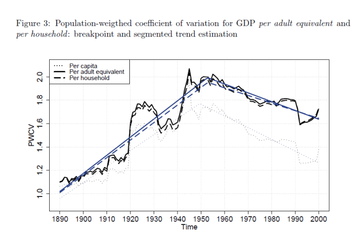
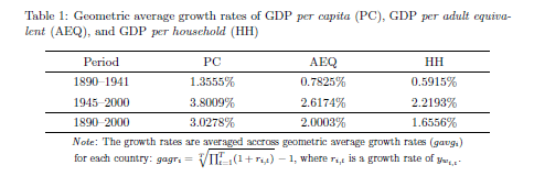
For OECD countries, we find that the adjusted income figures increased a third less than the unadjusted per capita figures (see table below). This suggests a more modest growth trend. In addition, we also find that up to the structural break in variations between countries (NDLR: divergence between OECD countries increased to around 1950) there was more divergence with the adjusted figures than with the unadjusted figures (see figure below). We also find that since the break point, there has been less convergence than previously estimated.

While the paper is presented as a note, the point is simple and suggests that those who study convergence between regions or countries should consider the role of demography more carefully in their work.

GrowthHouseholdSize

ConvergenceHouseholdSize.png

Eye Candy: the US Asian population, circa 2010

NOL map US Asian population
Click here to zoom

“Asian” is a pretty broad term. Racial classifications are, perhaps, the dumbest thing in the world.

Imagine seeing something like this in the press today, or this as an advertisement. There’s been lots of progress in this country, it’s just hard to see sometimes.

Nightcap

  1. China’s Christianity problem (and Islam too) Ian Johnson, NY Times
  2. An Indian Merchant in Marseilles, 1792 Blake Smith, the Appendix
  3. The Island Where France’s Colonial Legacy Lives On Maddy Crowell, the Atlantic
  4. The Ugly Critique of Chick-Fil-A’s Christianity Stephen L. Carter, Bloomberg View

Nightcap

  1. One of the 19th century’s most mysterious and eccentric figures Rhys Griffiths, Public Domain Review
  2. Internationalists are more libertarian than non-interventionists Isabel Hull, London Review of Books
  3. Why is the US military all over Africa? Eric Schewe, JSTOR Daily
  4. California is a model for divorce, not domination David French, National Review

Life expectancy at birth is not a predictor of health care efficiency…

This is going to be a short post to argue that pundits (and some economists) need to stop quoting life expectancy figures to argue for/against a particular health care system. This belief is best exemplified in a recent paper in the Journal of the American Medical Association where Papanicolas et al. (2018)  point out that the United States “spent nearly twice as much as 10 high-income countries (…) and performed less well on many population health outcomes”. While the authors make good points about administrative costs, they point out that the US has a low level of life expectancy.

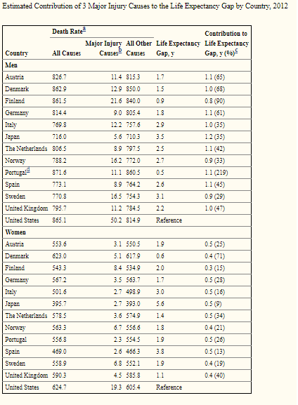
Sure, that is actually true – but Americans tend to die in greater proportions from homicides, drug overdoses and car accidents (Americans drive more than Europeans) than in other rich countries. While these factors of mortality are tragic (except car accidents since Americans seem to prefer the benefits of mobility to the safety of not driving), they are in no way related to the efficiency of health care provision. How much of a deal are these in explaining differences with other industrialized countries? A pretty big deal.  For example, these three factors alone account for 64% of the male life expectancy gap between Austria and the United States (see table reproduced below). For women, 26% of the gap between Austria and the United States is explained by these three factors.

The study I cite here only includes three factors. If you add in other factors like drownings among youths (Americans tend to have more drownings than several industrialized countries) which is a result of the fact that Americans are richer and can afford pools (while Europeans tend not to), then you keep explaining away the difference.  This is not to say that American health care is great. However, this says that American health care is not as bad as life expectancy outcomes suggest.

Mortality


On demography and living standards in the colonial era

This is a topic that has been bugging me. Very often, historians will (accurately) point out mortality statistics in the United States, Canada (Quebec) and the Latin America during the colonial era were better than in the comparable Old World (comparing French with French, British with British, Spanish with Spanish). However, they will argue that this is evidence that living standards were higher. This is where I wish to make an important nuance.

Settlement colonies (so, here there is a bigger focus on North America, but it applies to smaller extent to Latin America which I am more tempt to label as extractive – see here) are generally frontier economies. This means that they are small economies because of small populations.  This means that labor and capital are scarce relative to land. All outputs that come from the relatively abundant factor will thus tend to be cheaper if there is little international trade for the goods that they are best at producing. The colonial period pretty much fits that bill. The American and Canadian colonies were basically agricultural colonies, but very few of those agricultural outputs actually crossed the Atlantic. As such, agricultural produces were cheap. This is akin to saying that nutrition was cheap.

This, by definition, will give settlement colonies an advantage in terms of biological living standards. As they are not international price takers, wheat is cheaper than in the old world. This is why James Lemon spoke of the New World as the “Best poor man’s country” (I love that expression) : it was easy to earn subsistence. However, beyond that it is very hard to go beyond. For example, in my dissertation (articles still in consideration at Cliometrica and Canadian Journal of Economics) I found that when wages were deflated by a subsistence basket containing very few services and manufactured goods and which relied heavily on untransformed foods, Canada was richer than the richest city of France. Once you shifted to a basket that marginally increased transformed goods and manufactured goods, the advantage was wiped away.

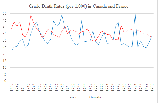
Yet, everything indicates that mortality rates were greater in Paris and France and than in Quebec City and Quebec as a whole (but not by a lot) (see images below).  Similar gaps seem to exist for the United States relative to Britain, but the data is not as rich as for Quebec. However, the data that exists for New England suggests that death rates were lower than in England but the “bare bones” real incomes measured by Lindert and Williamson show that New England may have been poorer than Great Britain (not by much though).

Crude Death Rates

IMR

I am not saying that demographic and biological data is worthless. Quite the contrary (even I wanted to, I could not since I have a paper on the heights of French-Canadians from 1780 to 1830)! The point is that data matters in context.  The world is full of small non-linearities between variables. While “good” demographic outcomes are generally tracking “good” economic outcomes, there are contexts where this may be a weaker relation (curvilinear relations between variables). I think that this is a good example of that point.

Where is the optimal marriage market?

I have spent the past few weeks playing around with where the optimal marriage market is and thought NoL might want to offer their two cents.

At first my instinct was that a large city like New York or Tokyo would be best. If you have a larger market, your chances of finding a best mate should also increase. This is assuming that transaction costs are minimal though. I have no doubt that larger cities present the possibility of a better match being present in the dating pool.

However it also means that the cost of sorting through the bad ones is harder. There is also the possibility that you have already met your best match, but turned them down in the false belief that someone better was out there. It’s hard to buy a car that we will use for a few years due to the lemon problem. Finding a spouse to spend decades with is infinitely harder.

In comparison a small town information about potential matches is relatively easy to find. If you’re from a small town and have known most people since their school days, you have better information about the type of person they are. What makes someone a fun date is not always the same thing that makes them a golf spouse. You may be constrained in who you have in your market, but you can avoid lemons more easily.

Is the optimal market then a mid sized city like Denver or Kansas City? Large enough to give you a large pool of potential matches, but small enough that you can sort through with minimal costs?

P.S. A friend has pointed out that cities/towns with large student populations or military bases are double edged swords for those looking to marry. On the one hand they supply large numbers of dating age youths. On the other hand, you would not want to marry a 19 year old who is still figuring out what they want to major in.

Wedding date and superstitions

There is a neat new paper in the most recent edition of the Journal of Population Research by Gabriele Ruiu and Marco Breschi on wedding dates and superstitutions in Italy. Here is the abstract:

In Italy, it is believed that Tuesdays and Fridays are particularly unlucky days for weddings as well as the 17th day of each month. Previous studies realized in the aftermath of the Second World War have shown the strong influence that these superstitions had in determining the wedding dates in the entire country. We have used exhaustive data collection of all marriages celebrated in Italy in the years 2007–2009 to investigate whether superstitions are still able to influence the choices of spouses. We find that this influence is still present after the great economic, social and demographic transformation of Italian society. We also show that a wife’s education reduces the influence of superstition on the choice of the date of marriage while those who opt for a religious rite are also those who are more careful in avoiding inauspicious days.

On 7 million deaths from air pollution

ATTN published a video of An-huld (the really cool guy who made my childhood by being in all my favorite action movies like Predator* and who ended up being the governor of California). In that short clip, Schwarznegger starts by saying that 7 million individuals die from pollution-related illnesses.

That number is correct. But it is misleading.

People see pollution as “all and the same”. But some forms of pollution increase with development (sulfur emissions and some would argue that too much CO2 emissions is pollution as it causes climate change). However, others drop dramatically – especially heavy particules (Pm10) which are a great cause of smog. Julian Simon (the late cornucopian economist who is one my greatest intellectual influence) pointed out this issue and noted that the deadliest forms of pollution are those that relate to underdevelopment.

Back in 2003, Jack Hollander published the Real Environmental Crisis: Why Poverty, Not Affluence is the Environment’s Number One Enemy. Hollander pointed out that simply from the combustion of organic matter (read: firewood and animal manure – literally burning fecal matter) indoors for the purposes of heating, cooking and lighting was responsible for close to 2 millions deaths.

Since then, the WHO came out with a study pointing out that around 3 billion people cook and heat their homes with open fires and stoves that rely on biomass or anthracite-coal. They put the number of premature deaths directly resulting from this at over 4 million people. This is close to 60% of the figure cited by the former President of California (yes, I know he was governor – see here). In other words, 60% of the people who die prematurely as a result of strokes, ischaemic heart diseases, chronic obstructive pulmonary diseases and lung cancers can be attributed to indoor air pollution. That means pollution resulting from the fact that you are so poor that you have to burn anything at hand at the cost of your health.

True, richer countries pollute and there are policy solutions (I have often argued that governments are better at polluting than at reducing pollution, but that is another debate) that should be adopted. But, these forms of pollution do not harm human life as much as those that come with poverty.

* By the way, when you watch Predator, do you realize that there are two future American governors in that movie? I mean, imagine that when Predator came out, some dude from the future told you that two of the main actors would end governing American states. Pretty freaky!

How Well Has Cuba Managed To Improve Health Outcomes? (part 3)

As part of my series of blog post reconsidering health outcomes in Cuba, I argued that other countries were able to generate substantial improvements in life expectancy even if Cuba is at the top. Then I pointed out that non-health related measures made Cubans so poor as to create a paradoxical outcome of depressing mortality (Cubans don’t have cars, they don’t get in car accidents, life expectancy is higher which is not an indicator of health care performance). Today, I move to the hardest topic to obtain information on: refugees.

I have spent the last few weeks trying to understand how the Cuban refugees are counted in the life tables. After scouring the website of the World Health Organization and the archives of Statistics Canada during my winter break, I could not find the answer.  And it matters. A lot.

To be clear, a life table shows the probability that an individual of age will die by age X+1 (known as Qx). With a life table, you will obtain age-specific death rates(known as Mx), life expectancy at different points and life expectancy at birth (Lx)(Where x is age). Basically, this is the most important tool a demographer can possess. Without something like that, its hard to say anything meaningful in terms of demographic comparison (although not impossible).The most common method of building such a table is known as a “static” method where we either compare the population structure by age at a single point in time or where we evaluate the age of deaths (which we can compare with the number of persons of each group alive – Ax). The problem with such methods is that static life tables need to be frequently updated because we are assuming stable age structure.

When there is important migration, Qx becomes is not “mortality” but merely the chance of exiting the population either by death of migration. When there are important waves of migration (in or out), one must account for age of the entering/departing population to arrive at a proper estimates of “exits” from the population at each age point that separate exits by deaths or exits (entries) by migration.

As a result, migration – especially if large – creates two problems in life tables. It changes the age structure of the population and so, the table must be frequently updated in order to get Ax right. It also changes the structure of mortality (exits). (However, this is only a problem if the age structure of migrants is different from the age structure of the overall population).

Since 2005, the annual number of migrants from Cuba to the United States has fluctuated between 10,000 and 60,000. This means that, on an annual basis, 0.1% to 0.5% of Cuba’s population is leaving the country. This is not a negligible flow (in the past, the flow was much larger – sometimes reaching north of 1% of the population). Thus, the issue would matter to the estimation of life tables. The problem is we do not know how Cuba has accounted for migration on both mortality and the reference populations! More importantly, we do not know how those who die during migration are measured.

Eventually, Ax will be adjusted through census-based updates (so there will only be a drift between censuses). However, if the Cuban government counts all the migrants as alive as they arrive in a foreign country as if none died along the way, it is underestimating the number of deaths. Basically, when the deaths of refugees and emigrants are not adequately factored into survival schedules, mortality schedules are be biased downward (especially between censuses as a result of poor denominator) and life expectancy would be accordingly biased upward.

Now, I am willing to reconsider my opinion on this particular point if someone indicates some study that has escaped my gaze (my Spanish is very, to put it euphemistically, poor). However, when I am able to find such information for other Latin American countries like Chile or Costa Rica and not for Cuba, I am skeptical of the value of the health statistics that people cite.

The other parts of How Well Has Cuba Managed To Improve Health Outcomes?

  1. Life Expectancy Changes, 1960 to 2014
  2. Car ownership trends playing in favor of Cuba, but not a praiseworthy outcome