On quasi-rents and the minimum wage

Ryan Murphy of Southern Methodist University has a new article published in Economics Bulletin regarding the minimum wage and “quasi-rents”.  The argument made by Ryan has the advantage of theoretically fleshing out a point made by many skeptics of the new literature. Generally, the argument has been that in the short-term, the minimum wage may have minimal effects, but in the long-term, firms will adjust.

I tended, until Ryan’s article, to be more or less skeptic of the value of this counter-argument. My point has always been that the new literature (like the Dube-Lester-Reich paper) tends to act as a partial equilibrium story (focusing only on one sector only or one indicator). My view has always been very “Coasian” in the sense that there are transaction costs to adapting to any new minimum wage rate.

The height of the hike and what industries are primarily affected will determine the method of adjustments. Firms can cut on benefits, substitute between forms of labor (the minimum wage increases the supply of older workers which remplace younger inexperienced workers), hours or training. They can also, depending on the elasticity of demand for their products, increase prices or cut quality. They can also cut employment. All of these are channels of adjustment and they will be used differently depending on the context. They are all different expressions of the fact that the demand curve slopes downward. But each expression has costs to be used that are to be weighted against their benefits – which are highly circumstantial. For example, if I have a firm of two employees, I will not sacrifice half my workforce by firing a worker (thus sacrificing 50% of my output) for a 5% hike in the minimum wage. Not only would this be an over-reaction, but there are transaction costs for me to fire that worker : separation fees, emotional pain, learning what the employee was doing etc. Reducing his hours would be a safer adjustment.

Until there is a study that measures all of these adjustments channels at once, I am skeptical.

So where does Ryan’s story come in? Well, none of my arguments had a long-term component. They were largely void of any time dimension. While I am aware of research like those of Meer and WestClemens and Wither and Clemens regarding job growth patterns following minimum wage hikes, I always discounted that argument. I was always reluctant to engage in long-term reasoning because I felt it was conceding a point that ought not to be conceded even if that counter-point is valid.  I only used it to top up the rest of my argument. But Ryan introduced to me the concept of quasi-rents, of which I had vaguely heard during my undergraduate microeconomics class.

Basically, here is the argument about quasi-rents: in the short-term, there are rents to be extracted from fixed factors of productions. Firms need these quasi-rents to remain in business, but only in the long-run.  However, if labor can find a way to capture the rents in the short-run, they will get higher earnings and employers will not fire people as much. As a result, there is basically a reshuffling of the consumer surplus. However, in the long-run, nothing is fixed and firm owners can adjust by shifting to different production methods. Thus, they will reduce their future hirings. In Ryan’s words:

But the on-impact negative effects of minimum wages may be hidden. In the longer run, after the quasi-rent is dissipated, the owner would have the incentive to eventually switch from more labor-intensive methods to ones that are less globally efficient (this being the conventional “demand slopes down” result). More perniciously, the threat of future increases in the minimum wage may create regime uncertainty undermining a willingness to invest in the types of technology and capital complementary to low skilled labor, thereby reducing employment for low skilled workers. That is to say, the risk of the appropriation of quasi-rents can shift investment towards capital unlikely to be appropriated via the minimum wage. Repeated and arbitrary increases in the minimum wage worsen this risk. This is consistent with the recent shift towards long run effects of increases in the minimum wage, for instance Meer and West (2016).

This is exactly what Andrew Seltzer found for the introduction of the minimum wage during the Great Depression in certain American industries. In the short-term, the capital was more or less fixed and production methods could not be abandonned easily. In the long run, firms adapted and shifted production methods. This is why Ryan’s argument is convincing. It offers a theoretical explanation for the empirical results observed by Dube, Lester and Reich or Card and Krueger. It fits well with theories of imperfect markets (damn I hate that word that is basically saying that all markets have frictions) like those of Alan Manning (see his Monopsony in Motion here).

This is the kind of work on the minimum wage that, if measured, should force considerable requestionning on the part of minimum wage hike advocates.

Canadian Megatrends: Top 1% income share and median age

Statistics Canada just came up with a study on the top income share of the top 1% in Canada. As I have explained elsewhere, my view of inequality is that: a) it has increased; b) not as much as we think; c) a lot of the increase is from desirable factors (personal utility maximization differing from income maximization or international immigration) or neutral factors (demography, marriage); d) that the inequality that is worrisome stems either from birth or government manipulations of the market and; e) that those stemming from government manipulations, direct (like subsidizing firms) or indirect (like the war on drugs which means that a large number of individuals are jailed and then released with a “prison earnings penalty” which stymies their income levels and growth), are the easiest to fight.

The recent Statistics Canada study allows me to make my point again with regards to element C of my answer. As I looked at their series, all I could think was “median age”. A lot of the variations seem to be related to the median age of the population. I went back to the census data I had collected for my book and plotted it against the data. This is what it looks like.

medianage

Why would there be a relation? Well, each year you measure the income distribution, the demographic structure of that population changes. As it grows older, you have more people at the top of their earnings curve relative to those at the bottom. Not only that, but earnings curve seem elongated in recent times – we live longer and so some people work older as witnessed by increased labor force participation rates above a certain age closer to retirement. And the heights of the earnings curve are now higher than ever before while we also enter later into the labor market.

Now, I am not sure how much aging would “explain away” rising inequality in Canada, but there is no point denying that it does explain some of it away. But, I would not be surprised that a large part is explained away. Why am I saying that? Because of this paper on Norway’s age structure. 

In Norway, the median age in 1950 was much higher than it was in Canada back then and today, it is roughly the same as Canada (although Canada has had a steeper increase in inequality). And according to the paper on Norway, adjusting for composition bias in inequality measures caused by aging, eliminates entirely the upward trend in that country. In fact, it may even reverse the trend whereby inequality adjusted for age has actually declined over time. This is a powerful observation. Given that Canada has had a steeper increase in median age, this suggests that the increase in inequality might be simply the cause of a statistical artifice.

Summing up: the year of irrationality

Brandon says I’ve got one last chance to write his favorite post of the year. But it’s the end of a long semester and I’m brain dead, so I’m just going to free ride on his idea: a year end review. If I were to sum up the theme of this year in a word, that word would be irrational.

After 21 months of god awful presidential campaigning, we were finally left with a classic Kodos vs Kang election. The Democrats were certain that they could put forward any turd sandwich and beat Trump, but they ultimately lost out to populist outrage. Similar themes played out with Brexit, but I don’t know enough to comment.

Irrationality explains the Democrats, the Republicans, and the country as a whole. The world is complex, but big decisions have been made by simple people.

We aren’t equipped to manage the world’s complexity.

We aren’t made to have direct access to The Truth; we’re built to survive, so we get a filtered version of the truth that has tended to keep our ancestors out of trouble long enough to get laid. In other words, what seems sensible to each of us, may or may not be the truth. What we see with our own eyes may not be worth believing. We need more than simple observation to actually ferret out The Truth.

Our imperfect perceptions build on imperfect reasoning faculties to make imperfect folk economics. But what sounds sensible often overlooks important moving parts.

For every complex problem there is an answer that is clear, simple, and wrong.

Only a small minority of the population will ever have a strong grasp on any particularly complex thing. As surely as my mechanic will never become an expert in economics, I will never be able to do any real work on my car. The trouble arises when we expect me or my mechanic to try to run the country. The same logic applies to politicians, whose job (contrary to what your civics teacher thinks) is to get re-elected, not to be a master applied social scientist. (And as awful as democracy is, the alternative is just some other form of political competition… there is no philosopher king.)

But, of course, our imperfect perception and reasoning have gotten us this far. They’ve pulled us out of caves and onto the 100th floor of a skyscraper*. Because in many cases we get good enough feedback to learn a lot about how to accomplish things in our mysterious universe.

We’re limited in what we can do, but sometimes it’s worth trying something. The trouble is, I can do things that benefit me at your expense. And this is especially true in politics (also pollution–what they have in common is hot air!). But it’s not just the politicians who create externalities, it’s the electorate. The costs of my voting to outlaw gravity (the simplest way for me to lose a few pounds) are nil. But when too many of us share the same hare-brained idea, we can do some real harm. And many people share bad ideas that have real consequences.

Voting isn’t the only way to be politically engaged, and we face a similar problem in political discourse in general. A lot of Democrats are being sore losers about this election rather than learning and adapting. Trump promised he would have done the same had he lost. We’re basically doomed to have low-quality political discourse. It’s easy and feels (relatively) good to bemoan that the whole world is going to hell.

We’re facing rational irrationality. Everyone is simply counting on someone else to get their shit together, because each of us individually is more comfortable with our heads firmly up our asses.

It’s a classic tragedy of the commons and it should prompt us to find some way to minimize the harm of our lousy politics. We’ve been getting better at this over the centuries. Democracy means the levers of power can change hands peacefully. Liberalization has entailed extending civil and economic rights to a wider range of people. We need to continue in this vein. More freedom has allowed more peace and prosperity.


So what do we do? I’d argue that we should focus on general rules rather than trying to have flawed voters pick flawed politicians and hope for the best. I don’t mean “make all X following specifications a, b, and c.” I mean, if you’re mad, try and sue someone. We don’t need dense and exploitable regulations. We don’t need new commissions. We just need a way for people to deal with problems as they arise. Mind you, our court system (like the rest of our government) isn’t quite ready for a more sensible world. But we can’t be afraid to be a little Utopian when we’re planning for the long run. But let’s get back to my main point…

We live in an irrational world. And it makes sense that it’s that way; rationality is hard. We can see irrationality all around us, but we see it most where it’s cheapest: politics and Facebook. The trouble is, sometimes little harmless irrational acts add up to cause real harm. Let’s admit we’ve got a problem with irrationality in politics so we can get better.


*Although that’s only literally true in 17 cases.

Has Canada been Poorer than the US for so long?

A standard stylized fact in Canada is that we are poorer, on average, than the average American. This has been presented as a fact that is as steady as the northern star. But our evidence on Canadian incomes is pretty shoddy prior to 1870 (here I praise M.C. Urquhart for having designed a GNP series that covers from 1870 to 1926 and links up with the official national accounts even if I think there are some improvements that can be brought to measuring output from some key industries and get the deflator right). But what about anything before 1870? There are some estimates for Ontario from 1826 to 1851 by Lewis and Urquhart (great stuff), but Ontario was pretty much the high-income of Canada.

So, can we go further back? This is what my work is about (partially), and I just made available my results on Canadian living standards (proxied by Quebec where the vast majority of the population was) from 1688 to 1775 as captured by welfare ratios. So that’s pretty much the closest we can get to the “founding”. Below are my results derived from this paper. They show that the colonists in Canada were not very much richer than their counterparts in France with the basket meant to capture the meanest of subsistence and roughly equal to their counterparts in France with a basket that includes more manufactured goods like clothing and more alcohol. This explains why most migrants from France to Canada were “volunteered” (in the sense that they were pretty much reluctant migrants) for migration. But the key interesting result is that relative to New England – the poorest of the American colonies – it is poorer regardless of the basket used. Thus, there seems to be truth to the common logic about Canadians being always poorer than the Americans.

comparingcanadane

However, I am not fully convinced of my own results. This may surprise some. The reason is not that I do not trust my data (in fact, I think it is superior to most of what exists for the time given that I will be able to proceed to tons of other data). The reason is simple (and rarely discussed): natives.

Natives are always omitted from the stories of living standards. But they existed nonetheless. In terms of national accounts, if the British and French settlers dispossessed and killed natives, their welfare losses are just not computed. But the welfare losses of a musket shot to the head are real. I have always been convinced that if we could correct estimates of living standards to account for the living standards of natives, the picture would change terribly. The reason is two-fold. The first reason is that the historiography is pretty clear that while they were obviously not nice, the French were nicer than the British towards the Natives (at least until 1763 when the British shifted strategy). In fact, trade between French and Natives was very frequent and so it might be that for the whole population (natives + settlers), the French-area peoples enjoyed more growth and higher average levels. In the British colony, if the settlers killed and dispossessed natives, this is basically the British turning native capital stocks into their own capital stock or into consumption (which would enter settlers GDP but not change total GDP). In essence, this is basically a variation on the arguments of Robert Higgs with regards to measuring the American GDP in World War Two and Albrecht Ritschl on the German interwar growth. I am pretty sure that adjusting for the lives of natives would show a greater level for Canada leading to rough equality between the two colonies. However, I am not sure if the argument would cut that way (my guts say yes) since in their conjectural growth estimates, Mancall and Weiss show that with the natives included, their zero rate of income per capita growth turns into a positive rate.

Nonetheless, I still think that knowing that the settlers were better off in the US as an improvement over the current state of knowledge. Until ways to impute the value of native output and production are found, my current estimates are only a step forward, not the whole nine yards.

Minimum wage, measurements and incarceration rates

A few weeks ago, I published a blog post about how incarceration rates affect our measurement of the relative economic conditions of Blacks in America. My claim was that the statistics are hiding a reversal of the painfully achieved advances secured between 1870 and 1960. Basically, my claim was that those who (in greater numbers) found their ways to a prison cell tended to be at the bottom of the income distribution, were more susceptible to be unemployed and had lower wages. This creates a composition effect whereby the official surveys cream-skim the top of black wage, income and employment distributions.

But, could this problem also affect our measurement of the effects of minimum wage? Let me be clear before you continue ahead, I am just asking this question because I could find no satisfactory answer to (or even mention of) this issue.

In recent times, minimum wage surveys have tended to find some gains in earnings for some workers following increases in minimum wage rates. Regardless of how you look at the prison population, it increases  – albeit at a decelerating rate since the early 2000s – since the 1980s. Coincidentally, that starting point is also the point at which the famous Minimum Wage Study Commission was published (1981). That report basically cemented the point made by George Stigler (i.e. minimum wages are not desirable). That report surveyed the entire literature to summarize the amplitude of the effects. That literature encompassed articles written between the end of the Second World War and … well… 1981. If you look below at the graph, incarceration rates were more or less constant during that regime. Thus, if there were composition effects associated with surveys of wages, incomes and employment, they were more moderate than after 1981 when incarceration rates surged.

minwage

But, its also after 1981 that some papers began to find some positive effects of minimum wage increases. These studies took place under a growing composition problem in surveys of wages, incomes and employment. Take the famous Dube, Lester and Reich paper in the Review of Economics and Statistics  who used data from 1990 to 2006. During that period, the male incarceration rate surged from 297 per 100,000 to 501 per 100,000. I understand that DLR used a time fixed effect method, but would that be sufficient to at least deal with the issue of shifting labour supplied (it won’t for the data bias issues described notably by Bruce Western)

If we assume that those who are plausibly affected by minimum wages (i.e. lower income individuals) are also those more likely to end up in jail in the United States, then there is clearly a bias. As they are dropped from the labor market (or as they join the prison population), they leave only the workers least affected by the minimum wage inside the samples. That is one possibility.

The other possibility – which is that surveys do not suffer from a large composition, but which is not mutually exclusive to that composition problem – is that the growing prison population represents a year-over-year reduction in the labor supply which offsets the effects of hikes in the minimum wage (or maybe even eliminates them entirely if the shift is big enough).

minwage2

I have tried many variations of this google scholar research and went back to my copy of the Handbook of Labor Economics and my Economics of Inequality, Poverty and Discrimination  (a book worth reading by the way) and I found very little on this point. Very few scholars have considered the possibility of this problem (which implies a shift of the labor supply curve concurrent with minimum wage hikes and a composition problem where those affected are simply not measured anymore). Yet, I feel like this is a defensible claim. In England, where some studies also show minimal effects or positive effects of the minimum wage, there has also been an increase in the prison population. In contrast, Canada – whose prison population is declining moderately (meaning that the labor supply is increasing as the minimum wage is being increased – the studies do tend to find the “conventional” result.

Am I crazy or is this a case of poor measurement? Personally, I feel that there must an answer, but please tell me I did not just stumble on this!

Sensitive and Crucial: on Measuring Living Standards in the 18th Century

In the course of the twitterminar on the High-Wage Economy argument (HWE) which generated responses from John Styles on his blog (who has convinced me that the key solution to HWE rests in Normandy, not the Alsace) and many other on Twitter. In the course of that discussion, I skirted a point I have been meaning to make for a long time. However, I decided to avoid it because it is tangentially related to the HWE story. Its about how we measure living standards over space in the past.

Basically, the HWE story is a productivity story and all that matters in such a story is wage rates relative to other input prices. Because we’re talking about relatives, the importance of proper deflators is not that crucial. However, when you move beyond HWE and try to ask the question regarding absolute differences over space in living standards, the wage rates are not sufficient and proper deflators are needed.

They are many key issues to estimating living standards across space. The largest is that given that very few goods crossed borders in the past, converting American incomes into British sterling units using reported exchange rates would be rife with errors and calculating purchasing power parities would be complicated. The solution, very simple and elegant by its simplicity, is to rely on the logic of the poverty measures. Regardless of where you are, there is a poverty threshold. Then, all that is needed is to express incomes as the ratio of income to the poverty line. If the figure is three, then the average income buys three times the poverty line. Expressed as such, comparisons are easy to do. This is what Robert Allen did and it was basically a deeper and more complete approach than Fernand Braudel’s “Grain-Wages” (wage rates divided by grain prices).

Where should the line be?

While this represents a substantial improvement for economic historians like me who are deeply interested in “getting the data right”, there are flaws. In the course of my dissertation on living standards in Canada (see also my working papers here and here), I saw one such flaw in the form of how long the length of the work year was. In fact, a lot of my comments in this post were learned on the basis of Canada as an extreme outlier in terms of sensitivity. In Canada, winter is basically a huge preindustrial limitation on the ability to work year-round (thus, the expression mon pays ce n’est pas un pays, c’est l’hiver). But this flaw is only the tip of the iceberg. First of all, the winter means that the daily energy intake must substantially greater than 2,500 calories in order to maintain body mass. The mechanism through which the temperature increases the energy requirements of the human metabolism is in part the greater weight carried by the heavier clothing in addition to the energy needed by the body to maintain body temperature. At higher altitudes, these are compounded by the difference in air pressure.In their attempt to construct estimates of the living standards of Natives in the Canadian north during the fur trade era, Ann Carlos and Frank  Lewis assert that it is necessary to adjust the basket of comparison to include more calories for the natives given the climate – they assert that 3500 calories were needed rather 2500 calories for English workers.In Russia, Boris Mironov estimated that the average calories ingested stood at 2952 per day between 1865 and 1915 while the adult male had to consume 3204 calories per day. In Canada in the 18th century, it was estimated that patients at the Augustines hospital in Quebec City required somewhere 2628 calories and 3504 calories per day while soldiers consumed on average 2958 calories per day and the average population consumed 2845 calories per day (see my papers linked up above).  The range of calorie requirements for soldiers (which I took from a reference inside my little sister’s military stuff) is quite large: from 3,100 in the desert at 33 degrees Celsius to 4,900 in artic conditions (minus 34 degrees Celsius) – a 58% difference. So basically, when we create welfare ratios for someone in, say, Mexico, the calories needed in the basket should be lower than in the Canadian basket.

Another issue, of greater importance, is the role of fuel. In the welfare ratios commonly used, fuel is alloted at 2MBTU for the basic level of sustenance which. This is woefully insufficient even in moderately warm countries, let alone Canada. My estimates of fuel consumption in Canada is that the worst case hovers around 20MBTU (ten times above the assumption) if the most inefficient form of combustion (important losses) and the worst kind of wood possible (red pine). Similar levels are observed for the American colonies.

Combined together, these corrections suggest that the Canadian poverty threshold should be higher than the one observed in France, England, South Carolina or Argentina. These adjustments can more or less be easily made by using military manuals. The army measures the basic calories requirements for all types of military theaters.

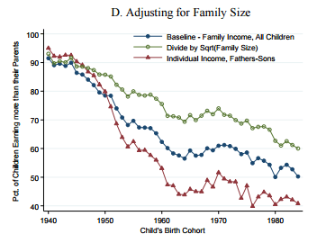
How to factor in family size and use equivalence scales. 

Equivalence scales refer to the role of family size. Given the same income, families of different size will have different levels of welfare. Thanks to economies of scale in housing, cooking, lighting and heating, larger households can get more utility out of one dollar of income. That adjustments are required to render different households comparable is well accepted amongst economists. However, given the sensitivity of any analysis to the assumptions underlying any adjustments, there is an important debate to be had.

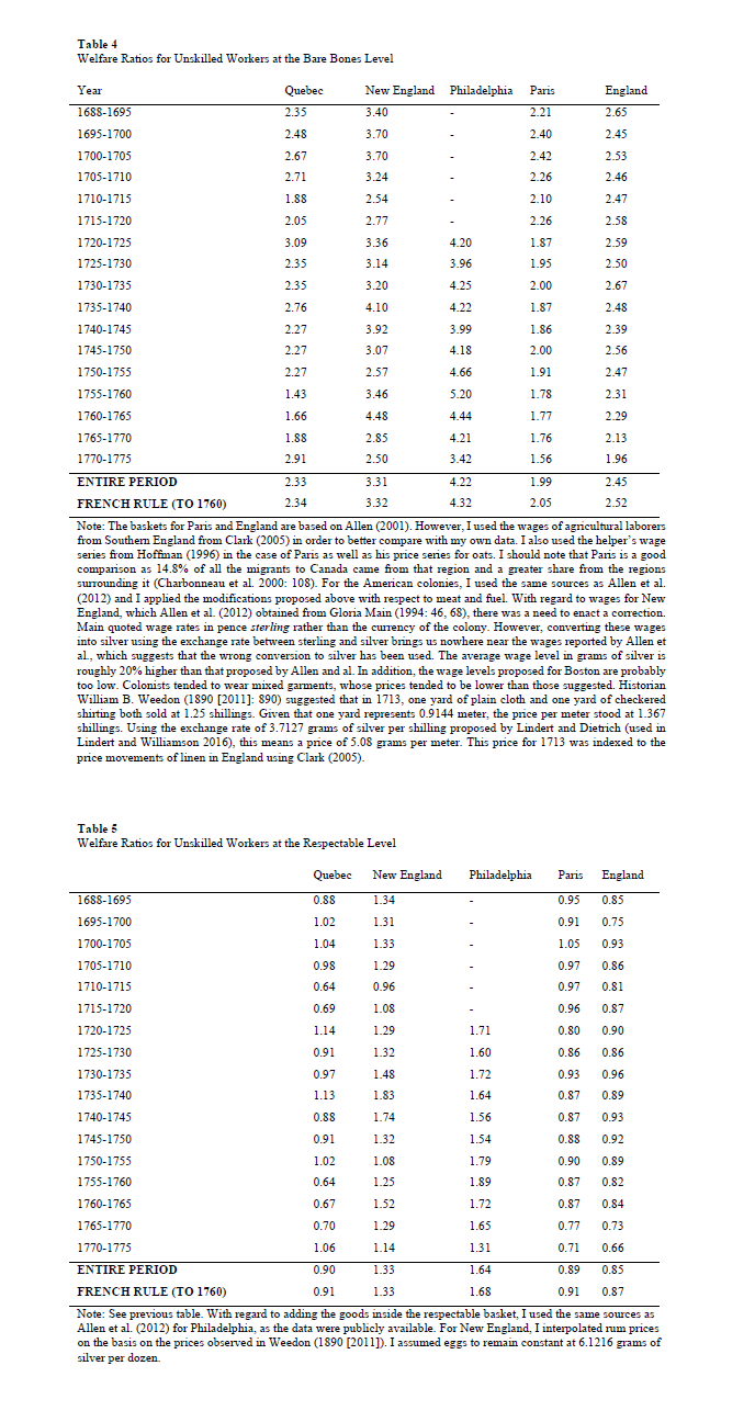
The convention among economic historians has been to assume that households have three adult equivalents. This assumption has gone largely undiscussed. The problem is “which scale to use”. The conversion into adult equivalents is subject to debates. Broadly speaking, three approaches exist. The first uses the square root of the number of individuals. The second attributes the full weight of the first adult, half the weight of the second adult and 30% for each child. This approach is commonly used by the OECD, Statistics Canada and numerous government agencies in Canada The third approach is the one used by the National Academy of Sciences in the United States which proposed to use an exponent ranging between 0.65 and 0.75 to household size but only after having multiplied the number of children by 0.7. As a result, a family of four (two parents, two infants) can have either 2 adult equivalents (square root), 2.1 adult equivalents (OECD and Statistics Canada approach) or 2.36 adult equivalent (NAS approach). The differences relative to the square roots approach are 5% and 18%. If we move to a family of 6 persons, the differences increase to 10.22% and 34.72%.  If we are comparing regions with identical family structures, this would not be a problem. If not, then it is an issue. The selection of one method over another would have important effect on the cost of the living basket, with the NAS approach showing the costliest basket. Using a method relatively close to that of the OECD (although not exactly that measure), Eric Schneider found that the relatively small size of families in England led Allen to underestimate living standards. In a more recent paper, Allen alongside Schneider and Murphy pointed out that extending Schneider’s analysis to Latin America where “family sizes were likely larger (…) than in England and British North America” would amplify the wage gap between the two regions.

familysize

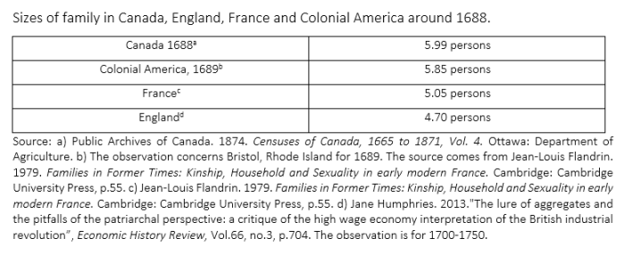
The table above shows how much family size varied around the late 17th century across region. Clearly, this is a non-negligible issue.

Sensitivity of estimates

Just to see how much these points matter, let’s modify for two easily modifiable factors: household size (given the numbers above) and fuel requirements (calories from food are harder to adjust for and I am still in the process of doing that). Let’s recompute the welfare ratios (those classified as bare bones) of Canada (the outlier) relative to the other according to different changes circa the end of the 17th century. How much does it matter?

Comparing New World places like Canada and Boston does not change much – they are more or less similar (family size and relative price-wise). However, just adjusting for family size eliminates a quarter of the gap between Canada and Paris (from 61% to somewhere 43.9% and 49.5%). Then, the adjustment for the fact that it is freezing cold in Canada eliminates a little more than half the advantage Canada enjoyed. So roughly two third of the Canadian advantage over Paris (the richest place in France) is eliminated by adjusting for family size and fuel consumption without adjusting for food requirements. However, family size does not affect dramatically the comparison between Paris and London (regardless of whether we use the Allen figures or the Stephenson-Adjusted figures).  Thus, most of the sensitivity issues are related to comparing the New World with the Old World. effectofcorrections

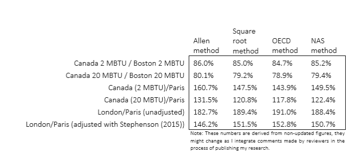
Still, there are some appreciable differences from family structures within Europe (i.e. the Old World) that may alter the relative positions.  For example, Ireland had much larger families than England in the 18th century (see here – the authors shared their dataset with me and a co-author): in 1700, England & Wales had an average household size of 4.7 compared with 5.32 in Ireland. That would moderately disrupt the comparison. Not as much as comparison between the New World and Old World, but enough to make cautious about European differences.

Conclusion

I have seen many discussions regarding the sensitivity of welfare ratios in numerous papers. I am not attempting to make my present point into some form of revolutionary issue. However, all the sensitivity estimates were concentrated on a case or another and they all concern a specific problem. No one has gathered all the problems in one place and provided a “range of estimates”. Maybe its time to go in that direction so that we know which place was poor and which was not (relative to one another, since anything preindustrial was basically dirt-poor by our modern standards).

On Capitalism and Slavery : Pêle-Mêle Comments

Last week, a debate was initiated via an article in the Chronicle of Higher Education that relates to the clash between historians and economists over the topic of slavery. The debate seems acrimonious given the article and at the reading of a special issue of the Journal of Economic History regarding the Half has never been told by Edward Baptist, its hard to conclude otherwise. Pseudoerasmus published comments on the issue in a series of posts and a Trumpian twitterstorm (although the quality is far from being Trumpian). I find myself largely in agreement with him in response to the historians, but there are some pêle-mêle points that I felt I needed to add.

On Historians Versus Economists

To be honest, when I took my first classes in economic history, it seemed clear that there were important points that were agreed upon in the literature on slavery. The first was that the accounting profitability of slavery was not the same as the economic profitability (think opportunity cost here) of slavery. Thus, it was possible that (concentrating on the US here) the peculiar institution could more or less thrive regardless of the social costs it imposed (i.e. slavery is a tax on leisure which also increases the expropriation rate from slaves, and non-slaveowners often had to shoulder the cost of enforcing the institution). This argument is not at all new; in fact it is basically a public choice argument that Gordon Tullock and Anne Krueger could have signed on to without skipping a heartbeat (see Sheilagh Ogilvie – one of my favorite economist who does history in equality with Jane Humphries). The second point of agreement is that no one agreed on how to measure the productivity of slavery in the United States and the distribution of its costs and gains. The second point has been a very deep methodological debate which related to the method of measuring productivity (CES vs Translog TFP – stuff that would make your head blow and which also lead to the self-invitation of the Cambridge Capital Controversy to the debate). The quality of the data has been at the centre-stage as well, and datasets on slave prices, attributes, tasks and many other variables are still being collected (see notably the breathtaking work of Rhode and Olmsted here and here).

Thus, I will admit to being unimpressed by the use of oral histories to contest that literature. In addition, the absence of theory in Baptist’s work yields an underwhelming argument. Oral histories are super-duper important. The work of Jane Humphries on child labor is a case in point of the need to use oral histories. She very carefully used the tales told by children who worked during the industrial revolution to document how labor markets for children worked. The story she told was nuanced, carefully argued and supported by other primary evidence. This is economic history at its best – a merger of cliometrician and historian. In fact, while this is an evaluation that is subjective, the best economists are also historians and vice-versa. The reason for that is the mix of theory with multiple forms of evidence. But they key is to have a theory to guide the analysis.

Unexpectedly for some, the best exposition of this argument comes from Ludwig von Mises in his unknown book Theory and HistoryI was made aware of that book in a discussion with Chris Coyne of George Mason University and I proceeded to reading it. I was surprised how many similarities there were between the Mises who wrote that book and the Douglass Norths and the Robert Fogels of this world. The core argument of Theory and History is that axiomatic statements can be applied to historical events. The goal of historians and economic historians is to sort which theory applies. For example, the theory of signaling and the theory of asymmetric information are both axiomatically true. Without the need for evidence, we know that they must exist. The question of an economic historian becomes to ask “did it matter”? Both theories can compete to offset each other: if signaling is cheap, then asymmetric information can be solved; if it is not, asymmetric information is a problem. Or both may be irrelevant to a given historical development. To explain which two axiomatic statements apply to the event (and in what dosage), you need data (quantitative and qualitative). Thus, Theory and History actually proposes the use of econometrics and statistical methods because it does not try to predict as much as it tries to a) sort which axiomatic statements applied; b) the relative strengths of competing forces; c) the counterfactual scenario.

Without theory, all you have is Baptist’s descriptions which tell us very little and can, incidentally, be distorted by he who recounts the tales he read.

On the Culture of Peasants/Slaves/Slaveowners

When I started my PhD dissertation Canadian economic history, the most annoying thing I saw was the claim that the French-Canadians had “different mentalities” or “more conservative outlooks”. This was basically the way of calling them stupid. This has recently evolved to say that they “maximized goals other than wealth”. Regardless, this was basically: the French-Canadian was not culturally suited for economic development.

But culture is not a fixed variable, it is not an exogenous variable. Culture is basically the coherent framework built by individuals who share certain features to “cut out” the noise. Everyday, we are bombarded with tons of pieces of information and there is no way that the human brain can process them all. Thus, we have a framework – culture (ideology does the same thing) – which tells us what is relevant and what is irrelevant and what interpretation to give to relevant information.

People can cling to old beliefs for a long time, but only if there is no cost to them. I can persist in terrible farming practices if I am not made aware of the proper valuation of the opportunity I am foregoing. For example, British farmers who arrived in Quebec in the 19th century tended to use oxen as they did in England for tilling the soil. They had probably been taught to do that by their parents who learnt it from their grandparents because it was part of the farming culture of England. The behavior was culturally inherited. However, when they saw that the French-Canadians were using horses and that horses – in the Canadian hinterland – got the job done better, they shifted. The culture changed at the sight of how important was the foregone opportunity by continuing to use oxen. Where the British and the French co-existed, both were equally good farmers. Where they could not observe each other, they were all sub-optimal farmers. Seeing the other methods forced changes in culture.

The same applies to slaveowners and slaves! Slaveowners were a more or less tightly knit group that frequented similar circles and were constantly on the lookout to increase productivity. If some master had noticed that he could increase production by whipping more slaves, why would he not adopt this method? Why would he leave 100$ bill on the street? Why did the masters growing cotton in South Carolina not adopt the method of whipping adopted by growers in Louisiana? Without a theory of how culture changes (and what purposes it serves beyond the simplistic Marxist power structure argument), there is no answer to this question. With the work of Rhode and Olmstead, there is an answer: the type of cotton that had higher yields was not suited for growing everywhere! In this case, we are applying my comment from the section above on Historians versus Economists. There are competing theories of explaining increasing output: either some slave masters were unable to observe the other slave masters and adopt the torture methods they had (which would need to be the case for Baptist to be right) or there were biological limitations to growing the better crops in some areas (Rhode and Olmstead).

Two competing theories (they are not mutually exclusive though) that can be tested with data and they set a counterfactual. That is why you need theory to make good history.

One last thing: slave owners were not capitalists

This is probably the most childish thing to come out of works like those of Baptist: to assert that because slaves were capital assets, that the owners were capitalists. That is true if you want to adhere to the inconsistent (and self-contradicting) Marxist approach to capital. In fact, as Phil Magness pointed out to me, slave owners were not free market types. They were very much anti-capitalists. Slavery apologists like Fitzhugh and Carlyle were even more anti-capitalists than that. It’s not because you own capital that you are a capitalist unless you adhere to Marxist theory.

But, capital is just a production input. Its value depends on what it can produce. As Jeffrey Hummel pointed out, there is a deadweight loss from slavery: enforcement costs, the overproduction of cotton because slavery is basically a tax on leisure and the implicit taxation of the output produced by slaves. All three of these factors would have slowed down economic growth in the south. Thus, as capital assets, slaves were relatively inefficient.

How Well Has Cuba Managed To Improve Health Outcomes? (part 1)

Since the passing of Fidel Castro, I have devoted myself to researching a proper assessment of his regime’s achievements in matters of health care. The more I dig, the more I am convinced that his regime has basically been incredibly brilliant at presenting a favorable portrait. The tweaking of the statistics is not blatant or gigantic, it is sufficiently small to avoid alerting demographers (unlike when Davis and Feshbach, Eberstadt and Miller and Velkoff found considerable evidence of data tweaking in the USSR which raised a massive debate). Indeed, a re-computation of life expectancy based on life tables (which I will present in the new few weeks) to adjust for the false reclassification of early neonatal deaths as late fetal deaths (raising the low infant mortality rate by somewhere 28% and 96%) suggests that somewhere between 0.1 and 0.3 years must be knocked off the life expectancy figures. Given that the variations between different measurements available (WHO, World Bank, MINISAP, CIA, FAO) are roughly of that magnitude, it falls within a very reasonable range of errors. This statistical tweaking is combined with an over-dramatization of how terrible the situation was in 1959 (the life expectancy figures vary from 63.9 years to 65.4 years at the beggining of the Castrist regime). But that tweaking is not sufficient to invalidate the massive downward trend.  As a result, the majority of public health scholars seem confident in the overall level and trend (and I tend to concur with that statement even if I think things are worse than presented and the slope of the downward trend is too steep).

Those little tweaks have been combined with the use of massive coercive measures on the local population (beautifully described  by Katherine Hirschfeld in what should be an example of ethnographic work that economists and policy-makers should rely on because it goes behind the data – see her book Health, Politics, and Revolution in Cuba: 1898-2005) that go from using doctors as tools for political monitoring to the use of abortion against a mother’s will if it may hinder a physician’s chance of reaching the centrally-decided target without forgetting forced isolations for some infectious patients. Such methods are efficient at fighting some types of diseases, but they are associated with institutions that are unable to provide much economic growth which may act as a palliative counter-effects to how choices may make us less healthy (me having the freedom to eat too much salt means I can die earlier, but the type of institutions that let me eat that much salt also avoid infringing on my property rights thus allowing me to improve living standards which is the palliative counter-effect).  With such a trade-off, the issue becomes one of the ability of poor countries to improve in the absence of extreme violence as that applied by the Castrist regime.

Over the next few weeks, I will publish many re-computations of health statistics to sustain this argument as I write my article.  The first one I am doing is the evolution of life expectancy from 1960 to 2014. What I did is that I created comparatives for Cuba based on how much living standards (income per capita). Cuban living less than doubled over that 49 years period (82% increase) from 1959 to 2008 (the latest available data from the high-quality Maddison data).  Latin American and Carribean countries that saw their living standards less than double (or even decline) are Argentina (+90%), Bolivia (+87%), El Salvador (+68%), Haïti (-33%), Honduras (+71%), Jamaica (+51%), Nicaragua (-17%) and Venezuela (+7%). This forms the low income group. The remaining countries available are separated in two groups: those whose income increased between 100% and 200% (the mid-income group composed of Brazil, Colombia, Mexico, Peru, Uruguay, Ecuador, Guatemala, Panama and Paraguay) and those whose incomes increased more than 300% (the high-income group composed Chile, Costa Rica, Dominican Republic, Puerto Rico and Trinidad & Tobago).  I also compared Cuba with a group of countries that had incomes per capita within 20% of the income per capita of Cuba.  So, how did Cuba’s life expectancy increase?

Well, using only the official statistics (which I do not fully trust although they are from the World Bank Development Indicators Database), Cuba life expectancy (which was already pretty high by Latin American standards in 1959) increased 24%. However, all other countries – which were well below Cuba – saw faster increases. The countries that had the least growth in Latin America saw life expectancy increase 38% and the countries that were equally poor as Cuba saw life expectancy increase an impressive 42%. Chile, whose life expectancy was only 57.5 years against Cuba’s 63.9 in 1960, also increased more rapidly (also 42%) and it has now surpassed Cuba (81.5 years against 79.4 years) and what is more impressive is that this rate has increased in a monotonic fashion regardless of changes in political regimes (democracy, socialism, Pinochet, liberal democracy) while Cuba’s rate seems to accelerate and decelerate frequently. Now, this is assuming that the figures for 1960 are correct. I have surveyed the literature and it is hard to find a way to say which of the estimates is the best, but that of the World Bank for 1960 is the lowest. There are other rates, contained in McGuire and Frankel’s work – the highest stands at 65.4 years for 1960. That means that the range of increase of life expectancy in Cuba is between 21.4% and 24.2%. Its not earth-shattering, but it makes Cuba’s achievements less impressive (although it is impressive to keep increase life expectancy from an already-high level). But as you can see, more important improvements could have been generated without recourse to such violent means. In fact, as a post that I will publish this week shows, the decline in car ownership from 1959 to 1988 probably played moderately in favor of the increase in life expectancy while the massive increase in car ownership in all other countries played (all else being equal) in favor of slowing down the increases in life expectancy (but being too poor or making it illegal to import a foreign car is not health care and I deem it improper to consider that this accident from misfortune should be praised).

improvementslifeexpectancy

In a way, what I am saying is that the benefit is not as impressive as claimed. Given the costs that Cubans have to assume for such a policy, anything that makes the benefits look more modest should make more inclined to cast a damning judgment on Castro’s regime.

Coming up (I will add the links as they are published) :

  1. Life Expectancy Changes, 1960 to 2014
  2. Car ownership trends playing in favor of Cuba, but not a praiseworthy outcome
  3. Of Refugeees and Life Expectancy
  4. Changes in infant mortality
  5. Life expectancy at age 60-64
  6. Effect of recomputations of life expectancy
  7. Changes in net nutrition
  8. The evolution of stature
  9. Qualitative evidence on water access, sanitation, electricity and underground healthcare
  10. Human development as positive liberty (or why HDI is not a basic needs measure)

Inflation in Canada and the US since 1774

It is often said that Canada and the United States are very much alike, except for the fact that Canada has tons of French people (myself included) and free (TANSTAFL) healthcare. It is also often said that when the US economy catches a cold, Canada gets pneumonia.

From an economic historian’s perspective, this is a hard claim to swallow without making tons of nuances. Yes, economic conditions in Canada are heavily affected by those in the US. But, the evidence for that generally concerns the twentieth century. There is very little before that. The first pieces of evidence we have for Canada start only in the 1870s. In fact, that evidence is also subject to many caveats (my work with Michael Hinton suggests that the GDP deflator for Canada from 1870 to 1900 causes a considerable underestimation of Canadian economic growth during the period and that Canada).

Thus, we do not know if that was always true. To some extent, I am tempted to believe that this is true, but that it is has grown “truer” over time. Canada used to be geared towards Britain and Europe for a long time, but, progressively, it became more connected with the United States. Now, the Maddison project data shows that Canada in terms of GDP per capita converged towards that of the United States from the 1870s to the present day. Morris Altman produced revised estimates of Canadian GDP growth (here) that show a moderately steeper convergence between 1870 and 1929. Given the amount of capital movements between both countries, this is not really surprising (in fact, excluding Quebec from Canada brings the two countries closer together).  But again, we don’t go back further than 1870.

So, to see if this is the case, I decided to take my paper (online since yesterday) on creating a price index for Canada since 1688. Measuring Worth offers an American Price Index that starts in 1774. If the two economies began to become more interlinked, then a price index that goes back to the founding of the United States should do the trick. The result is below.

pricescorrelation

I organized the data by time period and it seems that the rates are generally correlated (which you would expect since global monetary conditions do suggest some long-terms similarities in terms of price trends – I have many reservations about the book I am citing here, but it gets the empirical point across). However, the dispersion seems to collapse over time. As we move from the colonial era to the modern era, inflation rates get more tightly grouped together. Free trade, lower transport costs, central bank policy, capital mobility and labor mobility would have factored in to mean that things become more tightly knit.

It does seem like Canada and the US became more interdependent over time.

I have more to come on this!

The most depressing thing with Chetty et al.

The Chetty et al. paper has been on my mind over the weekend (see Saturday’s post). The one thing that has moved more or less in line with the absolute mobility measure of Chetty et al. has been…the size of government.

I know that as soon as some of you read the last four words on the previous paragraphs, your eyes rolled. However, even from a social-democratic perspective, it is depressing! It is not the first time I make this observation.   In the pages of Essays in Economic and Business HistoryI recently reviewed Unequal Gains (authored by Peter Lindert and Jeffrey Williamson and published at Princeton University Press) and I observed that the “great leveling” they observed from the 1910s to the 1970s had a lot to do with the northward migration of American blacks, the closing of the gender wage gap and the convergence of the southern states. I also observed that the increase in inequality in the United States after 1970 occurred at the same time as an the state grew more in size and scope (see blog post here).

However, as I mentioned elsewhere, I am very skeptical of the tax-based data on inequality in the United States and I am afraid to push that point. However, the Chetty et al. data provides further confirmation: trends in inequality/social mobility deteriorates as the state becomes more active (see the graph below).

sizegov

Now, I am aware that the causality can cut both ways. It may be that inequality (economic mobility) is rising (falling) in spite of increasing state action, it may be that state action is fueling the the rise (reduction) of inequality (economic mobility) or it may be that the state has no effects whatsoever on the evolution. Regardless of which of the three viewpoints you tend to adopt (I lean towards a mixture the second option – see my paper with Steve Horwitz here which is under consideration for publication), the implications are immensely depressing with regards to social policy in the last 75 years.

Chetty et al and the metamorphosis of the earnings curve

The Chetty et al. paper is probably one of the most important papers of 2016 and it will long be debated. Many comments have been made on this and I need to reiterate that I do not believe the trend to be off, merely the level. I have just found another reason to doubt the level by thinking about demography. It relates to one key methodological decision made in the paper: taking the income of parents in the 25 to 35 years old age-window. This is a fixed window where their incomes are compared to that of a child at age 30.

This is probably a flaw that alters the level evolution importantly. My argument is simple. A person born in 1940 was, by the time he was 30, close to his peak earning point. A person born in 1980, by the time he is 30, is further away from a higher peak earning point. Thus, you are not comparing the same type of birth cohorts. In simpler terms, I am saying that with the 1940 birth cohort you are comparing children who, by age 30, were at the apex of their earnings while those of the 1980 birth cohort were not at the apex.

From the work of Ransom and Sutch on the economic history of aging in the United States, I remembered that graph (for late 19th century Michigan).  What I see is that for most workers, by 30 years of age, they are pretty much at the top of their earnings cure. Over time, if the shape of the curve does not change and simply keeps moving upwards, then there are no problems with the level of absolute mobility measured by Chetty et al.

earningfunctionsusa1890

But here is the problem, the curve does change shape! There are no longer flat lines like that of the Michigan farm laborers in the figure above. Earnings curve look more and more like that of the Michigan railroad employees. Not only that, the peak point is now higher in terms of income and at a further point in time. And that makes sense since we are studying longer and working menial jobs while we do for which we earn low incomes. When we enter the labor force, we get a very steep rise at a later point in our lives than our fathers or mothers did. So the earning curve of younger cohorts is more skewed than that of earlier cohorts. Kitov and Kitov shows the evolution of income by age groups relative to a fixed groups and as one can see, the youngest are getting further away from the peak over time – implying that it is shifting.  Again, from Kitov and Kitov, you can see that the 2013 curve starts later and has a steeper curve than the 1967 curve. From this trend in the earnings curve, we can more or less be certain that by 30, a person born in 1940 was closer to peak earnings than a person born in 1980. Thus, the person born in 1940 is at his apex (by the time he turns 30) when compared to his parents and the person born in 1980 is not at his apex when compared to his parents. (I am only using Kitov and Kitov for the sake of showing the evolution but this metamorphosis of the curve, I think, is not in dispute).

So, by setting the boundaries for measuring absolute mobility at a fixed point, Chetty et al. are capturing some changes that are purely related to changing demographics of the labor market and not absolute mobility. The 1940 level of mobility is too high relative to that of 1980. Chetty et al. do try to address this by looking at different time windows (they just don’t have a “rolling age window” which would be ideal – like indexing to the median age of the population).

I do accept that mobility has fallen since 1940, but I am very skeptical about how robust the big drop shown actually is. The issues of changes in family size, price deflators, taxes and transfers made me willing to entertain a fall of 25-30 points (rather than 40-45), now with this issue of the metamorphosis of the earning curves in mind, I am inching towards 20-25 points drop (still substantial).

Note: Still a big fan of Chetty et al. and their works is crucial, that’s why I don’t want pundits to try and extract this beyond what it actually says and does not say.

Prices in Canada, 1688 to 2015

I have just finished my working paper creating a price index for Canada that covers the period from 1688 to 1850 in order to link with the existing datasets that cover up to 2015. Here is the result (and the paper is currently consideration for publication). The paper is here and it shows how much prices have changed in Canada since the late 17th century.

pricescanada

Sons outearning Fathers in Chetty et al. : working hours should be considered

In response to my post yesterday, my friend and economist/nuclear engineer (great mix) Laurent Béland pointed out that the Father-Sons mobility figures in Chetty et al. are depressing. Yes, at first glance, they are (see below – the red line). fathersons

But, at second glance, it is not as terrible. Think about family structures with the 1940 birth cohorts. The father works and, in most likelihood, the mother is a stay-at-home father. Most of the earnings come from the father who probably works 45 to 60 hours a week.  If my father earns 40,000$ at 60 hours a week or earn 40,000$ at 40 hours a week, the line remains at the same height, but we are not talking about the same living standard in reality. Chetty et al. do not account for hours worked to achieve income.  The steep decline – faster than the baseline of household-size adjusted decline – matches the steep increase in female labor force participation and the decline labor force participation of males (see graph here and Nicolas Eberstadt’s work here) as well as the decline in hours worked by males.

If the question had been “what are your chances of out-earning your father per hour worked”, then the red line would not have fallen like that. Income divided by labor supplied would probably bring the red-line back with the blue-line.

Note: Again, please note that I am not trying to rip apart Chetty et al. (as some have claimed elsewhere). Their work is great and as a guy who does all his research on providing data series regarding economic history, I am never going to rip on someone who does hard data work like Chetty et al. did ! My point is that I am not convinced that the decline is so big. And, in good faith, it seems that Chetty et al. do try to put the “caution” labels where its needed – and its important to discuss those caution labels before some politician or two-cents-pundit goes all Trump on us by saying stuff that this doesn’t say!

A flaw regarding the chance of “out-earning” your parents

When Raj Chetty publishes a paper, it generally comes with a splash. The last one is no exception. His paper (co-authored), picked up by David Leonhardt at the New York Times and Justin Wolfers on Twitter, basically measures the American dream : what are your chances to do better than your parents. The stunning conclusion is that someone born in 1940 had a 90%+ chance of “out-earning” his parents compared with a few points above 50% for those born in the 1980s. I am not convinced. Well, when I am not convinced, I am saying I am not convincing about how big the drop is! I think the drop is smoother (the slope of decline is gentler) and the starting point for the 1940 cohort is too high.  As a big fan of Chetty, I must press this point.

More precisely, I am saying that the bar (income threshold) over which someone had to jump in 1940 is underestimated and overestimated in 1980. Setting the bar too low (high) means very high (low) chances of “out-earning” your parents. To set the bar too low, you must underestimate (overestimate) the income of the parents.  This could occur if household economies of scale are not accounted for.

An income of 30,000$ for 3 persons is not the same as an income of 60,000$ for 6 peoples. On a per capita basis, the income is the same. But, if you adjust for economies of scale in housing and furnitures, there are differences (the simplest is square root).  This gives you income per adult equivalent. Chetty et al. are aware of that and they provided a sensitivity analysis which is not mentioned by those who are relaying the article. Since household size has tended to fall over time, the growth in per capita income is faster than the growth in income per adult equivalent (a better measure). Any correction for this long-term demographic trend would attenuate the slope of the decline of the chance to out-earn your parents. And indeed, once Chetty et al. make the correction, the decline is much more modest (but still present – see below).

size

Simultaneously, Chetty et al. also present other important sensitivity checks. All of them relevant. But, in a strange decision, Chetty et al. decided to isolate each of the sensitivity checks rather than compile them. Taken individual, they all seem minor – except adjusting for family size. But compound this with the other sensitivity check proposed by Chetty et al.: price deflators. Using the well-known bias in the the CPI that overestimates inflation by 0.8%, Chetty et al. find that, by the end of their perod, there is roughly a ten percentage point difference between the baseline uncorrected CPI and the corrected CPI (see below). Compound this with the corrections for family and you still get a decline – but again the slope of the decline is much more modest. If you add panel B from figure 3 in Chetty et al – which includes taxes and transfers – you probably get a few extra points up. There will still probably be a decline, but a moderate one.

pricetaxes

Finally, at footnote 19, Chetty et al. also point out that they do not account for in-kind transfers prior to 1967 (there were some).  And, on page 13, they point out that “one may be concerned that levels of absolute mobility for recent cohorts may still be understated because of increases in fringe benefits, nonmarket goods, or under-reporting of income in the CPS”. Add in all these little extra problems to the family size, the transfers and the inflation correction and I am not sure how big the drop from 1940 to the end of the studied period is. Finally, I would also add that an understudied point in economic history is what the distribution of in-kind payments according to income was. From studying the British industrial revolution, I have generally to see that it is the poorest workers who receive in-kind payments (which are not measured) and the richest receive much fewer of those in proportion of their incomes. One of the few to note that distributional was the hardcore left-leaning scholar Gabriel Kolko who mentioned this issue in Dissent back in the 1950s.  If Kolko is correct, then the income of “poor parents” in 1940 is underestimated. As a result, the bar over which the children of said parents must jump is set mildly too low. If that is the case, the odds for the 1940 birth cohort are overestimated.

Combine all of these things together and I am not sure that the drop is as dramatic as many are making it out to be. I would be very satisfied if Chetty et al. would publish all the corrections they did and do a sensitivity check with hypothetical regarding a sliding-scale of in-kind payments in 1940 according to income (10% of income for poorest to 0% for the richest). I would just like to see how much it matters.

In Cuba, not having a car might save your life

My two blog posts on the health statistics of Cuba have convinced me to try to assemble a research article on the topic of assessing health outcomes under Castro’s regime. My first blog post was that there is a trade-off (the core of the article) that Castro decided to make. He would use extreme coercive measures to reduce some forms of mortality in order to shore up support abroad. The cost of such institutions is limited economic growth and increased mortality from other causes (dying from waterborne diseases or poverty diseases rather than dying from measles).

When I thought of that, I was inspired by Werner Troesken’s Pox of Liberty on the American constitution and the disease environment of the country. I was mostly concerned by direct medical interventions. However, the extent of coercive measures used by Castro go well beyond simple medical care (or medical imposition). Price controls, rationing and import restrictions on many goods could also help improve life expectancy. Indeed, rationing salt at 10g (hypothetical number) per person per day is a good way to prevent dietary diseases that emerge as a complication from overconsumption of salt. That will, by definition, raise life expectancy.

And so will bans on importing cars.

There is an extensive literature on the role that car fatalities has on life expectancy. This paper in Demography (one of the top demographic journals) finds that male life expectancy in Brazil is lowered by 0.8 years by traffic deaths. And traffic has very little to do with the quality of health care services. Basically, the more you drive, the more chances you have of dying (duh!). But, people don’t care much because the benefits of driving outweigh the personal risks.

In Cuba, people don’t get to make that choice. As a result, the very few drivers on Cuban roads have few accidents. According to WHO data, the car fatality rate is 8.15 per 100,000. There is also only 55 cars per 1,000 persons in Cuba. The next closest country is Nicaragua at 93 cars per 1,000 and the top country is Uruguay at 584 cars per 1,000. When you compute reported (rather than WHO estimated) car fatalities per 1,000 cars (rather than persons), Cuba becomes the unsafest place to drive in Latin America (1.46 fatalities per 1,000 cars) after El Salvador (2.22 fatalities per 1000 cars but only 129 cars per 1000), Ecuador (1.78 fatalities per 1000 cars but only 109 cars per 1000) and Bolivia (1.53  fatalities per 1000 cars and only 113 cars per 1000).

The graph below shows the relation between car fatalities per 100,000 inhabitants and life expectancy. Cuba is singled out as a black square. Low rate of car fatalities, higher life expectancy. Obviously, this is not a regression and so I am not trying to infer too much. However, it seems fair to say that Cuba’s life expectancy can easily be explained by the fact that Cubans face stiff prohibitions on the ability to drive. Those prohibitions give them a few extra years of life for sure, but would you really call that a ringing endorsement of the health outcomes under Castro’s regime? I don’t…

life-expectancy