The most depressing thing with Chetty et al.

The Chetty et al. paper has been on my mind over the weekend (see Saturday’s post). The one thing that has moved more or less in line with the absolute mobility measure of Chetty et al. has been…the size of government.

I know that as soon as some of you read the last four words on the previous paragraphs, your eyes rolled. However, even from a social-democratic perspective, it is depressing! It is not the first time I make this observation.   In the pages of Essays in Economic and Business HistoryI recently reviewed Unequal Gains (authored by Peter Lindert and Jeffrey Williamson and published at Princeton University Press) and I observed that the “great leveling” they observed from the 1910s to the 1970s had a lot to do with the northward migration of American blacks, the closing of the gender wage gap and the convergence of the southern states. I also observed that the increase in inequality in the United States after 1970 occurred at the same time as an the state grew more in size and scope (see blog post here).

However, as I mentioned elsewhere, I am very skeptical of the tax-based data on inequality in the United States and I am afraid to push that point. However, the Chetty et al. data provides further confirmation: trends in inequality/social mobility deteriorates as the state becomes more active (see the graph below).

sizegov

Now, I am aware that the causality can cut both ways. It may be that inequality (economic mobility) is rising (falling) in spite of increasing state action, it may be that state action is fueling the the rise (reduction) of inequality (economic mobility) or it may be that the state has no effects whatsoever on the evolution. Regardless of which of the three viewpoints you tend to adopt (I lean towards a mixture the second option – see my paper with Steve Horwitz here which is under consideration for publication), the implications are immensely depressing with regards to social policy in the last 75 years.

Chetty et al and the metamorphosis of the earnings curve

The Chetty et al. paper is probably one of the most important papers of 2016 and it will long be debated. Many comments have been made on this and I need to reiterate that I do not believe the trend to be off, merely the level. I have just found another reason to doubt the level by thinking about demography. It relates to one key methodological decision made in the paper: taking the income of parents in the 25 to 35 years old age-window. This is a fixed window where their incomes are compared to that of a child at age 30.

This is probably a flaw that alters the level evolution importantly. My argument is simple. A person born in 1940 was, by the time he was 30, close to his peak earning point. A person born in 1980, by the time he is 30, is further away from a higher peak earning point. Thus, you are not comparing the same type of birth cohorts. In simpler terms, I am saying that with the 1940 birth cohort you are comparing children who, by age 30, were at the apex of their earnings while those of the 1980 birth cohort were not at the apex.

From the work of Ransom and Sutch on the economic history of aging in the United States, I remembered that graph (for late 19th century Michigan).  What I see is that for most workers, by 30 years of age, they are pretty much at the top of their earnings cure. Over time, if the shape of the curve does not change and simply keeps moving upwards, then there are no problems with the level of absolute mobility measured by Chetty et al.

earningfunctionsusa1890

But here is the problem, the curve does change shape! There are no longer flat lines like that of the Michigan farm laborers in the figure above. Earnings curve look more and more like that of the Michigan railroad employees. Not only that, the peak point is now higher in terms of income and at a further point in time. And that makes sense since we are studying longer and working menial jobs while we do for which we earn low incomes. When we enter the labor force, we get a very steep rise at a later point in our lives than our fathers or mothers did. So the earning curve of younger cohorts is more skewed than that of earlier cohorts. Kitov and Kitov shows the evolution of income by age groups relative to a fixed groups and as one can see, the youngest are getting further away from the peak over time – implying that it is shifting.  Again, from Kitov and Kitov, you can see that the 2013 curve starts later and has a steeper curve than the 1967 curve. From this trend in the earnings curve, we can more or less be certain that by 30, a person born in 1940 was closer to peak earnings than a person born in 1980. Thus, the person born in 1940 is at his apex (by the time he turns 30) when compared to his parents and the person born in 1980 is not at his apex when compared to his parents. (I am only using Kitov and Kitov for the sake of showing the evolution but this metamorphosis of the curve, I think, is not in dispute).

So, by setting the boundaries for measuring absolute mobility at a fixed point, Chetty et al. are capturing some changes that are purely related to changing demographics of the labor market and not absolute mobility. The 1940 level of mobility is too high relative to that of 1980. Chetty et al. do try to address this by looking at different time windows (they just don’t have a “rolling age window” which would be ideal – like indexing to the median age of the population).

I do accept that mobility has fallen since 1940, but I am very skeptical about how robust the big drop shown actually is. The issues of changes in family size, price deflators, taxes and transfers made me willing to entertain a fall of 25-30 points (rather than 40-45), now with this issue of the metamorphosis of the earning curves in mind, I am inching towards 20-25 points drop (still substantial).

Note: Still a big fan of Chetty et al. and their works is crucial, that’s why I don’t want pundits to try and extract this beyond what it actually says and does not say.

Sons outearning Fathers in Chetty et al. : working hours should be considered

In response to my post yesterday, my friend and economist/nuclear engineer (great mix) Laurent Béland pointed out that the Father-Sons mobility figures in Chetty et al. are depressing. Yes, at first glance, they are (see below – the red line). fathersons

But, at second glance, it is not as terrible. Think about family structures with the 1940 birth cohorts. The father works and, in most likelihood, the mother is a stay-at-home father. Most of the earnings come from the father who probably works 45 to 60 hours a week.  If my father earns 40,000$ at 60 hours a week or earn 40,000$ at 40 hours a week, the line remains at the same height, but we are not talking about the same living standard in reality. Chetty et al. do not account for hours worked to achieve income.  The steep decline – faster than the baseline of household-size adjusted decline – matches the steep increase in female labor force participation and the decline labor force participation of males (see graph here and Nicolas Eberstadt’s work here) as well as the decline in hours worked by males.

If the question had been “what are your chances of out-earning your father per hour worked”, then the red line would not have fallen like that. Income divided by labor supplied would probably bring the red-line back with the blue-line.

Note: Again, please note that I am not trying to rip apart Chetty et al. (as some have claimed elsewhere). Their work is great and as a guy who does all his research on providing data series regarding economic history, I am never going to rip on someone who does hard data work like Chetty et al. did ! My point is that I am not convinced that the decline is so big. And, in good faith, it seems that Chetty et al. do try to put the “caution” labels where its needed – and its important to discuss those caution labels before some politician or two-cents-pundit goes all Trump on us by saying stuff that this doesn’t say!

A flaw regarding the chance of “out-earning” your parents

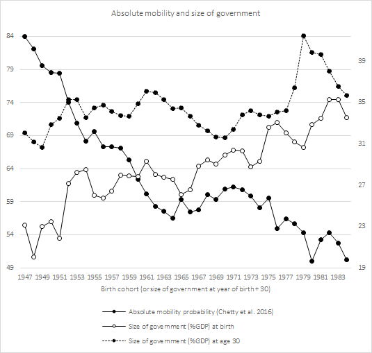
When Raj Chetty publishes a paper, it generally comes with a splash. The last one is no exception. His paper (co-authored), picked up by David Leonhardt at the New York Times and Justin Wolfers on Twitter, basically measures the American dream : what are your chances to do better than your parents. The stunning conclusion is that someone born in 1940 had a 90%+ chance of “out-earning” his parents compared with a few points above 50% for those born in the 1980s. I am not convinced. Well, when I am not convinced, I am saying I am not convincing about how big the drop is! I think the drop is smoother (the slope of decline is gentler) and the starting point for the 1940 cohort is too high.  As a big fan of Chetty, I must press this point.

More precisely, I am saying that the bar (income threshold) over which someone had to jump in 1940 is underestimated and overestimated in 1980. Setting the bar too low (high) means very high (low) chances of “out-earning” your parents. To set the bar too low, you must underestimate (overestimate) the income of the parents.  This could occur if household economies of scale are not accounted for.

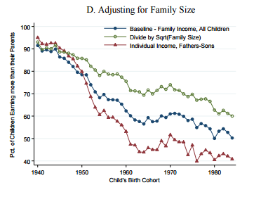
An income of 30,000$ for 3 persons is not the same as an income of 60,000$ for 6 peoples. On a per capita basis, the income is the same. But, if you adjust for economies of scale in housing and furnitures, there are differences (the simplest is square root).  This gives you income per adult equivalent. Chetty et al. are aware of that and they provided a sensitivity analysis which is not mentioned by those who are relaying the article. Since household size has tended to fall over time, the growth in per capita income is faster than the growth in income per adult equivalent (a better measure). Any correction for this long-term demographic trend would attenuate the slope of the decline of the chance to out-earn your parents. And indeed, once Chetty et al. make the correction, the decline is much more modest (but still present – see below).

size

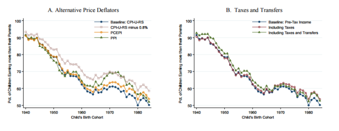
Simultaneously, Chetty et al. also present other important sensitivity checks. All of them relevant. But, in a strange decision, Chetty et al. decided to isolate each of the sensitivity checks rather than compile them. Taken individual, they all seem minor – except adjusting for family size. But compound this with the other sensitivity check proposed by Chetty et al.: price deflators. Using the well-known bias in the the CPI that overestimates inflation by 0.8%, Chetty et al. find that, by the end of their perod, there is roughly a ten percentage point difference between the baseline uncorrected CPI and the corrected CPI (see below). Compound this with the corrections for family and you still get a decline – but again the slope of the decline is much more modest. If you add panel B from figure 3 in Chetty et al – which includes taxes and transfers – you probably get a few extra points up. There will still probably be a decline, but a moderate one.

pricetaxes

Finally, at footnote 19, Chetty et al. also point out that they do not account for in-kind transfers prior to 1967 (there were some).  And, on page 13, they point out that “one may be concerned that levels of absolute mobility for recent cohorts may still be understated because of increases in fringe benefits, nonmarket goods, or under-reporting of income in the CPS”. Add in all these little extra problems to the family size, the transfers and the inflation correction and I am not sure how big the drop from 1940 to the end of the studied period is. Finally, I would also add that an understudied point in economic history is what the distribution of in-kind payments according to income was. From studying the British industrial revolution, I have generally to see that it is the poorest workers who receive in-kind payments (which are not measured) and the richest receive much fewer of those in proportion of their incomes. One of the few to note that distributional was the hardcore left-leaning scholar Gabriel Kolko who mentioned this issue in Dissent back in the 1950s.  If Kolko is correct, then the income of “poor parents” in 1940 is underestimated. As a result, the bar over which the children of said parents must jump is set mildly too low. If that is the case, the odds for the 1940 birth cohort are overestimated.

Combine all of these things together and I am not sure that the drop is as dramatic as many are making it out to be. I would be very satisfied if Chetty et al. would publish all the corrections they did and do a sensitivity check with hypothetical regarding a sliding-scale of in-kind payments in 1940 according to income (10% of income for poorest to 0% for the richest). I would just like to see how much it matters.