“Watch” the (industrial) revolution!

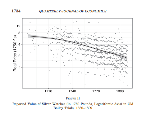
I don’t know how I missed such a valuable article, but O’Grada and Kelly have this fascinating piece on the price of watches in England from the early 18th century to the early 19th century in the Quarterly Journal of EconomicsStarting from Adam Smith’s quote that the price of watches had fallen 95% over roughly one hundred years, they collected prices of stolen watches reported in court records.  They find that Smith was wrong. The drop was only 75% (see the sarcasm here).

watch-prices

Why is this interesting? Because it shows something crucial about the industrial revolution. This was a complex good to build which required incredible technical advances – many of which could be considered general purpose technologies which could then be used by other industries for their own advances (on the assumption that other entrepreneurs noticed these technologies). But, more importantly, it provides further evidence against the pessimistic view of living standards in Britain at the beginning of the Industrial Revolution. These “new” goods became incredibly cheaper. Along with nails, glass, pottery and shipping , watches did not weigh heavily in the cost of living of the British. However, they did weigh heavily as industrial prices which meant that costs of production were falling progressively which augured well for the beginning of the industrial revolution*.

Literally, you can watch the industrial revolution in that paper! (sorry, bad pun)

* By the way, I use the term because it is conventional but a revolution is a clean break. The British industrial revolution was not saltation as much as it was a steady process of innovation from the early 18th century up to the mid 19th century. The real “revolution” in my eyes is that of the late 19th century. The technological changes from 1870 to 1890 are the most momentous in history and if there was any technological revolution in the past, this was it.

Did the Thirty Glorious Years Actually Exist?

Okay, I am going for a flashy title here. I should have asked whether the Thirty Glorious were as glorious as they are meant to be. This is a question that matters in debates about both inequality and the often-bemoaned growth slowdown.

In the past (say before 1950), labor force participation was quite low (relative to today) by virtue of large family sizes and most married women not working. However, when they were at-home, these married women produced something. That something was simply not included in our national accounts. When they entered the labor force, they produced less of that something. However, since it had never been measured, we never subtracted that something from the actual output generated from their increased participation.

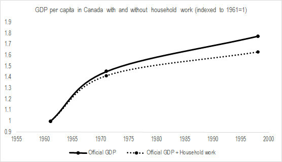
Even before the 1950s, this mattered considerably as growth tended to be heavily underestimated (by 0.3 percentage points from 1870 to 1890, overestimated by 0.38 points from 1890 to 1910 and by 0.06 percentage points from 1910 to 1930).This was at a time when variations between the household economy and the market economy were small. Imagine the importance of overestimates since the 1950s! In a short comment reply to Emily Skarbek last year, I pointed out that adjusting for the size of the household economy meant that 1/7th of Canada’s economic growth from 1960 to 1997 (see image below and this was before one additional surge of labor participation resulting from daycare and unemployment policy reforms).

SEcularStagnation2

Recently, I found an old book in my library. It is Kenneth Boulding’s Structure of a Modern EconomyIn it, he makes this exact same argument. Basically, actual output today is overestimated relative to output in the past. And there are many, many, many other articles on this. In all cases, the rate of growth is heavily reduced. In a way, that means that the Thirty Glorious are less glorious (which makes the growth stagnation argument seem more defensible).

And you know what? This is consistent with attempts to correct inequality measures. Most of the attempts made to correct inequality for age, number of workers per household, the size of household and prices, they generally increase very modestly the income growth of the bottom centiles and decrease appreciably the actual level of growth of incomes at the top. While these corrections reduce the level of inequality (and the growth thereof), they also reduce the growth rate of incomes.

Is it possible that the correction to make inequality measures more comparable over time are allow us to see the point about overestimating growth since the 1950s? It means that the Thirty Glorious aren’t that glorious (at the very least, they’re overestimated). It also means that someone who could follow some of the proposed corrections to national income accounts (generally, the best source for this is the Review of Income and Wealth) for every year since 1929 (starting date of the US national accounts which could be extended by using Kuznets’s national income measures from 1913 to 1929) could propose the “actual output” of the country and see how glorious the 1945-1975 period was. That is the work of economic historians to do!

On immigration, trade, and inequality: why nobody should care (that much)

Recently, I read snippets from George Borjas’s book, We Wanted Workers (I got distracted and reverted to reading Leah Platt Boustan’s Competition in the Promised Land).On its heels came this article by Dani Rodrik in Foreign Policy. Both work make the same case, that free movement of goods and people may imply some negative effects on inequality. Borjas argues that immigration increases inequality while Rodrik argues that low-skilled workers are displaced.

Both arguments are not convincing.

First of all, immigration will always increase inequality in one area. This is by definition. Unless the migrants follow the same distributional pattern as the host population, inequality will increase. If somebody from Cuba enters the United States at the tenth percentile, he increases inequality by swelling the ranks of low earners. If somebody from China enters the United States at the 90th percentile, he increases inequality by swelling the ranks of the high earners. However, from a global perspective (world population), inequality has actually dropped since the migrant has a greater income than in the past. After all, bringing a Haitian to the US may increase US inequality measures but the ten-fold increase in his income (this number comes from my colleague Ben Powell) means that worldwide inequality drops.

To be honest, I know that Borjas is probably aware of this point, but many of those who spin his work don’t get it. Borjas’s argument is little more sophisticated. His claim is that low-skilled workers (high school dropouts) see their wages go down while everybody else (high school graduates and university graduates) gains from immigration. This increases inequality because they are left behind economically. But this is where his argument is alike that of Rodrik and where it misses the target dramatically.

While I could be lazy and simply say that many other scholars place Borjas at the extreme of the spectrum of academics with regards to the effects of immigration on labor markets. Indeed, there are more scholars who find that low-skilled workers also gain from immigration all things being equal. But, I won’t be lazy. Let me assume, for the sake of argument, that the empirical result is valid. If unskilled workers are displaced, why can’t they find new employment elsewhere. If the effects of immigration are so positive for everybody else, it means that everybody else is substantially richer and they can demand more goods. Are there barriers preventing the unskilled from acquiring jobs? The answer is emphatically yes.

The ability to find a new form of employment following changes in the labor market depends on the frictions that exist on the labor market. Some of them are natural. We have to assume search costs (time, energy, some money) to look for a job and get the training for that job. But there are also barriers that create unnecessary frictions. The rise of occupational licencing is one of those (growing) frictions (see here, here and here). We could also point out that product regulations tend to affect the prices of goods that weigh more heavily in the consumption baskets of lower-income workers (here and here) thus pulling the poorest down. We could also point to the fact that states with right to work laws seem to have enjoyed more limited increases in inequality than the states without such laws (here). We could also underline the fact that housing regulations are making it harder for unskilled workers to move to dynamic areas, thus locking them in low-productivity areas (here). And the list could go on for a few more pages, but I think the point is made: there are tons of factors that make displacement a problem. However, those who worry about it when it comes from changes resulting from trade or immigration are concerned with a minor (and positive in the long-run) variable. In a way, Borjas and Rodrik are (rightfully) concerned about the poorest but they fail to identify the problem like if a doctor was concerned with his patient’s loss of sight rather than concentrating on the brain tumor that caused the loss.

Free trade and open borders generate massive benefits. But there are short-term costs as production methods and resources are being reallocated. Many government policies amplify exponentially these costs and delay reallocation. This creates the inequality they bemoan.

Did 89% of American Millionaires Disappear During the Great Depression?

Over the years, I became increasingly skeptical of using tax data to measure inequality. I do not believe that there is no value in computing inequality with those sources (especially after the 1960s, the quality is much better in the case of the US). I simply believe that there is a great need for prudence in not overstretching the results. This is not the first time I make this point (see my paper with Phil Schlosser and John Moore here) and I think it is especially crucial for anything prior to 1943 (the introduction of tax withholding).

One of my main point is that the work of Gene Smiley which ended up published in the Journal of Economic History has generally been ignored. Smiley had highlighted many failings in the way the tax data was computed for measuring inequality. His most important point was that tax avoidance foiled the measurements of top incomes and how well they could transposed on the overall national accounts.

More precisely, Smiley argued that the tax shelters of the 1920s and 1930s would have affected reporting behavior. As long as corporations could issue stock dividends rather than cash dividends, delaying the payment of dividends until shareholders were in lower tax brackets, there would be avoidance. Furthermore, state and municipal securities were exempted from taxation which meant that taxpayers could shelter income and end up in lower brackets. All this combined to wide fluctuations in marginal tax rates conspires to reduce the quality of the tax data in computing inequality. Rather than substantial increases in inequality, Smiley found that his corrected estimates (which kept tax rates constant) suggested no increase in inequality during the 1920s and a minimal decrease when you exclude capital gains.

Alongside John Moore, Phil Schlosser and Phil Magness, I am in the process of attempting to extend the Smiley corrections to include everything up to 1941 (Smiley had ended in 1929). As a result, I had to assemble the tax data and the tax rates and I was surprised to see that, even without regressions, we can see the problem of relying on the tax data for the interwar period.

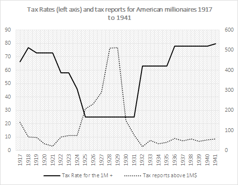
The number of millionaires in the tax reports is displayed below. As one can see, it is very low from 1917 to 1924 – a period of high tax rates. However, as tax rates fell in the 1920s, the number of millionaires quintupled. And then, when the Depression started in synchronicity with the increases in top marginal tax rates, it went back down. It went down by 89% from 1929 to 1941. Now, I am quite willing to entertain that many millionaires were wiped out during the Great Depression. I am not willing to entertain the idea that 9 out of every 10 millionaires disappeared. What I am willing to entertain is that the tax data is clearly and heavily problematic for the pre-withholding era.* This is evidence in favor of caution and prudence in interpreting inequality measures derived from tax data.


taxreports

I am of those who believe that inequality was lower than reported elsewhere in the 1920s, higher than reported in the 1930s and 1940s. Combined together, these would mean that inequality would tend to follow a L-curve or a J-curve from the 1920s up to the present rather than the U-curve often reported.  I will post more on this as my paper with Moore, Schlosser and Magness progresses. 

A non-argument against immigration

I often encounter the argument that immigrants, especially Muslims, are so different from the populations of their host countries that they threaten the institutional foundations of these societies. As a result, the logic goes, we must restrict immigration.

I do not accept that argument as valid nor do I accept it as sufficient (in the case I am wrong) to make the case in favor of further restrictions on immigration.

First of all, the “social distance” between immigrants and the hosts society is very subjective. The caricature below offers a glimpse into how “unsuited” were Catholic immigrants to the US in the eyes of 19th century American natives. Back then, Catholics were the papist hordes invading America and threatening the very foundations of US civilization. Somehow, that threat did not materialize (if it ever existed).  This means that many misconceptions will tend to circulate which are very far from the truth. One good example of these misconceptions is illustrated by William Easterly and Sanford Ikeda on the odds of a terrorist being a muslim and the odds of a muslim being a terrorist. Similar tales (especially given the propensity of Italian immigrants to be radical anarchists) were told about Catholics back then. So let’s just minimize the value of this argument regarding going to hell in a hand basket.

nast1

But let us ignore the point made above – just for the sake of argument. Is this a sufficient argument against more immigration? Not really. If the claim is that they hinder “our” institutions, then let them come but don’t let them participate in our institutions. For example, the right to vote could be restricted to individuals who are born in the host country or who have been in the country for more than X-number of years. In fact, restrictions on citizenship are frequent. In Switzerland, there are such restrictions related to “blood” or “length of stay”. I am not a fan of this compromise measure (elsewhere I have advocated the Gary Becker self-selection mechanism through pricing immigration as a compromise position).*

The point is that if you make the argument that immigrants are different than their host societies, you have not made the case against immigration, you have made the case for restrictions against civic participation.

* Another “solution” on this front is to impose user fees on the use of public services. For example, in my native country of Canada, provincial governments could modify the public healthcare insurance card to indicate that the person is an immigrant and must pay a X $ user fee for visiting the hospital. Same thing would apply for vehicle licencing or other policies. Now, I am not a fan of such measures as I believe that restrictions on citizenship (but offering legal status as residents) and curtailements of the welfare state are sufficient to deal with 99% of the “problem”. 

When (Where and Why) Women Were More Literate than Men

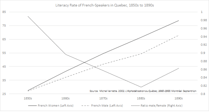
For most of history, men tended to be more literate than women. In essence, illiteracy was widespread but even more so for women. There is one exception: the French-Canadians. For most of the 19th century, literacy rates were greater for French-Canadian women than French-Canadian men.

literacy

This is a fascinating piece of economic history and somewhat of a puzzle (given that it is an oddity). It also shows how important institutions are to determining paths of development. In a 1999 article in the Journal of Economic History, Gillian Hamilton indicates that the more “liberal” institution of marriage contracts for the French-Canadians probably induced this result :

Quebec’s unique legal institutions offered the opportunity to draw up a prenuptial contract to couples who could benefit from a different property structure than the law provided. Not surprisingly, a prenuptial contract was unnecessary for most couples. Within this transaction cost-competitive marriage market framework, contracts generally were desirable only in cases of mismatch, either due to an exceptional woman or a relatively productive husband whose job did not entail a significant component of family participation. Their contracting decisions are consistent with terms that would have provided them with more appropriate incentives for work and the production of jointly produced goods, and at least the potential for greater utility and wealth than they otherwise would have accumulated. The use of contracts likely provided Quebec with higher overall wealth and a wider income distribution than it would have experienced without contracts (because the skilled disproportionately signed agreements).


On Minimum Wages, Health Code Violations and Proper Assessment

A few days ago, Tyler Curtis at the Freeman (the Foundation for Economic Education’s flagship publication) posted a short piece on the minimum wage and health code violations in restaurants. Curtis based on a paper (unavailable in full) by Srikant Devaraj who asserted that increases in minimum wages in Seattle had led to increases in health code violations by restaurants (heavily affected by the increases).

Devaraj used a standard difference-in-difference econometric approach. The problem underlined by some was the choice of benchmark for the method : New York City. New York City and Seattle are two very different cities with different health codes. It is hard to make this claim stick even if the uncontrolled results (before statistical tests) show an increase in health code violations. Nonetheless, I have been able to find one other study that shows – based on Californian data – that there was a very small deterioration in health code violations (especially by the top restaurants) following increases.

Now, I am not convinced by the econometric design of both, but I am axiomatically convinced. This is where I think economists have made the error of relying too much on empirical methods. While, as an economic historian, I always favor more data, I also am trained to be skeptical about data does not say.

In the case of the minimum wage, the debate has raged between economists over the employment effects (i.e. the demand for labor). But this is a fraction of everything involved with the production of goods in industries affected by minimum wages. For an employer, a cost is a cost regardless of the form it takes. If an employer is forced to pay somebody above what they produce in value, then something has to give. For a 5% increase in the minimum wage, it is doubtful that an employer with three employees will be willing to sack one third of his workforce (and roughly one third of his output). So, he can cut costs differently. He may ask employees to buy their uniforms, he may refuse to provide them with free lunches, he may also even decide to cut on quality of his service – as is the case with the two studies outlined above.

The problem is that no study of the minimum wage has attempted to measure all these effects at once!  There is no study that looks simultaneously at hours worked, people employed, type of people employed (substitution effects), prices for consumers, quality and marginal benefits (uniforms, free lunch, insurance, etc.) on both the short and long-terms levels and trends (they also rarely adjust the minimum wages for regional purchasing power parities and the under-reporting of tips)

The health code violations papers show how many channels employers can use to adapt – channels which some fail to account for when they proclaim that we can raise the minimum wage without adverse consequences. Maybe its time that we, as economists, try to be more cautious when we make claims about the minimum wage’s minimal effects.

How much has Cuban productivity increased since 1960?

Is it possible for two equally rich countries (on a per capita basis) to have different level of output per worker? The answer is obviously yes, and it matters in the case of measuring growth in Cuba since the revolution.

A country with a very young population will tend to have fewer workers than one with an older (but not too old) population. Let’s say that countries A and B have a median age of 22.5 in year one.  However, in year ten, country A has a median age of 35 but country B has seen a more modest increase to a median age of 25. This will bias any estimates of growth comparison between both country. The increase in the median age suggests that there are more and more workers in country A (people of prime age) than in country B. As a result of that, output per capita will increase faster in country A than in country B even if both countries have equal rates of growth in output per worker.

Well, countries A and B are basically Cuba and most of the rest of Latin America. Since the 1950s, Cuba’s population has aged rapidly but birth rates have plummeted so fast that families shrunk. With fewer kids in the population, it means that the share of the Cuban population that are of prime working age increased rapidly. This is what biases the comparison of Cuban living standards with other Latin American countries.

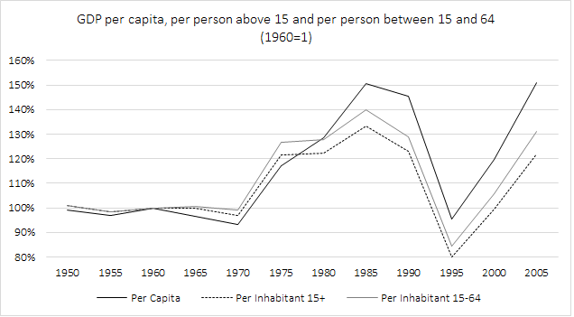
In the figure below, I took the GDP (the Maddison data) of Cuba since 1950 (indexed at 1960 to see the arrival of Castro) and divided it by the total population, the population above 15 years of age and the population between 15 and 64.

cubagdp

As one can see, with the GDP per capita series, Cubans saw a 50% increase in their incomes between 1960 and 2005 (the Maddison data stops at 2008). However, when you look at GDP per working age adult in order to capture the growth in productive capacity, you get moderately different results whereby the cumulative increase is three-fifths to half as small.

In light of this, it seems like Cuba’s living standards are less and less impressive.

On Gentrification, Inequality and Zoning

On the CityLab blog, Richard Florida posted a piece pointing out that gentrification has virtually no effects on homeowners. I can buy that result, especially since I wrote a policy piece for a think tank back in the summer of 2016 on the issue. The important point that Florida underlines (by citing a paper by Martin and Beck in Urban Affairs Review) is that homeowners are not being displaced, but renters are more likely to be. This will probably fuel some people who are concerned about inequality. I disagree.

I want to point out that my interest in the issue is entirely related to the issue of inequality which some individuals have tried to tie to gentrification (sometimes without understanding that causality can run both ways). If you want to tie the two issues together, then you must realize that there are four “types” of gentrification. First of all, gentrification always appear in an area that is poor and it is always a result of a shift in demand for land in that area. However, that area can be largely unoccupied or heavily inhabited. It can also be in a district where zoning is lax or burdensome. In each of these situations, you will different effects with different interpretations for inequality.

  • Scenario 1 (largely vacant, lax zoning laws): in this situation, demand shifts right but there is slack in the local housing market and in any case, supply can adjust easily. In that case, the effects on rents will be minimal and will probably be smaller than the economic gains in terms of local economic activity. In this situation, there is little displacement and there is in fact a reduction in inequality.
  • Scenario 2 (largely vacant, heavy zoning laws): same happens, except that the restrictions on construction and building conversions put a ceiling on the capacity of a local area to adapt. The effect on rents is ambiguous and depends largely on the relative quantity changes (how many people relative to empty units). There are probably small to moderate gains in the area. There are ambiguous effects on inequality.
  • Scenario 3 (heavily occupied, lax zoning laws): in this situation, the influx of individuals creates a temporary surge in rents. This is because, in the short-term, housing supply is inelastic. In the long-run, the supply is more elastic and new units can be added to counterbalance the price effects. So, there is a long-term benefit that comes after a small bump. More individuals will be displaced than in scenario 1. Overall, a reduction in inequality might occur.
  • Scenario 4 (heavily occupied, heavy zoning laws): in this situation, the influx happens in a market where the supply is highly inelastic (short and long-run). In that case, the shift in demand creates a substantial increase in rents. This is where gentrification can hurt and be tied to inequality.

These four scenarios are important because they show something important that some people have to understand. Gentrification can increase inequality. However, that depends on the context and the institutions (zoning) surrounding the area in which it happens. In all cases, gentrification is a normal process that can’t really be stopped but turns sour because of zoning laws. Thus, if you really want to tie gentrification to inequality, it should twice removed since the first parents are zoning laws and construction limits.

On Sugary Drinks, Taxes and Demand Curves

A few days ago, I discovered a blog post on the website of Jayson Lusk (a very good agricultural economist whose work has often guided some of my own economic history research given that most economic history is also agricultural history). The post relates to a study of the implementation of a sugary drink tax in Berkeley to fight obesity.

Obviously, a tax will reduce the consumption of any good. That is pretty axiomatic and all that we need to know is how much. In other words, how elastic is demand. If all things are held constant, the quantity consumed relative to the price change will give you that measure.* However, the study that Lusk pointed too basically shows that we often do not hold everything constant.

The authors of the study point out that when tax is passed, there is generally a debate that occurs beforehand. This generates publicity about the issue. This alters the behavior of consumers because they face more information. This is an effect that must be isolated from that of the tax itself.  That is what the authors do in their papers and they find that a reduction of soft drinks consumption did occur during the campaign and after the tax was adopted but before it was implemented (they rely on on-campus sales of soft drinks at a “major university” which we can assume is UC-Berkeley). Thus, the reduction in consumption preceded the price change. Lusk himself found something similar in a case related to animal welfare. Using a Californian electoral proposition regarding animal welfare in the production of eggs, he found that the publicity surrounding the proposition changed consumer behavior.

Lusk, rightly in my opinion, points out this suggests that information-based policies are probably more efficient than heavy-handed measures like taxes.

But I think there is a deeper point to make. When you inform consumers, you don’t only change the location of the demand, you also change the slope of the curve. If a consumer is made aware of the costs (and benefits) of his consumption that he had not previously considered, he may become more sensitive to the price. Informing people about the ill-effects of sweet drinks might make them more sensitive to the price they pay. Imagine that the information campaign during the Berkeley vote on the tax caused consumption to become more elastic. That means that the tax’s effects is being amplified by the information effect from the publicity. Had the tax been imposed as a surprise, the effect would have been smaller. Basically, Lusk’s presentation of the argument is understating the effects of information-based policies.


* On a tangential point, I would like to remind that people can reduce their consumption of soft drinks without changing their total calorific intake. Indeed, if I am taxed when I consume a soft drink, I can switch to coffee with cream. Thus, pundits often confuse a reduction in soft drinks consumption after a tax as a step in favor of reducing obesity.

On Tax Resistance, Censuses and the Cliometrician’s Craft

In the process of finalizing another research article (under revise and resubmit for Agricultural History), I found a small case of tax resistance in Canada East (modern day Quebec) in 1851  that is interesting.

The district of Grenville, northwest of Montreal, was an ethnically mixed district (25% French, the rest were English-Canadians) operating under the British freehold tenure system (as opposed to most of the rest of the province that operated under French seigneurial tenure). During the 1851 census, the enumerator complained that the population of roughly 2,000 inhabitants refused to report statistical information.

Basically, the enumerator pointed out that the majority supposed the information they were giving was “the precursor of a general tax for schools which they are strongly opposed to”.

tax-resistance-in-the-censuses

I find this to be interesting because it is a nice little case of how hard to master the craft of an economic historian. As a cliometrician, my task is to find the best data possible to answer historical questions with strong economic theory (while enriching theory with historical evidence). The data for that area would be biased downwards as peasants would understate their incomes to avoid being heavily taxed. Any statistical test to assert the applicability of a theory to historical questions of Canada (or Quebec) would be altered by this reaction on the part of peasants.

True, for some broad questions (like measuring GDP), this would not be too dramatic an issue. However, for more specific questions like “what was the role of tenure systems in explaining Quebec’s relative poverty”, the issue would be more problematic.

How much do the little things matter, right?

Is Trump So Old? Its all relative really!

Today is inauguration day. Donald Trump will officially be the 45th President of the United States of America. Many have pointed out that Trump is the oldest president (slightly above 70 years of age). I disagree.

Old is not a “purely” absolute concept. Advances in living standards mean advances in our ability to live longer lives. Not only do we live longer lives than in the past, but at any point in our life, our health is better. Someone who reached 65 years of age in 1900 probably did not have the same health prospects as someone who reaches that age today. Basically, the “quality” of old age has increased over time (see this great book on the economic history of aging). So, when people say “old”, I ask “old as compared to what”.

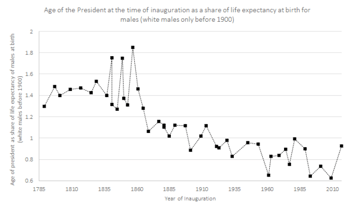
To meet that test, I took the CDC data on life expectancy as well as soon historical database  from 1900 to today. I combined it with David Hacker’s work on life tables in the US from 1790 to 1900 which can be found in this article of Historical Methods.  Hacker’s data concerns only the white population. I took only the age expectancy at birth of males. Then, I plotted the age of the president at the time of inauguration as a share of the life expectancy at birth (E0). This is the result:

inauguration

As one can see, the age of presidents as a share of life expectancy is falling steadily since the early 1900s. In this light, Donald Trump is not the oldest president. In fact, the oldest president is …. drumroll…James Buchanan (1.85 times the life expectancy of white males at birth). Moreover, in this light, the youngest president at inauguration is not Teddy Roosevelt (Kennedy was the youngest elected). Rather, the youngest is Barack Obama followed very closely by Bill Clinton and John F. Kennedy.

I find this post to be interesting as it shows something more important in my eyes: how the poorest in society have done. Presidents have generally stemmed from the top of the income distribution. Over time, the ages of presidents at inauguration (in absolute terms) has not followed any clear trend. The drop seen in the graph above is entirely driven by increases in the life expectancy of the “average” American. In a certain way, it shows that the distance between that “Joe the Plumber” and the “Greatest Man in America” (huh…Lord Acton anyone?) seems to be diminishing over time.

On the (big) conditions for a BIG

This week, EconTalk featured a podcast between Russ Roberts and Michael Munger (he of the famous Munger-proviso which I live by) discussed the Basic Income Guarantee (BIG). In the discussion, there is little I ended up disagreeing with (I would have probably said some things differently though). However, I was disappointed about a point (which I made here in the past) which economists often ignore when discussing a BIG: labor demand.

In all discussions of the BIG, the debates always revolve around the issue of labor supply assuming that it will induce some leftward shift of the supply curve. While this is true, it is irrelevant in my opinion because there is a more important effect: the rightward shift of the labor demand curve.

To make this argument, I must underline the conditions of a BIG for this to happen. The first thing to say is that a) the social welfare net must be inefficient relative to the alternative of simply giving money to people (shifting to a BIG must be Pareto-efficient); b) the shift mean that – for a fixed level of utility we wish to insure – the government needs to spend less and; c) the lower level of expenditures allows for a reduction in taxation.  With these three conditions, the labor demand curve could shift rightward. As I said when I initially made this point back in January 2016:

Yet, the case is relatively straightforward: current transfers are inefficient, basic income is more efficient at obtaining each unit of poverty reduction, basic income requires lower taxes, basic income means lower marginal tax rates, lower marginal tax rates mean more demand for investment and labor and thus more long-term growth and a counter-balance to any supply-side effect.

As I pointed out back then, the Canadian experiment (in Manitoba) with a minimum income led to substantial improvements in health outcomes which meant lower expenditures for healthcare. As a result, b) is satisfied and (by definition) so is a). If, during a shift to a BIG, condition c) is met, the entire discussion regarding the supply effects becomes a mere empirical issue.

I mean, equilibrium effects are best analyzed when we consider both demand and supply…

P.S. I am not necessarily a fan, in practice, of BIG. Theoretically, the case is sound. However, I can easily foresee policy drifts where politicians expand the BIG beyond a sound level for electoral reasons (or even tweak the details in order to add features that go against the spirit of the proposal). The debate between Kevin Vallier (arguing that this public choice reasoning is not relevant) and Phil Magness (who argues the reverse) on this issue is pretty favorable to Magness (in my opinion). UPDATE: Jason Clemens over at the Fraser Institute pointed to a study they made regarding the implementation of a BIG in Canada. The practical challenges the study points too build upon the Magness argument as applied in a Canadian perspective. 

The Pox of Liberty – dixit the Political Economy of Public Health

9780226922171

A few weeks ago, I finished reading the Pox of Liberty authored by Werner Troesken. Although I know some of his co-authors personally (notably the always helpful Nicola Tynan whose work on water economics needs to be read by everyone serious in the field of economic history – see her work on London here), I never met Troesken. Nonetheless, I am what you could call a “big fan” in the sense that I get a tingling feeling in my brain when I start reading his stuff. This is because Troesken’s work is always original. For example, his work on the economic history of public utilities (gas and electricity) in the United States is probably one of the most straightforward application of industrial organization to historical questions and, in the process, it kills many historical myths regarding public utilitiesThe Pox of Liberty is no exception and it should be read (at the risk of become a fan of Troesken like I am) as a treatise on the political economy of public health.

Very often, it will be pointed out that public health measures are public goods that government should provide lest it be “underprovided” if left to private actors. After all, it is rare to hear of individuals who voluntarily quarantined themselves upon learning they were sick. As a result, the “public economics” argument is that the government should mandate certain measures (mandatory vaccination and quarantine) that will reduce infectious diseases. Normally, the story would end there. And to be sure, there is a lot of evidence that mild coercive measures do reduce some forms of mortality (mandatory vaccination and quarantine). The more intense the policies, the larger the positive effects on health outcomes. For example, taxes on cigarettes do reduce consumption of cigarettes and thus, secondhand smoke. In fact, even extreme coercive measures like smoking bans seem to yield improvements in terms of public health (another example is that of Cuba which I discussed on this blog).

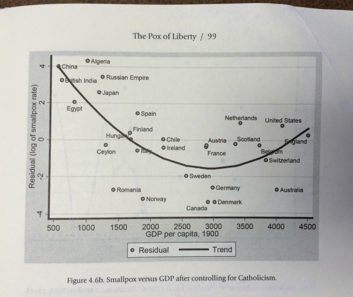
However, Troesken’s contribution is to tell us that the story does not end there. In a way, the “public economics” story is incomplete. The institutions that are best able to deploy such levels of coercion are generally also the institutions that are unable to restrain political meddling in economic affairs. Governments that are able to easily deploy coercive measures are governments that tend to be less constrained and they can fall prey to rent-seeking and regulatory capture. They will also tend to disregard property rights and economic freedom. This implies slower rates of economic growth. As a result, there is a trade-off that exists: either you get fast economic growth with higher rates of certain infectious diseases or you get slow economic growth with lower rates of certain infectious diseases (Troesken concentrates mostly on smallpox and yellow fever). The graphic below illustrates this point of Troesken. Countries like Germany – with its strong centralizing Prussian tradition – were able to generate very low levels of deaths from infectious diseases. But, they were poorer than the United States. The latter country had a constitutional framework that limited the ability of local and state governments to adopt even mild measures like mandatory vaccination. Thus, that meant higher mortality levels but the same constitutional constraints permitted economic growth and thus the higher level of living standards enjoyed by Americans relative to the Germans.

fullsizerender

But Troesken’s story does not end there.  Economic growth has some palliative health effects (in part the McKeown hypothesis*) whereby we have a better food supply and access to better housing or less demanding jobs. However, in the long-run economic growth means that new sectors of activity can emerge. For example, as we grow richer, we can probably expend more resources on drugs research to extend life expectancy. We can also have access to more medical care in general.  These fruits take some time to materialize as they grow more slowly. Nonetheless, they do form a palliative effect that contributes to health improvements.

However, there is an analogy that allows us to see why these palliative effects are important in any political economy of public health provision. This analogy relates to forestry. The health outcomes fruits from a “coercive institutional tree” can only be picked once. Once they are picked, the tree will yield no more fruits.  However, the yield from that single harvest is considerable. In comparison, the “economic growth tree” yields fewer and smaller fruits, but it keeps yielding fruits. It never stops yielding fruits. In the long-run, that tree outperforms the other tree. The problem is that you cannot have both trees. If you chose one, you can’t have the other.

In this light, public health issues become incredibly harder to decipher and understand. However, we can see a much richer wealth of information under this light. In writing the Pox of Liberty, Troesken is enlightening and anyone doing health economics should read (and absorb his work) as it is the first comprehensive treatise of the political economy of public health.


* I should note that I think that the McKeown hypothesis is often unfairly lambasted and although I have some reservations myself, it can be adapted to fit within a wider theoretical approach regarding institutions – like Troesken does. 

How Well Has Cuba Managed To Improve Health Outcomes? (part 3)

As part of my series of blog post reconsidering health outcomes in Cuba, I argued that other countries were able to generate substantial improvements in life expectancy even if Cuba is at the top. Then I pointed out that non-health related measures made Cubans so poor as to create a paradoxical outcome of depressing mortality (Cubans don’t have cars, they don’t get in car accidents, life expectancy is higher which is not an indicator of health care performance). Today, I move to the hardest topic to obtain information on: refugees.

I have spent the last few weeks trying to understand how the Cuban refugees are counted in the life tables. After scouring the website of the World Health Organization and the archives of Statistics Canada during my winter break, I could not find the answer.  And it matters. A lot.

To be clear, a life table shows the probability that an individual of age will die by age X+1 (known as Qx). With a life table, you will obtain age-specific death rates(known as Mx), life expectancy at different points and life expectancy at birth (Lx)(Where x is age). Basically, this is the most important tool a demographer can possess. Without something like that, its hard to say anything meaningful in terms of demographic comparison (although not impossible).The most common method of building such a table is known as a “static” method where we either compare the population structure by age at a single point in time or where we evaluate the age of deaths (which we can compare with the number of persons of each group alive – Ax). The problem with such methods is that static life tables need to be frequently updated because we are assuming stable age structure.

When there is important migration, Qx becomes is not “mortality” but merely the chance of exiting the population either by death of migration. When there are important waves of migration (in or out), one must account for age of the entering/departing population to arrive at a proper estimates of “exits” from the population at each age point that separate exits by deaths or exits (entries) by migration.

As a result, migration – especially if large – creates two problems in life tables. It changes the age structure of the population and so, the table must be frequently updated in order to get Ax right. It also changes the structure of mortality (exits). (However, this is only a problem if the age structure of migrants is different from the age structure of the overall population).

Since 2005, the annual number of migrants from Cuba to the United States has fluctuated between 10,000 and 60,000. This means that, on an annual basis, 0.1% to 0.5% of Cuba’s population is leaving the country. This is not a negligible flow (in the past, the flow was much larger – sometimes reaching north of 1% of the population). Thus, the issue would matter to the estimation of life tables. The problem is we do not know how Cuba has accounted for migration on both mortality and the reference populations! More importantly, we do not know how those who die during migration are measured.

Eventually, Ax will be adjusted through census-based updates (so there will only be a drift between censuses). However, if the Cuban government counts all the migrants as alive as they arrive in a foreign country as if none died along the way, it is underestimating the number of deaths. Basically, when the deaths of refugees and emigrants are not adequately factored into survival schedules, mortality schedules are be biased downward (especially between censuses as a result of poor denominator) and life expectancy would be accordingly biased upward.

Now, I am willing to reconsider my opinion on this particular point if someone indicates some study that has escaped my gaze (my Spanish is very, to put it euphemistically, poor). However, when I am able to find such information for other Latin American countries like Chile or Costa Rica and not for Cuba, I am skeptical of the value of the health statistics that people cite.

The other parts of How Well Has Cuba Managed To Improve Health Outcomes?

  1. Life Expectancy Changes, 1960 to 2014
  2. Car ownership trends playing in favor of Cuba, but not a praiseworthy outcome