Two days ago, I posted something on how much we were estimating growth since the 1950s. While organizing another research paper that I am trying to finish, I realized that I could make a follow-up to this based on previous research of mine.
A few months ago, I published (alongside Vadim Kufenko and Klaus Prettner) a short note in Economics Bulletin where we showed that the large differences in household size in Canada that existed up to 1975 led many to overestimate the level of differences between provinces. Moreover, we pointed out that because household size were converging at the same time as incomes, we argued that the rate of convergence from 1945 onwards was slightly overestimated. That paper convinced us to do the same between all the OECD countries (we are assembling the data right now). But this was an argument about variance, what if we simply plot the “per capita” income of Canada with the “per adult equivalent” income of Canada since 1870.
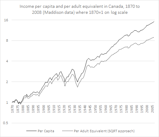
By using the Maddison dataset combined with the data from my article, it took me a few seconds to get the graph below. What is important to notice in this graph is that, incomes per adult equivalent (measured in 1990 Geary-Kheamis dollars) have increased 40% less than incomes per person. Since adult equivalents are a better measure of living standards (because you capture the economies of scale associated with household size), we can easily say that we have been underestimating the level of improvement in Canada (it is still substantial however).