Wars and Presidents: Avoiding the Power-Display Bias

This week on EconTalk, Russ Roberts interviewed Bruce Bueno de Mesquita on how presidents who took the United States to war find themselves higher in the rankings of “Great Presidents” (see this paper by Henderson and Gochenour on the issue)  For some time now, I have found myself in agreement with that contention as wars are generally momentous events that stand out in history. In contrast, the man who sits by and does nothing except preventing a war or making it easier for people to trade, that is harder to observe.  But why would evaluating Presidents be associated with such a premium? Individuals are aware that wars are bad, so why are they praising this? On other metrics, how do Presidents fare?

On the power-display bias 

In my forthcoming book on Canadian economic history (published by Palgrave McMillan as part of their Studies in Economic History), I reviewed some pantheons and counter-pantheons of Presidents (which I will present below) and I felt I had to offer my argument regarding these pantheons:

The established pantheon and the counter-pantheon differ mostly due to people’s bias towards positively assessing outward signs of power. When he wrote to one of his correspondents that “absolute power corrupts absolutely,” British historian Lord Acton was not only speaking of politicians, but also of those would retroactively judge them: Acton was referring to a general human tendency – accentuated amongst historians – to be more forgiving of those who hold power, because the powerful are judged by their actions. Indeed, it is easier to size up a politician who undertook significant reforms – regardless of the results obtained thereby – than to evaluate the achievements of one who passively held the line. If the reformer fails, it can be said that at least he tried. Moreover, a given president’s place in the pantheon is closely linked to how many Americans he killed during the military conflicts that defined his reign. The more Americans killed per capita overall, the higher a given president’s ranking in the list of “greats.”

Economic history teaches us, however, that the most proactive presidents may not be the most beneficial to their country, on the contrary. For several years now, Franklin Delano Roosevelt (1933-1945) has been the subject of increased criticism in the economic literature for his interventionist economic policies between 1932 and 1939. Economists Albrecht Ritschl, Monique Ebell, Lee Ohanian and Harold Cole have determined that FDR’s interventionist policies in fact served to prolong the Great Depression.

In other words, the bias we have when evaluating men with power is that we evaluate based on the exercise of displaying the use of power. Those who refrain from using it are, properly, not recorded as historical events are conflicts/tensions/oppositions. This I think is generally a bias that is easily to fall prey to. I am not immune to that even if I happen to have libertarian leanings. I often see in one politician or another in history a man/woman that I wish would be here today to “save the day” (one of my childish belief). But each time I dig around that person, I am less enthused. For example, I used to be an admirer of William Pitt the Younger – a fierce one. After all, he had assisted Wilberforce in ending the slave trade, he had instituted a sinking fund to repay the British public debt (he had willfully tied his hands) and he he had been moderately sympathetic to the American revolution. I saw his role in the wars against France as a contest of circumstances. But, that was the point, I was ready to discount the war. In addition, as I read the work of Jane Humphries on child labor in industrializing Britain (here and here), I discovered more unsettling things.  During the French Wars, the build-up of the British state did lead to some crowding-out on factors markets, notably the labor market. Upon complaints of manufacturers, Pitt proposed to “Yoke Up the Children”. More precisely, he proposed the use of orphan in the public care to work as pauper apprentices to firms at pences on the shilling (bad pun of pennies on the dollar). He “lent” orphans to private firms and its hard to assume that they consented to work (as Humphries’s use of oral histories makes clear). If a person with libertarian leanings like me was willing to excuse such a man before, it is quite telling of how limited knowledge shores up the reputations of powerful men. This is because their use of power overshadows all the rest. Their use of power is like the joke about economists looking where the lamppost is: we evaluate them on what their use of power has illuminated.

Other Metrics

So, are there any other metrics that are less subjected to our inherent power-display bias? Obviously, anything that has a subjective element will be biased. However, evaluating the evolution of living standards under their rule is one way to go at it. Mark Zachary Taylor, in an article published in PS: Political Science and Politicsproposed an economic ranking of US Presidents since 1789. Whichever way you cut it, there is a weak rank correlation between the rankings of presidential greatness and the ranking of economic grades.

Ranking.png

There is another type of ranking, which is more subtle. It measures how much Presidents refrained from expanding federal power. This exercise was made by Richard Vedder and Lowell Gallaway (two great economic historians) who measured presidents based on their changes to the size of government and inflation. This measure alone (see table below) is not sufficient to be convincing, but taken as part of a constellation of rankings, it provides a key piece of evidence. This is really a counter-pantheon to the rankings of presidential greatness. In fact, one could see it as the cost for societies of presidential greatness.

presidentialgreatness

When comes the time to evaluate great rulers, being aware of our biases is crucial (as Lord Acton, I think they should rarely be excused based on flimsy excused like circumstances – the virtue of being an historian/economic historian is that we have enough hindsight to say how terrible certain choices were).  And that awareness should lead us to develop a “dashboard” of rankings to properly weigh the impact of such rulers.

How Well Has Cuba Managed To Improve Health Outcomes? (part 1)

Since the passing of Fidel Castro, I have devoted myself to researching a proper assessment of his regime’s achievements in matters of health care. The more I dig, the more I am convinced that his regime has basically been incredibly brilliant at presenting a favorable portrait. The tweaking of the statistics is not blatant or gigantic, it is sufficiently small to avoid alerting demographers (unlike when Davis and Feshbach, Eberstadt and Miller and Velkoff found considerable evidence of data tweaking in the USSR which raised a massive debate). Indeed, a re-computation of life expectancy based on life tables (which I will present in the new few weeks) to adjust for the false reclassification of early neonatal deaths as late fetal deaths (raising the low infant mortality rate by somewhere 28% and 96%) suggests that somewhere between 0.1 and 0.3 years must be knocked off the life expectancy figures. Given that the variations between different measurements available (WHO, World Bank, MINISAP, CIA, FAO) are roughly of that magnitude, it falls within a very reasonable range of errors. This statistical tweaking is combined with an over-dramatization of how terrible the situation was in 1959 (the life expectancy figures vary from 63.9 years to 65.4 years at the beggining of the Castrist regime). But that tweaking is not sufficient to invalidate the massive downward trend.  As a result, the majority of public health scholars seem confident in the overall level and trend (and I tend to concur with that statement even if I think things are worse than presented and the slope of the downward trend is too steep).

Those little tweaks have been combined with the use of massive coercive measures on the local population (beautifully described  by Katherine Hirschfeld in what should be an example of ethnographic work that economists and policy-makers should rely on because it goes behind the data – see her book Health, Politics, and Revolution in Cuba: 1898-2005) that go from using doctors as tools for political monitoring to the use of abortion against a mother’s will if it may hinder a physician’s chance of reaching the centrally-decided target without forgetting forced isolations for some infectious patients. Such methods are efficient at fighting some types of diseases, but they are associated with institutions that are unable to provide much economic growth which may act as a palliative counter-effects to how choices may make us less healthy (me having the freedom to eat too much salt means I can die earlier, but the type of institutions that let me eat that much salt also avoid infringing on my property rights thus allowing me to improve living standards which is the palliative counter-effect).  With such a trade-off, the issue becomes one of the ability of poor countries to improve in the absence of extreme violence as that applied by the Castrist regime.

Over the next few weeks, I will publish many re-computations of health statistics to sustain this argument as I write my article.  The first one I am doing is the evolution of life expectancy from 1960 to 2014. What I did is that I created comparatives for Cuba based on how much living standards (income per capita). Cuban living less than doubled over that 49 years period (82% increase) from 1959 to 2008 (the latest available data from the high-quality Maddison data).  Latin American and Carribean countries that saw their living standards less than double (or even decline) are Argentina (+90%), Bolivia (+87%), El Salvador (+68%), Haïti (-33%), Honduras (+71%), Jamaica (+51%), Nicaragua (-17%) and Venezuela (+7%). This forms the low income group. The remaining countries available are separated in two groups: those whose income increased between 100% and 200% (the mid-income group composed of Brazil, Colombia, Mexico, Peru, Uruguay, Ecuador, Guatemala, Panama and Paraguay) and those whose incomes increased more than 300% (the high-income group composed Chile, Costa Rica, Dominican Republic, Puerto Rico and Trinidad & Tobago).  I also compared Cuba with a group of countries that had incomes per capita within 20% of the income per capita of Cuba.  So, how did Cuba’s life expectancy increase?

Well, using only the official statistics (which I do not fully trust although they are from the World Bank Development Indicators Database), Cuba life expectancy (which was already pretty high by Latin American standards in 1959) increased 24%. However, all other countries – which were well below Cuba – saw faster increases. The countries that had the least growth in Latin America saw life expectancy increase 38% and the countries that were equally poor as Cuba saw life expectancy increase an impressive 42%. Chile, whose life expectancy was only 57.5 years against Cuba’s 63.9 in 1960, also increased more rapidly (also 42%) and it has now surpassed Cuba (81.5 years against 79.4 years) and what is more impressive is that this rate has increased in a monotonic fashion regardless of changes in political regimes (democracy, socialism, Pinochet, liberal democracy) while Cuba’s rate seems to accelerate and decelerate frequently. Now, this is assuming that the figures for 1960 are correct. I have surveyed the literature and it is hard to find a way to say which of the estimates is the best, but that of the World Bank for 1960 is the lowest. There are other rates, contained in McGuire and Frankel’s work – the highest stands at 65.4 years for 1960. That means that the range of increase of life expectancy in Cuba is between 21.4% and 24.2%. Its not earth-shattering, but it makes Cuba’s achievements less impressive (although it is impressive to keep increase life expectancy from an already-high level). But as you can see, more important improvements could have been generated without recourse to such violent means. In fact, as a post that I will publish this week shows, the decline in car ownership from 1959 to 1988 probably played moderately in favor of the increase in life expectancy while the massive increase in car ownership in all other countries played (all else being equal) in favor of slowing down the increases in life expectancy (but being too poor or making it illegal to import a foreign car is not health care and I deem it improper to consider that this accident from misfortune should be praised).

improvementslifeexpectancy

In a way, what I am saying is that the benefit is not as impressive as claimed. Given the costs that Cubans have to assume for such a policy, anything that makes the benefits look more modest should make more inclined to cast a damning judgment on Castro’s regime.

Coming up (I will add the links as they are published) :

  1. Life Expectancy Changes, 1960 to 2014
  2. Car ownership trends playing in favor of Cuba, but not a praiseworthy outcome
  3. Of Refugeees and Life Expectancy
  4. Changes in infant mortality
  5. Life expectancy at age 60-64
  6. Effect of recomputations of life expectancy
  7. Changes in net nutrition
  8. The evolution of stature
  9. Qualitative evidence on water access, sanitation, electricity and underground healthcare
  10. Human development as positive liberty (or why HDI is not a basic needs measure)

Inflation in Canada and the US since 1774

It is often said that Canada and the United States are very much alike, except for the fact that Canada has tons of French people (myself included) and free (TANSTAFL) healthcare. It is also often said that when the US economy catches a cold, Canada gets pneumonia.

From an economic historian’s perspective, this is a hard claim to swallow without making tons of nuances. Yes, economic conditions in Canada are heavily affected by those in the US. But, the evidence for that generally concerns the twentieth century. There is very little before that. The first pieces of evidence we have for Canada start only in the 1870s. In fact, that evidence is also subject to many caveats (my work with Michael Hinton suggests that the GDP deflator for Canada from 1870 to 1900 causes a considerable underestimation of Canadian economic growth during the period and that Canada).

Thus, we do not know if that was always true. To some extent, I am tempted to believe that this is true, but that it is has grown “truer” over time. Canada used to be geared towards Britain and Europe for a long time, but, progressively, it became more connected with the United States. Now, the Maddison project data shows that Canada in terms of GDP per capita converged towards that of the United States from the 1870s to the present day. Morris Altman produced revised estimates of Canadian GDP growth (here) that show a moderately steeper convergence between 1870 and 1929. Given the amount of capital movements between both countries, this is not really surprising (in fact, excluding Quebec from Canada brings the two countries closer together).  But again, we don’t go back further than 1870.

So, to see if this is the case, I decided to take my paper (online since yesterday) on creating a price index for Canada since 1688. Measuring Worth offers an American Price Index that starts in 1774. If the two economies began to become more interlinked, then a price index that goes back to the founding of the United States should do the trick. The result is below.

pricescorrelation

I organized the data by time period and it seems that the rates are generally correlated (which you would expect since global monetary conditions do suggest some long-terms similarities in terms of price trends – I have many reservations about the book I am citing here, but it gets the empirical point across). However, the dispersion seems to collapse over time. As we move from the colonial era to the modern era, inflation rates get more tightly grouped together. Free trade, lower transport costs, central bank policy, capital mobility and labor mobility would have factored in to mean that things become more tightly knit.

It does seem like Canada and the US became more interdependent over time.

I have more to come on this!

The most depressing thing with Chetty et al.

The Chetty et al. paper has been on my mind over the weekend (see Saturday’s post). The one thing that has moved more or less in line with the absolute mobility measure of Chetty et al. has been…the size of government.

I know that as soon as some of you read the last four words on the previous paragraphs, your eyes rolled. However, even from a social-democratic perspective, it is depressing! It is not the first time I make this observation.   In the pages of Essays in Economic and Business HistoryI recently reviewed Unequal Gains (authored by Peter Lindert and Jeffrey Williamson and published at Princeton University Press) and I observed that the “great leveling” they observed from the 1910s to the 1970s had a lot to do with the northward migration of American blacks, the closing of the gender wage gap and the convergence of the southern states. I also observed that the increase in inequality in the United States after 1970 occurred at the same time as an the state grew more in size and scope (see blog post here).

However, as I mentioned elsewhere, I am very skeptical of the tax-based data on inequality in the United States and I am afraid to push that point. However, the Chetty et al. data provides further confirmation: trends in inequality/social mobility deteriorates as the state becomes more active (see the graph below).

sizegov

Now, I am aware that the causality can cut both ways. It may be that inequality (economic mobility) is rising (falling) in spite of increasing state action, it may be that state action is fueling the the rise (reduction) of inequality (economic mobility) or it may be that the state has no effects whatsoever on the evolution. Regardless of which of the three viewpoints you tend to adopt (I lean towards a mixture the second option – see my paper with Steve Horwitz here which is under consideration for publication), the implications are immensely depressing with regards to social policy in the last 75 years.

Chetty et al and the metamorphosis of the earnings curve

The Chetty et al. paper is probably one of the most important papers of 2016 and it will long be debated. Many comments have been made on this and I need to reiterate that I do not believe the trend to be off, merely the level. I have just found another reason to doubt the level by thinking about demography. It relates to one key methodological decision made in the paper: taking the income of parents in the 25 to 35 years old age-window. This is a fixed window where their incomes are compared to that of a child at age 30.

This is probably a flaw that alters the level evolution importantly. My argument is simple. A person born in 1940 was, by the time he was 30, close to his peak earning point. A person born in 1980, by the time he is 30, is further away from a higher peak earning point. Thus, you are not comparing the same type of birth cohorts. In simpler terms, I am saying that with the 1940 birth cohort you are comparing children who, by age 30, were at the apex of their earnings while those of the 1980 birth cohort were not at the apex.

From the work of Ransom and Sutch on the economic history of aging in the United States, I remembered that graph (for late 19th century Michigan).  What I see is that for most workers, by 30 years of age, they are pretty much at the top of their earnings cure. Over time, if the shape of the curve does not change and simply keeps moving upwards, then there are no problems with the level of absolute mobility measured by Chetty et al.

earningfunctionsusa1890

But here is the problem, the curve does change shape! There are no longer flat lines like that of the Michigan farm laborers in the figure above. Earnings curve look more and more like that of the Michigan railroad employees. Not only that, the peak point is now higher in terms of income and at a further point in time. And that makes sense since we are studying longer and working menial jobs while we do for which we earn low incomes. When we enter the labor force, we get a very steep rise at a later point in our lives than our fathers or mothers did. So the earning curve of younger cohorts is more skewed than that of earlier cohorts. Kitov and Kitov shows the evolution of income by age groups relative to a fixed groups and as one can see, the youngest are getting further away from the peak over time – implying that it is shifting.  Again, from Kitov and Kitov, you can see that the 2013 curve starts later and has a steeper curve than the 1967 curve. From this trend in the earnings curve, we can more or less be certain that by 30, a person born in 1940 was closer to peak earnings than a person born in 1980. Thus, the person born in 1940 is at his apex (by the time he turns 30) when compared to his parents and the person born in 1980 is not at his apex when compared to his parents. (I am only using Kitov and Kitov for the sake of showing the evolution but this metamorphosis of the curve, I think, is not in dispute).

So, by setting the boundaries for measuring absolute mobility at a fixed point, Chetty et al. are capturing some changes that are purely related to changing demographics of the labor market and not absolute mobility. The 1940 level of mobility is too high relative to that of 1980. Chetty et al. do try to address this by looking at different time windows (they just don’t have a “rolling age window” which would be ideal – like indexing to the median age of the population).

I do accept that mobility has fallen since 1940, but I am very skeptical about how robust the big drop shown actually is. The issues of changes in family size, price deflators, taxes and transfers made me willing to entertain a fall of 25-30 points (rather than 40-45), now with this issue of the metamorphosis of the earning curves in mind, I am inching towards 20-25 points drop (still substantial).

Note: Still a big fan of Chetty et al. and their works is crucial, that’s why I don’t want pundits to try and extract this beyond what it actually says and does not say.

Prices in Canada, 1688 to 2015

I have just finished my working paper creating a price index for Canada that covers the period from 1688 to 1850 in order to link with the existing datasets that cover up to 2015. Here is the result (and the paper is currently consideration for publication). The paper is here and it shows how much prices have changed in Canada since the late 17th century.

pricescanada

Sons outearning Fathers in Chetty et al. : working hours should be considered

In response to my post yesterday, my friend and economist/nuclear engineer (great mix) Laurent Béland pointed out that the Father-Sons mobility figures in Chetty et al. are depressing. Yes, at first glance, they are (see below – the red line). fathersons

But, at second glance, it is not as terrible. Think about family structures with the 1940 birth cohorts. The father works and, in most likelihood, the mother is a stay-at-home father. Most of the earnings come from the father who probably works 45 to 60 hours a week.  If my father earns 40,000$ at 60 hours a week or earn 40,000$ at 40 hours a week, the line remains at the same height, but we are not talking about the same living standard in reality. Chetty et al. do not account for hours worked to achieve income.  The steep decline – faster than the baseline of household-size adjusted decline – matches the steep increase in female labor force participation and the decline labor force participation of males (see graph here and Nicolas Eberstadt’s work here) as well as the decline in hours worked by males.

If the question had been “what are your chances of out-earning your father per hour worked”, then the red line would not have fallen like that. Income divided by labor supplied would probably bring the red-line back with the blue-line.

Note: Again, please note that I am not trying to rip apart Chetty et al. (as some have claimed elsewhere). Their work is great and as a guy who does all his research on providing data series regarding economic history, I am never going to rip on someone who does hard data work like Chetty et al. did ! My point is that I am not convinced that the decline is so big. And, in good faith, it seems that Chetty et al. do try to put the “caution” labels where its needed – and its important to discuss those caution labels before some politician or two-cents-pundit goes all Trump on us by saying stuff that this doesn’t say!

A flaw regarding the chance of “out-earning” your parents

When Raj Chetty publishes a paper, it generally comes with a splash. The last one is no exception. His paper (co-authored), picked up by David Leonhardt at the New York Times and Justin Wolfers on Twitter, basically measures the American dream : what are your chances to do better than your parents. The stunning conclusion is that someone born in 1940 had a 90%+ chance of “out-earning” his parents compared with a few points above 50% for those born in the 1980s. I am not convinced. Well, when I am not convinced, I am saying I am not convincing about how big the drop is! I think the drop is smoother (the slope of decline is gentler) and the starting point for the 1940 cohort is too high.  As a big fan of Chetty, I must press this point.

More precisely, I am saying that the bar (income threshold) over which someone had to jump in 1940 is underestimated and overestimated in 1980. Setting the bar too low (high) means very high (low) chances of “out-earning” your parents. To set the bar too low, you must underestimate (overestimate) the income of the parents.  This could occur if household economies of scale are not accounted for.

An income of 30,000$ for 3 persons is not the same as an income of 60,000$ for 6 peoples. On a per capita basis, the income is the same. But, if you adjust for economies of scale in housing and furnitures, there are differences (the simplest is square root).  This gives you income per adult equivalent. Chetty et al. are aware of that and they provided a sensitivity analysis which is not mentioned by those who are relaying the article. Since household size has tended to fall over time, the growth in per capita income is faster than the growth in income per adult equivalent (a better measure). Any correction for this long-term demographic trend would attenuate the slope of the decline of the chance to out-earn your parents. And indeed, once Chetty et al. make the correction, the decline is much more modest (but still present – see below).

size

Simultaneously, Chetty et al. also present other important sensitivity checks. All of them relevant. But, in a strange decision, Chetty et al. decided to isolate each of the sensitivity checks rather than compile them. Taken individual, they all seem minor – except adjusting for family size. But compound this with the other sensitivity check proposed by Chetty et al.: price deflators. Using the well-known bias in the the CPI that overestimates inflation by 0.8%, Chetty et al. find that, by the end of their perod, there is roughly a ten percentage point difference between the baseline uncorrected CPI and the corrected CPI (see below). Compound this with the corrections for family and you still get a decline – but again the slope of the decline is much more modest. If you add panel B from figure 3 in Chetty et al – which includes taxes and transfers – you probably get a few extra points up. There will still probably be a decline, but a moderate one.

pricetaxes

Finally, at footnote 19, Chetty et al. also point out that they do not account for in-kind transfers prior to 1967 (there were some).  And, on page 13, they point out that “one may be concerned that levels of absolute mobility for recent cohorts may still be understated because of increases in fringe benefits, nonmarket goods, or under-reporting of income in the CPS”. Add in all these little extra problems to the family size, the transfers and the inflation correction and I am not sure how big the drop from 1940 to the end of the studied period is. Finally, I would also add that an understudied point in economic history is what the distribution of in-kind payments according to income was. From studying the British industrial revolution, I have generally to see that it is the poorest workers who receive in-kind payments (which are not measured) and the richest receive much fewer of those in proportion of their incomes. One of the few to note that distributional was the hardcore left-leaning scholar Gabriel Kolko who mentioned this issue in Dissent back in the 1950s.  If Kolko is correct, then the income of “poor parents” in 1940 is underestimated. As a result, the bar over which the children of said parents must jump is set mildly too low. If that is the case, the odds for the 1940 birth cohort are overestimated.

Combine all of these things together and I am not sure that the drop is as dramatic as many are making it out to be. I would be very satisfied if Chetty et al. would publish all the corrections they did and do a sensitivity check with hypothetical regarding a sliding-scale of in-kind payments in 1940 according to income (10% of income for poorest to 0% for the richest). I would just like to see how much it matters.

In Cuba, not having a car might save your life

My two blog posts on the health statistics of Cuba have convinced me to try to assemble a research article on the topic of assessing health outcomes under Castro’s regime. My first blog post was that there is a trade-off (the core of the article) that Castro decided to make. He would use extreme coercive measures to reduce some forms of mortality in order to shore up support abroad. The cost of such institutions is limited economic growth and increased mortality from other causes (dying from waterborne diseases or poverty diseases rather than dying from measles).

When I thought of that, I was inspired by Werner Troesken’s Pox of Liberty on the American constitution and the disease environment of the country. I was mostly concerned by direct medical interventions. However, the extent of coercive measures used by Castro go well beyond simple medical care (or medical imposition). Price controls, rationing and import restrictions on many goods could also help improve life expectancy. Indeed, rationing salt at 10g (hypothetical number) per person per day is a good way to prevent dietary diseases that emerge as a complication from overconsumption of salt. That will, by definition, raise life expectancy.

And so will bans on importing cars.

There is an extensive literature on the role that car fatalities has on life expectancy. This paper in Demography (one of the top demographic journals) finds that male life expectancy in Brazil is lowered by 0.8 years by traffic deaths. And traffic has very little to do with the quality of health care services. Basically, the more you drive, the more chances you have of dying (duh!). But, people don’t care much because the benefits of driving outweigh the personal risks.

In Cuba, people don’t get to make that choice. As a result, the very few drivers on Cuban roads have few accidents. According to WHO data, the car fatality rate is 8.15 per 100,000. There is also only 55 cars per 1,000 persons in Cuba. The next closest country is Nicaragua at 93 cars per 1,000 and the top country is Uruguay at 584 cars per 1,000. When you compute reported (rather than WHO estimated) car fatalities per 1,000 cars (rather than persons), Cuba becomes the unsafest place to drive in Latin America (1.46 fatalities per 1,000 cars) after El Salvador (2.22 fatalities per 1000 cars but only 129 cars per 1000), Ecuador (1.78 fatalities per 1000 cars but only 109 cars per 1000) and Bolivia (1.53  fatalities per 1000 cars and only 113 cars per 1000).

The graph below shows the relation between car fatalities per 100,000 inhabitants and life expectancy. Cuba is singled out as a black square. Low rate of car fatalities, higher life expectancy. Obviously, this is not a regression and so I am not trying to infer too much. However, it seems fair to say that Cuba’s life expectancy can easily be explained by the fact that Cubans face stiff prohibitions on the ability to drive. Those prohibitions give them a few extra years of life for sure, but would you really call that a ringing endorsement of the health outcomes under Castro’s regime? I don’t…

life-expectancy

Testing the High-Wage Economy (HWE) Hypothesis

Over the last week or so, I have been heavily involved in a twitterminar (yes, I am coining that portemanteau term to designate academic discussions on twitter – proof that some good can come out of social media) between myself, Judy Stephenson , Ben Schneider , Benjamin Guilbert, Mark Koyama, Pseudoerasmus,  Anton Howes (whose main flaw is that he is from King’s College London while I am from the LSE – nothing rational here), Alan Fernihough and  Lyman Stone. The topic? How suitable is the “high-wage economy” (HWE) explanation of the British industrial revolution (BIR).

Twitter debates are hard to follow and there is a need for summaries given the format of twitter. As a result, I am attempting such a summary here which is laced with my own comments regarding my skepticism and possible resolution venues.

An honest account of HWE

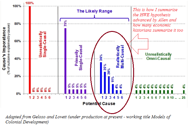
First of all, it is necessary to offer a proper enunciation of HWE’s role in explaining the industrial revolution as advanced by its main proponent, Robert Allen.  This is a necessary step because there is a literature attempting to use high-wages as an efficiency wage argument. A good example is Morris Altman’s Economic Growth and the High-Wage Economy  (see here too) Altman summarizes his “key message” as the idea that “improving the material well-being of workers, even prior to immediate increases in productivity can be expected to have positive effects on productivity through its impact on economic efficiency and technological change”. He also made the same argument with my native home province of Quebec relative to Ontario during the late 19th century. This is basically a multiple equilibria story. And its not exactly what Allen advances. Allen’s argument is that wages were high in England relative to energy. This factors price ratio stimulated the development of technologies and industries that spearheaded the BIR. This is basically a context-specific argument and not a “conventional” efficiency wage approach as that of Allen. There are similarities, but they are also considerable differences. Secondly, the HWE hypothesis is basically a meta-argument about the Industrial Revolution. It would be unfair to caricature it as an “overarching” explanation. Rather, the version of HWE advanced by Robert Allen (see his book here) is one where there are many factors at play but there is one – HWE – which had the strongest effects. Moreover, while it does not explain all, it was dependent on other factors that contributed independently.  The most common view is that this is mixed with Joel Mokyr’s supply of inventions story (which is what Nick Crafts has done). In the graph below, the “realistically multi-causal” explanation is how I see HWE. In Allen’s explanation, it holds the place that cause #1 does. According to other economists, HWE holds spot #2 or spot #3 and Mokyr’s explanations holds spot #1.

hwe

In pure theoretical terms (as an axiomatic statement), the Allen model is defensible. It is a logically consistent construct. It has some questionnable assumptions, but it has no self-contradictions. Basically, any criticism of HWE must question the validity of the theory based on empirical evidence (see my argument with Graham Brownlow here) regarding the necessary conditions. This is the hallmark of Allen’s work: logical consistency. His work cannot be simply brushed aside – it is well argued and there is supportive evidence. The logical construction of his argument requires a deep discussion and any criticism that will convince must encompass many factors.

Why not France? Or How to Test HWE

As a doubter of Allen’s theory (I am willing to be convinced, hence my categorization as doubter), the best way to phrase my criticism is to ask the mirror of his question. Rather than asking “Why was the Industrial Revolution British”, I ask “Why Wasn’t it French”. This is what Allen does in his work when he asks explicitly “Why not France?” (p.203 of his book). The answer proposed is that English wages were high enough to justify the adoption of labor-saving technologies. In France, they were not. This led to differing rates of technological adoptions, an example of which is the spinning jenny.

This argument hinges on some key conditions :

  1. Wages were higher in England than in France
  2. Unit labor costs were higher in England than in France (productivity-adjusted wages) (a point made by Kelly, Mokyr and Ó Gráda)
  3. Market size factors are not sufficiently important to overshadow the effects of lower wages in France (R&D costs over market size mean a low fixed cost relative to potential market size)
  4. The work year is equal in France as in England
  5. The cost of energy in France relative to labor is higher than in England
  6. Output remained constant while hours fell – a contention at odds with the Industrious Revolution which the same as saying that marginal productivity moves inversely with working hours

If most of these empirical statements hold, then the argument of Allen holds. I am pretty convinced by the evidence advanced by Allen (and E.A. Wrigley also) regarding the low relative of energy in England. Thus, I am pretty convinced that condition #5 holds. Moreover, given the increases in transport productivity within England (here and here), the limited barriers to internal trade (here), I would not be surprised that it was relatively easy to supply energy on the British market prior to 1800 (at least relative to France).

Condition #3 is harder to assess in terms of important. Market size, in a Smithian world, is not only about population (see scale effects literature). Market size is a function of transaction costs between individuals, a large share of which are determined by institutional arrangements. France has a much larger population than England so there could have been scale effects, but France also had more barriers to internal trade that could have limited market size. I will return to this below.

Condition #1,2,4 are basically empirical statements. They are also the main points of tactical assault on Allen’s theory.  I think condition #1 is the easiest to tackle. I am currently writing a piece derived from my dissertation showing that – at least with regards to Strasbourg – wages in France presented in Allen (his 2001 article) are heavily underestimated (by somewhere between 12% and 40% using winter workers in agriculture and as much as 70% using the average for laborers in agriculture). The work of Judy Stephenson, Jane Humphries and Jacob Weisdorf has also thrown the level and trend of British wages into doubts. Bringing French wages upwards and British wages downwards could damage the Allen story. However, this would not be a sufficient theory. Industrialization was generally concentrated geographically. If labor markets in one country are not sufficiently integrated and the industrializing area (lets say the “textile” area of Lancashire or the French Manchester of Mulhouse or the Caën region in Normandy) has uniquely different wages, then Allen’s theory can hold since what matters is the local wage rate relative to energy. Pseudoerasmus has made this point but I can’t find any mention of that very plausible defense in Allen’s work.

Condition #2 is the weakest point and given Robert Fogel’s work on net nutrition in France and England, I have no problem in assuming that French workers were less productive. However, the best evidence would be to extract piece rates in textile-producing regions of France and England. This would eliminate any issue with wages and measuring national productivity differences. Piece rates would perfectly capture productivity and thus the argument could be measured in a very straightforward manner.

Condition #4 is harder to assess and more research would be needed. However, it is the most crucial piece of evidence required to settle the issue once and for all. Pre-industrial labor markets are not exactly like those of modern days. Search costs were high which works in a manner described (with reservations) by Alan Manning in his work on monopsony but with much more frictions. In such a market, workers may be willing to trade in lower wage rates for longer work years. In fact, its like a job security argument. Would you prefer 313 days of work guaranteed at 1 shilling per day or a 10% chance of working 313 days for 1.5 shillings a day (I’ve skewed the hypothetical numbers to make my point)? Now, if there are differences in the structure of labor markets in France and England during the 18th and 19th centuries, there might be differences in the extent of that trade-off in both countries. Different average discount on wages would affect production methods. If French workers were prone to sacrifice more on wages for steady employment, it may render one production method more profitable than in England. Assessing the extent of the discount of annual to daily wages on both markets would identify this issue.

The remaining condition (condition #6) is, in my opinion, dead on arrival. Allen’s model, in the case of the spinning jenny, assumed that labor hours moved in an opposite direction as marginal productivity. This is in direct opposition to the well-established industrious revolution. This point has been made convincingly by Gragnolati, Moschella and Pugliese in the Journal of Economic History. 

In terms of research strategy, getting piece rates, proper wage estimates and proper labor supplied estimates for England and France would resolve most of the issue. Condition #3 could then be assessed as a plausibility residual.  Once we know about working hours, actual productivity and real wages differences, we can test how big the difference in market size has to be to deter adoption in France. If the difference seems implausible (given the empirical limitations of measuring effective market size in the 18th century in both markets), then we can assess the presence of this condition.

My counter-argument : social networks and diffusion

For the sake of argument, let’s imagine that all of the evidence favors the skeptics, then what? It is all well and good to tear down the edifice but we are left with a gaping hole and everything starts again. It would be great to propose a new edifice as the old one is being questioned. This is where I am very much enclined towards the rarely discussed work of Leonard Dudley (Mothers of Innovation). Simply put, Dudley’s argument is that social networks allowed the diffusion of technologies within England that fostered economic growth. He has an analogy from physics which gets the point across nicely. Matter has three states : solid, gas, liquid. Solids are stable but resist to change. Gas, matter are much more random and change frequently by interacting with other gas, but any relation is ephemeral. Liquids permit change through interaction, but they are stable enough to allow interactions to persist for some time. Technological innovation is like a liquid. It can “mix” things together in a somewhat stable form.

This is where one of my argument takes life. In a small article for Economic Affairs, I argued (expanding on Dudley) that social networks allowed this mixing (I am also expanding that argument in a working paper with Adam Martin of Texas Tech University). However, I added a twist to that argument which I imported from the work of Israel Kirzner (one of the most cited books in economics, but not by cliometricians – more than 7000 citations on google scholar). Economic growth, in Kirzner’s mind,  is the result of entrepreneurs discovering errors and arbitrage possibilities. In a way, growth is a process of discovering correcting errors. An analogy to make this point is that entrepreneurs look for profits where the light is while also trying to move the light to see where it is dark. What Kirzner dubs as “alertness” is in fact nothing else than repeated and frequent interactions. The more your interact with others, the easier it becomes for ideas to have sex. Thus, what matters is how easy it is for social networks to appear and generate cheap information and interactions for members without the problem of free riders. This is where the work of Anton Howes becomes very valuable. Howes, in his PhD thesis supervised by Adam Martin who is my co-author on the aforementioned project (summary here), showed that most innovators went in frequent with one another and they inspired themselves from each other. This is alertness ignited!

If properly harnessed, the combination of the works of Howes and Dudley (and also James Dowey who was a PhD student at the LSE with me and whose work is *Trump voice* Amazing) can stand as a substitute to Allen’s HWE if invalidated.

Conclusion

If I came across as bashing on Allen in this post, then you have misread me. I admire Allen for the clarity of his reasoning and his expositions (given that I am working on a funded project to recalculate tax-based measures in the US used by Piketty to account for tax avoidance, I can appreciate the clarity in which Allen expresses himself). I also admire him for wanting to “Go big or go home” (which you can see in all his other work, especially on enclosures). My point is that I am willing to be convinced of HWE, but I find that the evidence leans towards rejecting it. But that is very limited and flawed evidence and asserting this clearly is hard (as some of the flaws can go his way). Nitpicking Allen’s HWE is a necessary step for clearly determining the cause of BIR. It is not sufficient as a logically consistent substitute must be presented to the research community. In any case, there is my long summary of the twitteminar (officially trademarked now!)

P.S. Inspired by Peter Bent’s INET research webinar on institutional responses to financial crises, I am trying to organize a similar (low-cost) venue for presenting research papers on HWE assessment. More news on this later.

The Uniqueness of Italian Internal Divergence

A few weeks ago, I got engaged in a twitter debate with Garett Jones, Pseudoerasmus and Anna Missiaia (see her great work here) about institutions in Italy. During the course of that discussion, I was made aware that I held a false belief. Namely, the belief that since the late 19th century, there had only been a minor divergence within Italy. In reality, there has been considerable divergence within the country since the late 19th century.

In the wake of the Italian referendum, it is worth examining how big is this divergence. Below is a map of regional GDP per capita taken from Europa.ec.  The southern regions of Italy have GDP per capita below 75% of the European average while some of the northern regions have GDP per capita above 125% of the European average. The IStat database suggest similar levels of divergence across regions in Italy.

Gross_domestic_product_(GDP)_per_inhabitant_in_purchasing_power_standard_(PPS)_in_relation_to_the_EU-28_average,_by_NUTS_2_regions,_2014_(¹)_(%_of_the_EU-28_average,_EU-28_=_100)_RYB2016.png

So, how much divergence was there – say a little a more than one hundred years ago? Well, according to the great work of Felice (see here in the Economic History Review and here), there were more similarities back in the 19th century than there are today. Take the Liguria which – in 1891 – had per capita value added of 44% above national average. Take also Campania which was 3% below the national average. Today, the IStat data places Liguria 9% above national average but the region of Campania is 37% below the national average. Overall, regardless of how you present the data , divergence has increase. Just expressed at coefficient of variations, there has been an increase. In 1891, the coefficient of variation stood at 22.95% while it stood at 28.95% in 2013.

italiangdp

This makes Italy into an oddity. My own work shows that in Canada, since the 19th century, there has been considerable convergence (see article in Economics Bulletin). The same happened in the United States (see this paper by Michener and McLean), in England (here and here) and in Sweden (here). Among western countries, increased internal divergence is rare and Italy is the prime case example. And this is a strong indictment. Either Italy as a whole shares the same steady-state status and something is preventing upwards convergence from the South or Italy has two different economies with two different steady-states. In both cases, the implications are depressing.

Has there been any improvements in the relative economic conditions of American blacks?

A few years ago, I was teaching at HEC Montréal and I explained that putting people in prison – by statistical definition – did reduce unemployment. My students were shocked that I would say that. I told them that it was important to know definitions like that because you can then analyze the BS that politicians and pundits can spew.

And the case of Black-Americans is the best example, especially with regards to the wage gap. In recent years, I have seen pundits (left and right) use the slightly increasing ratio of black-to-white wages as a tool to promote their favored political narrative (i.e. the BS that I am referring to).

But, at the same time, the incarceration rates of Blacks has increased dramatically. Tell me, do you think that the socio-economic features of blacks in jail are distributed the same way as the socio-economic features of blacks not in jail? Of course not, criminals tend to be clustered disproportionately at the bottom of the income ladder. However, when its time to collect the wage statistics for blacks and whites, you are basically considering only the wages of blacks not in jail (i.e. blacks who are in the top centiles of the wage distribution). So, you’re basically committing a sin of statistical composition.

Some bloggers have caught on to that – the wage ratio is going up at the same pace as the incarceration rate for blacks. But they caught on after the work of scholars like Becky Pettit and Bruce Western came along (here and here and see graph below that illustrates the effect of correcting for incarceration on the employment rate of blacks).

pettit

When I look at this evidence, I understand why some people are pissed off at the conditions of Black Americans. It throws in doubt the contention that there has been racial convergence in America. At the same time, I wonder if the lack of recognition given to this statistical issue is a form of cognitive dissonance. If you claim that the convergence is mostly an artifice of composition fallacies, then what does it say about the policies of the last 30-40 years?

When Black Unemployment Rates Were Equal to White Unemployment Rates…

In a twitter-debate with Tariq Nasheed, I pointed out that the wages rates did converge between the 1940s and 1990s. Recently, Robert Margo of the University of Chicago extended this to per capita incomes since 1870. It is fascinating to see that there was convergence between 1870 and 1940 in spite of Jim Crow laws (it tells you how much more blacks could have achieved had the laws not existed – see notably the work of Bob Higgs on this).

income-convergece

Each time I see this evidence, I am bemused. You see, I often debate colleagues on particular features of social policy in order to assess policy reforms or the effects of past reforms. But, its always good to take a step back and look at the long-view of history. It puts things in perspective. The Margo graph does just that. It tells me the story of what could have been. And just for the sake of remembering properly (infer whatever conclusions you like), it is worth showing racial differences in unemployment rates since 1890. What strikes me is how similar the rates are until the 1950s. What happened at that point? When you ask yourself this question, you’re forced to put everything in perspective. And it becomes harder to have “generic” answers in the lazy-form of “its racism”. Why would racism explain the difference after 1950, but not before?
whites

Maybe, just maybe, people like Tariq Nasheed should stop proving that H.L. Mencken was right in saying that “for every complex problem, there is an answer that is simple, clear and plainly wrong”.


Planned obsolescence (in parts)

In response to my post on planned obsolescence, some have pointed out that a good is composed of many different inputs. If there are differences in the quality of the different parts of a good, then it might be rational to reduce its lifespan.

That is a important possibility which I should have considered. Imagine that good 1 is composed of parts A, B and C whose lifespan are 1, 2 and 3 years. The manufacturer of good 1 will converge one the lifespan which, in relative terms, will maximize his profits. If it costs more to bring part A to the lifespan of part C than it is to bring part C to the lifespan of part A, then a lower total lifespan would be appreciable.  That decision reduces the lifespan and the marginal cost which means that a greater quantity of goods can be consumed than if we “over-engineer” by bringing A to the level of C. This point was brought to my attention by Michael Makovi, a graduate student at Texas Tech University’s department of agricultural economics. In his words:

The corporate executive types told the engineers: If one part of the product can last X years but the other part of the machine can last Y years, then under-engineer the longer-lasting parts so that the whole product uniformly lasts the lowest-common-denominator of time, so that when the product fails, the customer didn’t waste money on over-engineering other parts of the product to last longer (…) engineers balked because it seemed immoral, but the executives assured them that it was in the customer’s own best interest. For example (…) if one part of your refrigerator lasts 10 years but another part lasts 20 years, and if the 10 year part cannot be replaced, so you have to replace the whole refrigerator at once, then over-engineering the other part to last 20 years is a waste of money.

What if fake news was merely an attempt at political entrepreneurship?

Fake news! The new plague that besets mankind! That is largely the new name given to what 19th century folks would have called “yellow journalism“.

Yellow journalism was sensationalist to the point of distorting the news in order to carry a very emotional message. Generally embedded in that message was a political narrative supporting progressive reforms (not all yellow journalists were progressive but it seems that most were).

The aim of many progressives was to design a new society, to reform the old society by getting rid of old institutions. In many cases, economic historians have documented that these reforms (like with prohibition, workers compensation, antitrust) ended up serving very narrow interest groups who either allied themselves with reforming zealots (as in bootleggers helping baptists pass Sunday sales bans), gained through the restriction of competition or gained at the expense of future workers and minorities. But it is not as if the “previous” order was paradise. The postbellum era prior to the progressive era was highly protectionist, used public funds to bailout poorly performing railways and solicited the federal army to deal with natives rather than peacefully deal with them.  Basically, both eras had their political entrepreneurs who found their way in the political process to obtain favors.

Progressives who indulged in yellow journalism merely wanted to replace one set of political entrepreneurs with another. Just like the Alt-Right, from which emanates most of the fake news. In a way, both are exactly the same. Many members of the Alt-Right are not interested in restraining government abuses, they’re in favor of redirecting government indulgences towards them (Trump did promise less immigration with paid maternity leaves and no reduction in social transfers). Some are well-meaning like the baptists of lore. But there are still bootleggers (example: Steven Mnuchin from Goldman Sachs) who co-opt the process in order to continue indulging in rent-seeking just as they did before.

Are we about to swap one bad set of institutions for another? Given that all I see is the same type of political entrepreneurs (after all, Bannon from the flagship of the fake news alt-right outlet Breitbart is now a member of the government) as those we saw during the progressive era, I am inclined to respond “yes”.