Phew, that’s a lot of acronyms. But this is a great map:
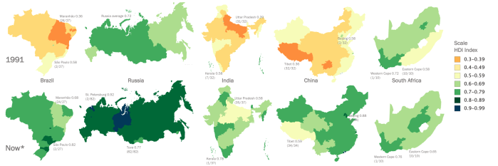
Orange and yellow is bad, green and blue is good. HDI stands for “Human Development Index,” which is a measurement that’s not nearly as good, in my opinion, for understanding how wealthy and happy a population is. Nevertheless, HDI is still one of the better measurements (Top 5, again in my opinion) out there. Here’s the wiki on HDI.
The maps are colored according to “subunits,” or provinces (which are like American states, such as Nebraska).
Brazil, India, and South Africa are multi-party democracies, while the other two are not. So what do all five have in common?
