Why farms die and should die


In Canada, I have the frustrating habit of criticizing government support to the agricultural sector especially entry-barriers in the form of production quotas. Most of those policies are regressive in the sense that they reallocate income from the poorest to the richest. In fact, their entire aim is to artificially increase the income of farmers (especially dairy and poultry farmers) at the expense of the rest of the population. However, when lobbyists for these subsidies come out in public, they do so under different disguises. Their favorite? Farms are dying.

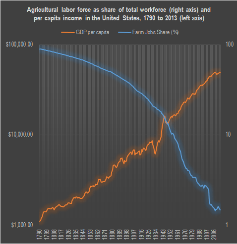
In each radio debate where that boogeyman is raised, I reply that “yes, they are dying and its a good thing”. If we can feed more and more people with less and less farmers using less and less land, that’s a good thing. In fact, it’s the greatest thing that happened in economic history. Less two centuries ago, 90% of the workers in some western economies were involved in agricultural activities. Today, that proportion has fallen to less than 1.5%. Thousands of farms disappeared, we liberated millions of acres of land to return to their natural state and in the process, we became rich and well-fed!

In testimony of this fact, which is my favorite economic history fact, I decided to recompute a graph by Mark Perry of the American Enterprise Institute but I added the GDP per capita figures for the same period (1790 to 2013).

GDPagriculture

Yes, let the farms die. Let the most productive stay in the fields and let them feed humanity while the others become engineers, doctors, teachers, businessmen, welders, carpenters or whatever trade they are best at!

The Economic Recovery: Jobs Edition

Economist Mark Perry has a great take on the current sluggishness of the jobs rate over at Carpe Diem. He brings our attention to the following graph:

His observations:

Most of the weakness in the U.S. labor market, the stubbornly high unemployment rate, and the slow rate of overall job creation can be traced to the ongoing decreases in government jobs, see chart above, especially at the local level […] Perhaps the significant downsizing of government at the state and local level is a positive development for the future growth of the U.S. economy, and one benefit of the Great Recession.  But we should also pay some attention to the fact that one of the reasons for the disappointing monthly employment reports is the persistent weakness in the public sector employment, which is offsetting the relatively healthy increases in private sector hiring.

This is a damn good point: unemployment rates have remained high because of losses in the public sector, not the private sector (which has been steadily growing). As Dr. Perry observes, this is good for long-run growth, but I can’t help but lament the fact that cuts in government spending have not been deeper and more robust. Imagine what the economy would look like if if deep cuts had been made six years ago.

As always, it is important to look at what the graph does not tell us. The graph explains that government jobs have been decreasing, but tells us nothing about expenses for current and retired government employees. Federal and state employees have gained notoriety for their lavish retirement packages (especially in California!), and none of this is covered in the graph. Public sector pension reform is still a vital issue that needs to be solved.

One other lament that I feel I must make pertains to the bank and auto bailouts of 2008-09. Although the bailouts don’t have any casual correlation to the graph I reproduced, I don’t think it is hard to image, again, what the economy would look like today if there had been a rigorous separation between business and state.