I have just completed a short piece on the impact of regional prices on the measurement and geographic distribution of low income individuals. Basically, Youcef Msaid and myself* used the March 2012-CPS data combined the BEA’s regional purchasing power parities database to correct incomes.
We found is that the level of inequality is very modestly overestimated (0.5%). Now this is a conservative estimate since we used state-level corrections for price differences. This means that we took price corrections for New York state as a whole even if there are wide differences within New York state. Obviously, with more fine-grained price-level adjustments we would find a bigger correction but it is hard to imagine that it could surpass 1-3%.
That was not our most important result. Our most important result relates to where the bottom decile of the income distribution is geographically located. We find that instead of being found disproportionately (relative to their share of the total US population) in poorer states, the bottom decile is disproportionately found in rich states. The dotted black line in the figure below illustrates the change in the number of individuals who are, nationally, in the bottom 10%. New York and California have significant increases while West Virginia has a large decrease. The dark black line shows the same for the top 10%.
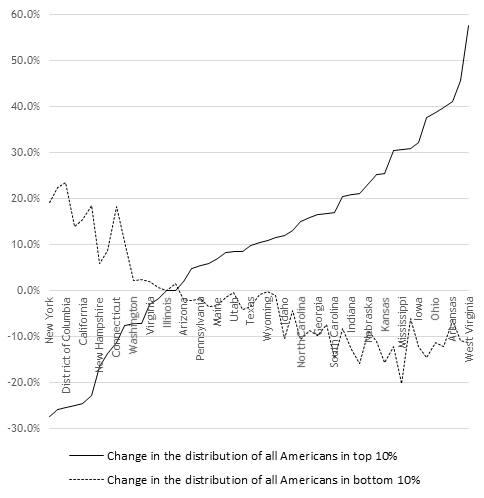
Another way to grasp the magnitude of this change is to relate the change to the population shares of each decile by state. For example, New York had 6.29% of the US population in 2012 and 6.61% of all Americans in the bottom 10% of the income distribution before adjusting for regional purchasing parities. After adjusting however, New York’s share of the bottom 10% surges to 7.88%.
Why does it matter? Because most of the cost difference adjustments come from differences in housing costs. The first obvious point is that housing is a crucial aspect of any discussion of inequality. The second, but less obvious point, is that these differences are massive barriers to migration within the United States and the poorest are those for whom these barriers are the heaviest. Unfortunately, the high-cost areas are also high-productivity areas (New York, San Francisco for example) whose high costs are largely the result of restrictions on the supply of housing. This means that high-productivity areas – which would raise the wages of low-skilled and low -income workers are inaccessible to them. It also means that those who were present before the increase in productivity of these areas capitalized the gains in more valuable real estates (even if this means lower real incomes).
In this light, the geographic reallocation of the bottom 10% is consistent with an emerging literature that argues that inequality is in great a result of housing policy (see notably Rognlie’s reply to Piketty in the Brookings Papers). This small modification (I consider it small) that me and Youcef made has important logical ramifications.
* Thank you to my friends Rick Weber (who blogs here at NOL and whose research can be seen here) and Ryan Murphy (whose research can be found here) who provided good comments to bring the paper to the stage where we are ready to submit.

Absolutely fascinating study, this fundamentally questions what I think a lot of people see as the root of poverty. It is also notable that, if housing prices are the main determinant, this could be a demonstration of the unseen negative effects of regulations. This is because regulations may actually be a greater determinant of housing price than population density or level of income (http://faculty.washington.edu/te/papers/Housing051608.pdf). I think this is what you meant by “supply restrictions causing high cost,” but I just wanted to emphasize that element of your blog.
Several questions about your data: first, what exactly does “change in the number/distribution of individuals in the top/bottom 10% specifically represent? I get the gist that states with the greatest proportion of rich people also have disproportionate numbers of the poorest people, but does “change” here represent the change to existing data on these numbers based on your purchasing power adjustment, or something else?
Second, what inequality do you mean is “overestimated” by 0.5%? the difference between the earnings of the top and bottom 10%? state inequalities?
Sorry to get stuck on details, but this is interesting and I want to be able to correctly understand and relate your findings. Lastly, is there a way to (or has someone already) analyze this on an urban vs. rural basis? It seems to me that most of the richest AND poorest cluster in urban areas, and your data seem to suggest that (because most of the states to the left of your graph are far more city-centric than the ones to the right).
Thanks for a great read!